Texas Integrative Rheumatology Specialists
Restoring mobility, relieving pain, and providing expert, compassionate care.
The Task
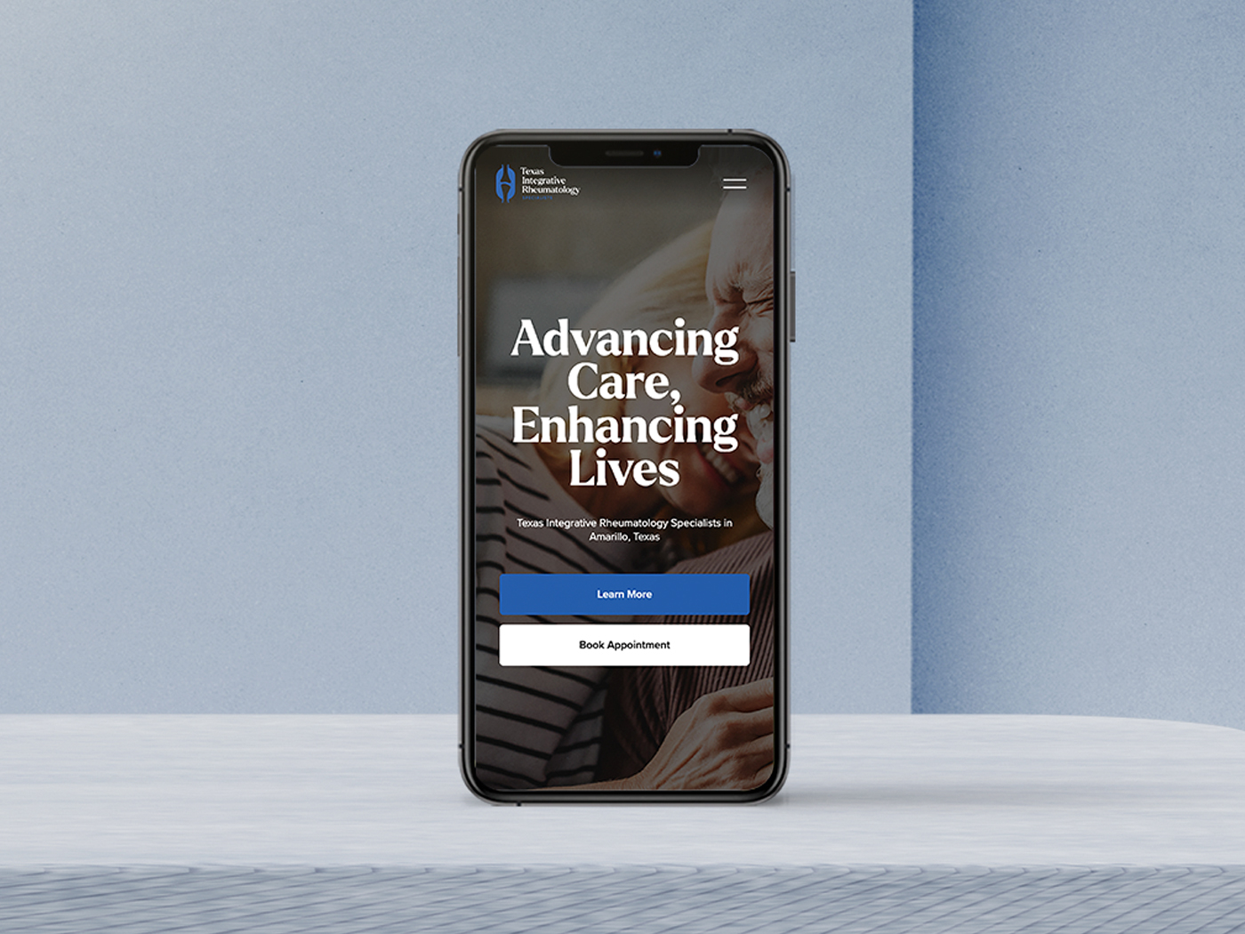
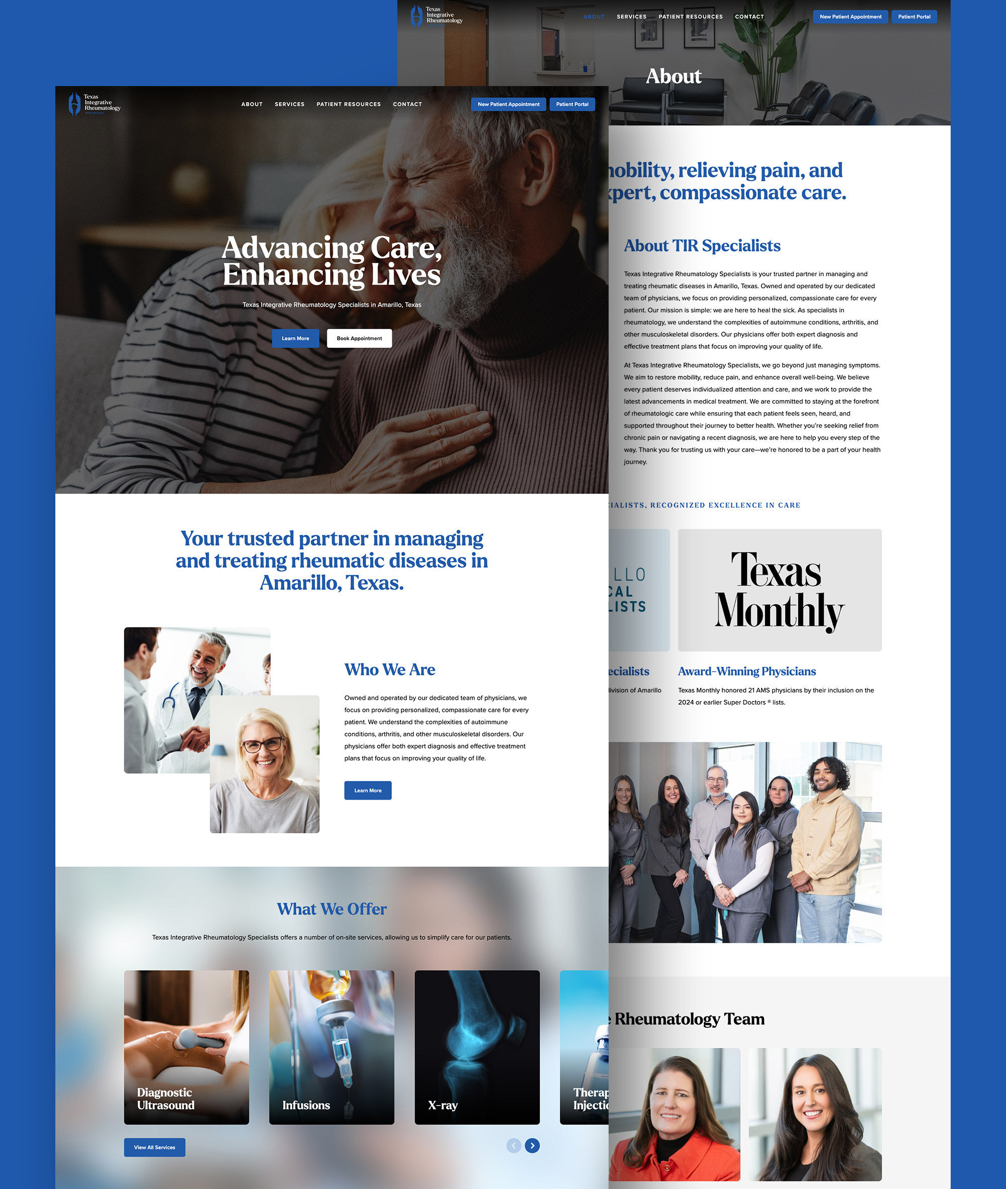
Texas Integrative Rheumatology Specialists (TIR Specialists) needed a strong visual identity and an intuitive website that accurately reflected their expertise in diagnosing and treating rheumatic diseases. As a trusted provider of specialized care, they wanted a professional, medical-grade design that conveyed trust, precision, and compassion while reinforcing their commitment to patient-centered treatment. The goal was to develop a cohesive brand that resonated with their diverse patient base, ensuring clarity, accessibility, and ease of use. Additionally, they sought a clean, corporate aesthetic that upheld the high standards of the healthcare industry while making vital resources readily available for new and existing patients.
The Solution
We began with an in-depth brand discovery session to understand their mission and audience. The result was a logo inspired by the very core of their work—joint health—symbolizing movement, healing, and expertise. The website followed suit, featuring a clean, corporate design with easy navigation, clear service listings, and a professional yet approachable tone. By integrating their patient portal and appointment booking system, we ensured a seamless user experience, making it easier for patients to connect with their specialists.
Let’s create something amazing together.
From brand identity to design direction, we partner with you to build a creative foundation that feels aligned, professional, and easy to grow with.