 Search
Buns Over Texas
A brand concept for an Amarillo burger spot that has been calling names at the counter since 1989. This is a concept only, not a launched rebrand. We drew a new logo, built a seal, a palette and a basket check, directed the photography, made the social kit and a 30-page lookbook, and designed the new website.
Download Brand Lookbook PDF Visit Conceptual Website- Client
- Buns Over Texas
- Location
- Amarillo, Texas
- Status
- Brand concept, Nov 2026
- Scope
- Brand identity, photography, social, website
- Sample site
- circlescosites.com/bunsovertexas
The task
Buns Over Texas has fed Amarillo for more than thirty years, but its look had drifted, with a different logo on the sign, the cups and the menu. They wanted one brand the whole Panhandle would know from the highway, and a website that gets people from hungry to ordered.
What we did
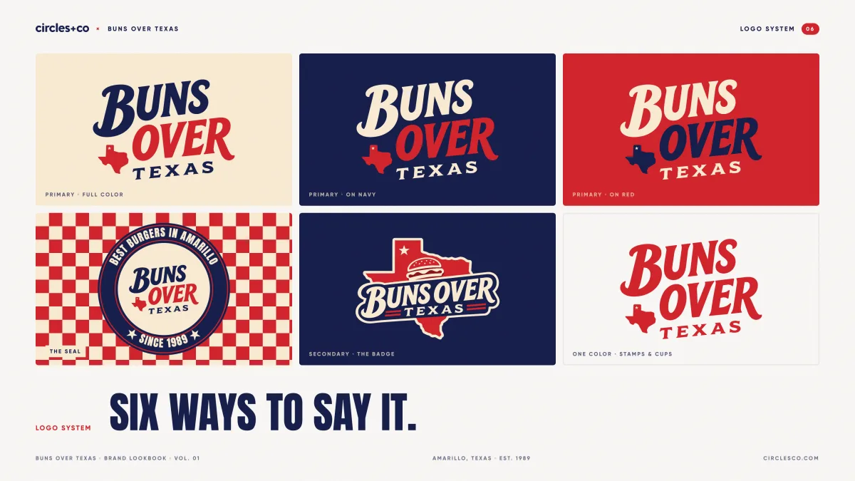
We drew the logo by hand: a badge with the name across Texas, a burger on top and a star pinned on Amarillo, plus a stacked wordmark and a one-line version for the web. Then we built the system around it: a seal, six colors, three typefaces and the red and cream basket check. We directed a library of photography, designed signs, packaging and merch, made a social kit and wrote it all up in a 30-page lookbook. The website is next.
One brand, ready for the whole Panhandle.
- 013Logos
The badge, the wordmark and a one-line
- 021Seal
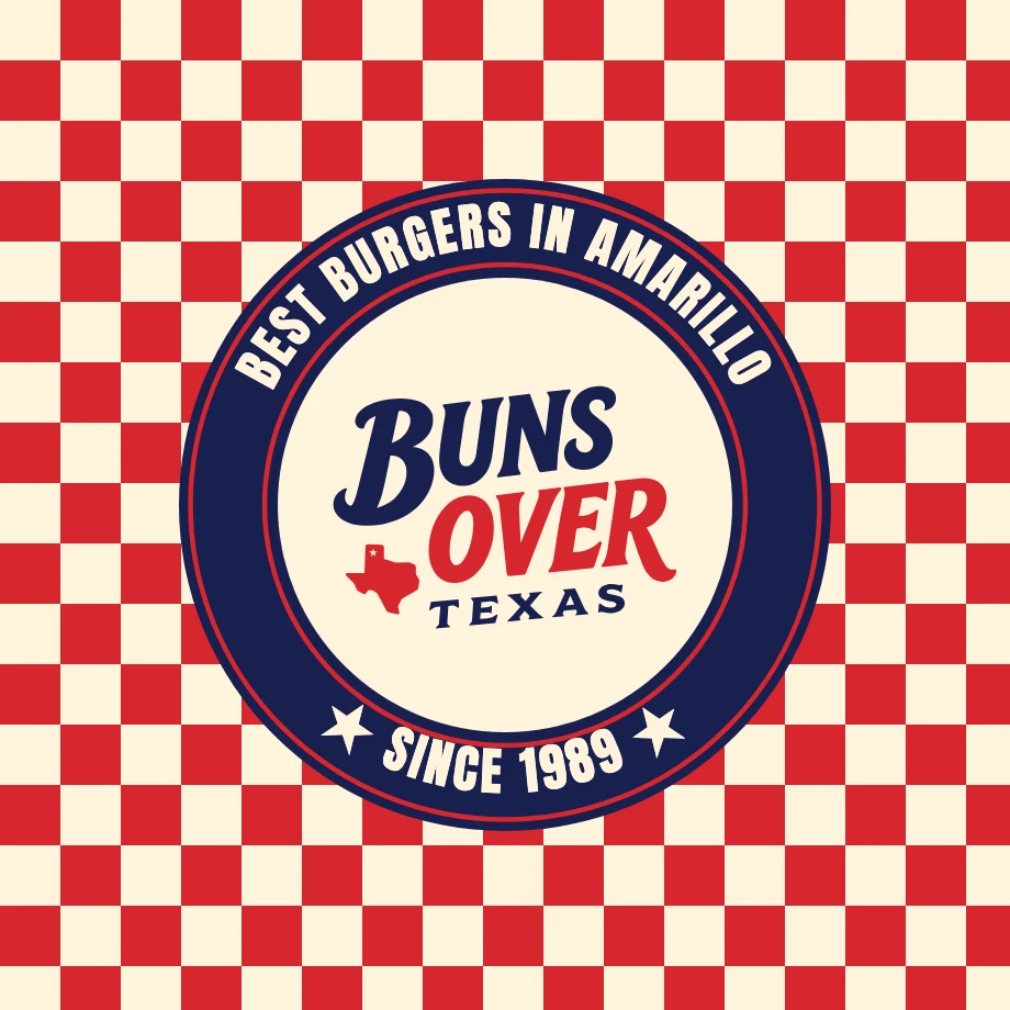
Best burgers in Amarillo, since 1989
- 036Colors
Navy, cream and red lead
- 043Typefaces
Anton, Bevan and Archivo
- 0525Photos
Directed from briefs, graded warm
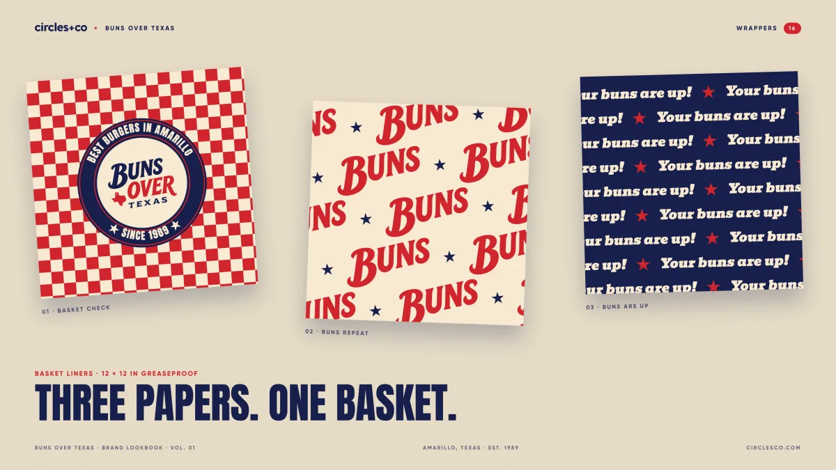
- 063Wrappers
Basket liners in greaseproof
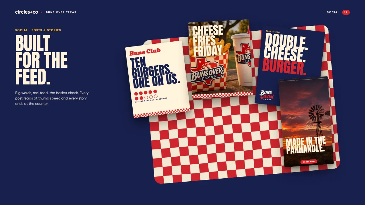
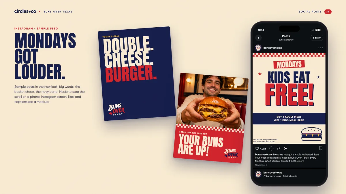
- 079Posts
Feed posts and stories
- 0830Pages
The brand lookbook
The whole state behind it.
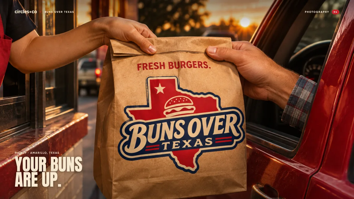
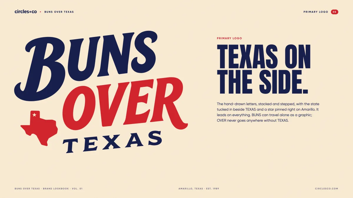
The primary logo is the badge: the hand-drawn name on a banner across Texas, a burger on top and a star pinned on Amarillo. The stacked wordmark is the secondary logo, and a straight one-line version runs in the website header.
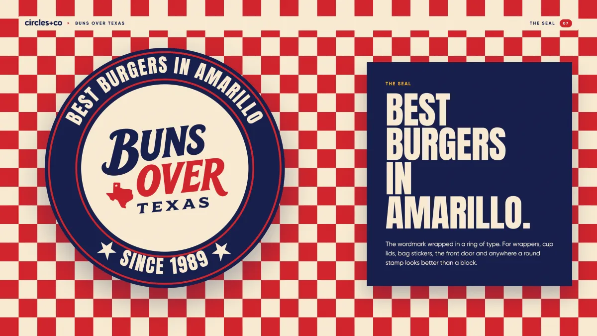
Best burgers in Amarillo.
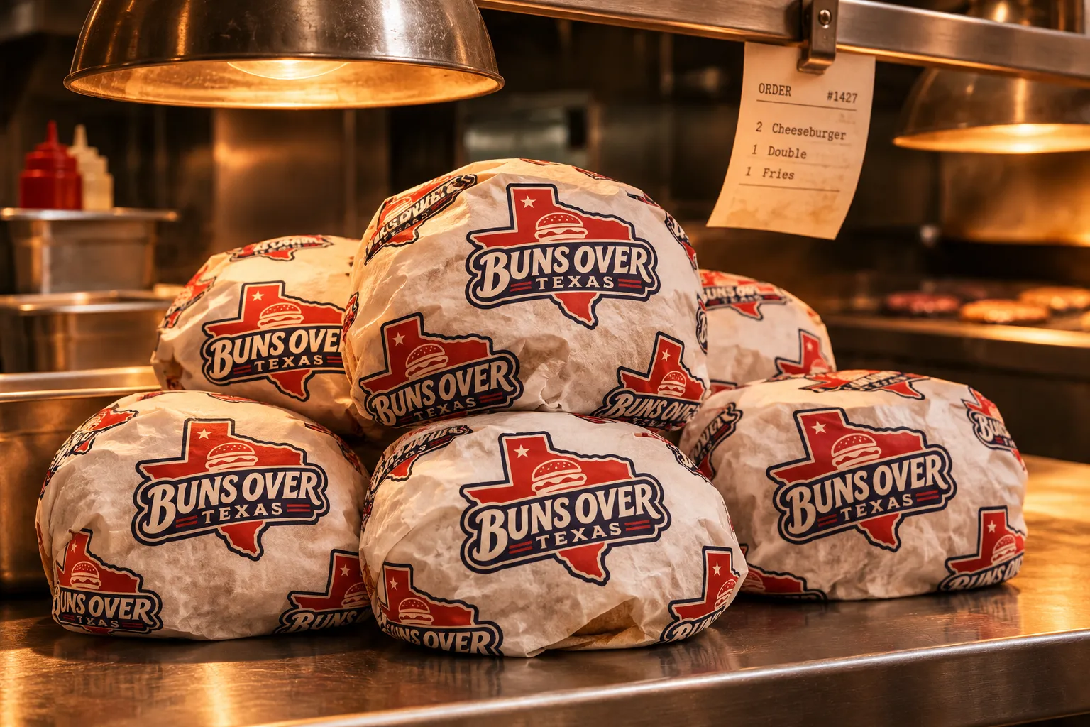
The wordmark wrapped in a ring of type. It goes on wrappers, cup lids, bag stickers and the front door: anywhere a round stamp looks better than a block. Since 1989 sits at the bottom, right side up.
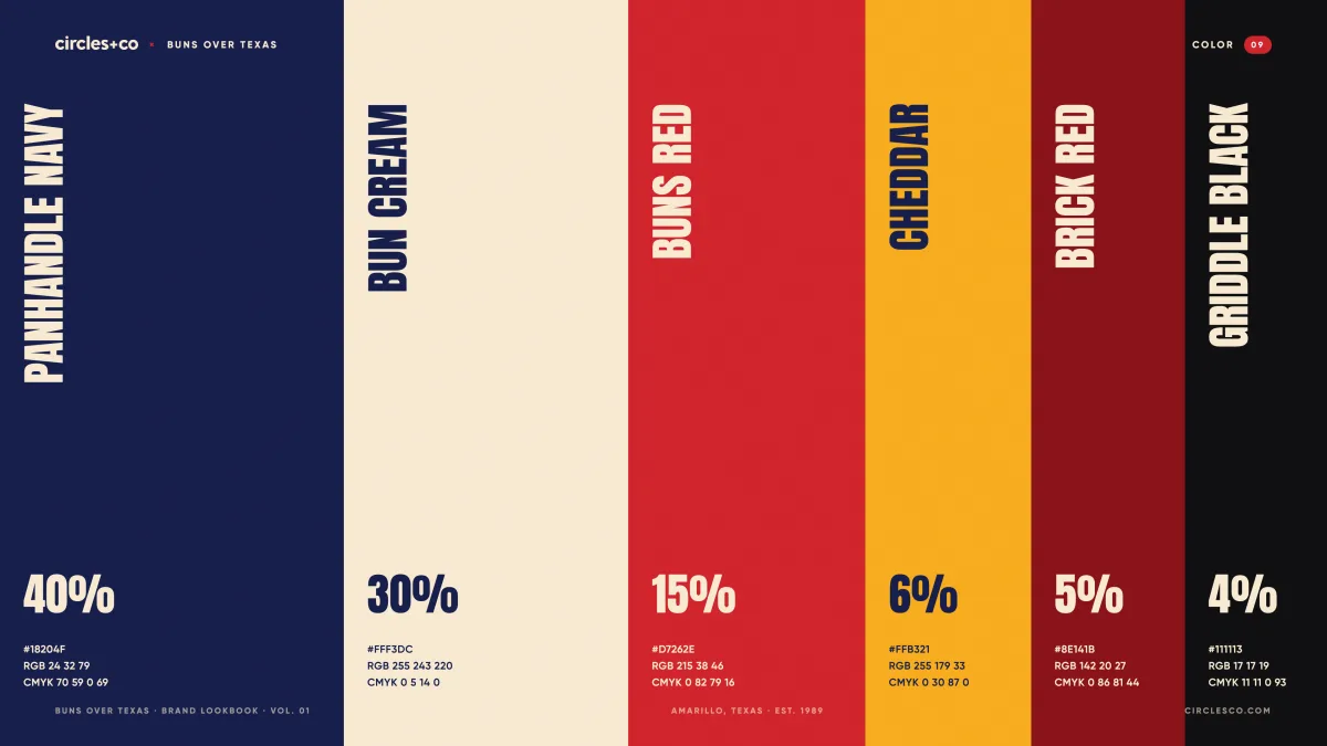
Navy. Cream. Buns red.
Panhandle navy and bun cream do most of the work. Red is for the big words and the basket check. Cheddar is a garnish, never a main.
Big, tall and loud.
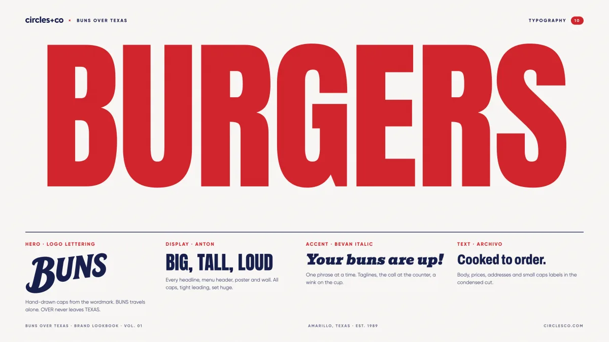
Anton for every headline, menu header and wall. Bevan Italic for one phrase at a time. Archivo, condensed, for prices and the small print.
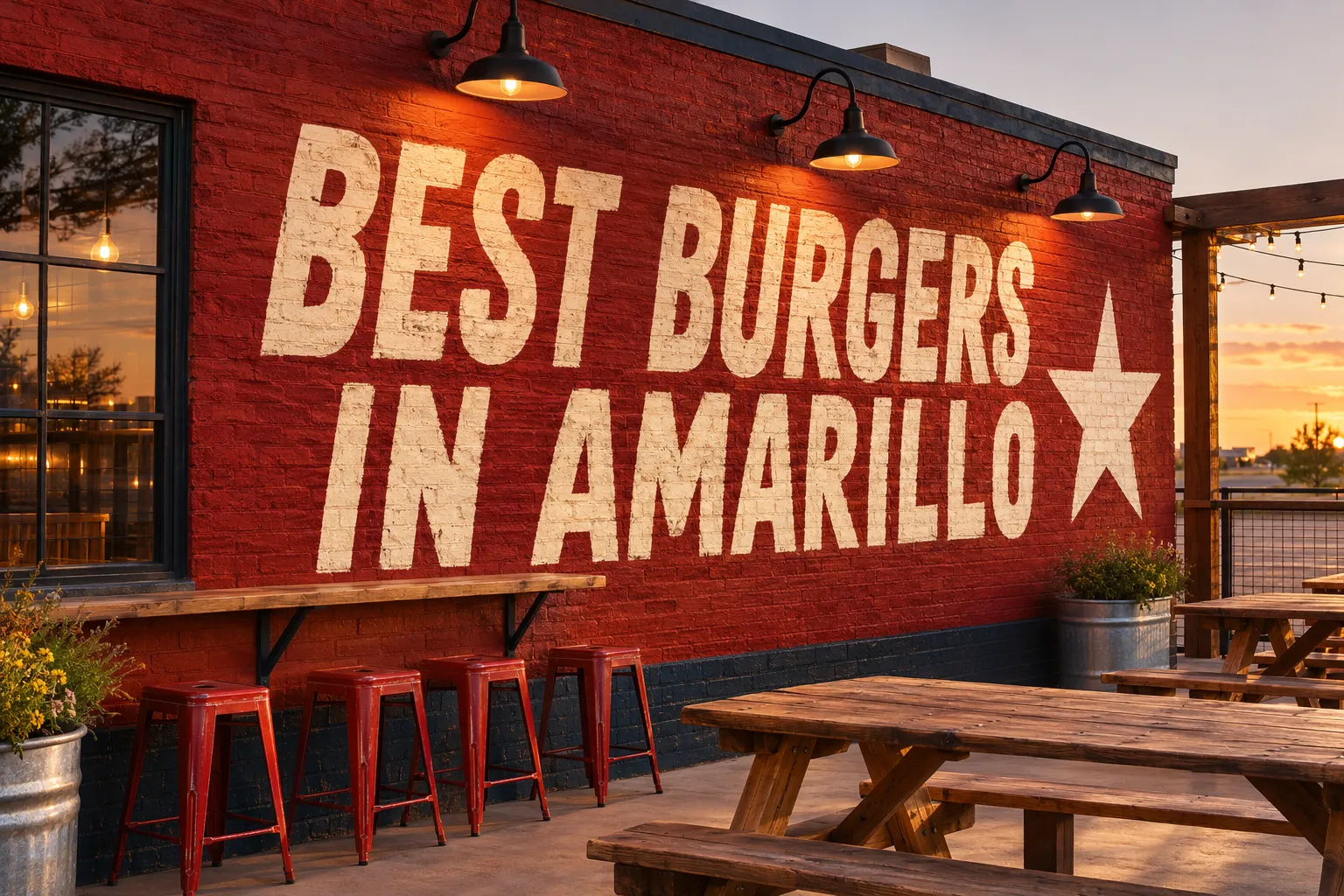
All caps, tight leading, set huge.
The call at the counter, a wink on the cup.
Body copy, prices and labels.
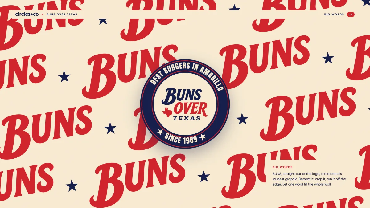
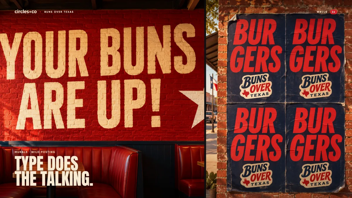
Big wordsBUNS is the brand's loudest graphic. Repeat it, crop it, run it off the edge. Let one word fill the whole wall.
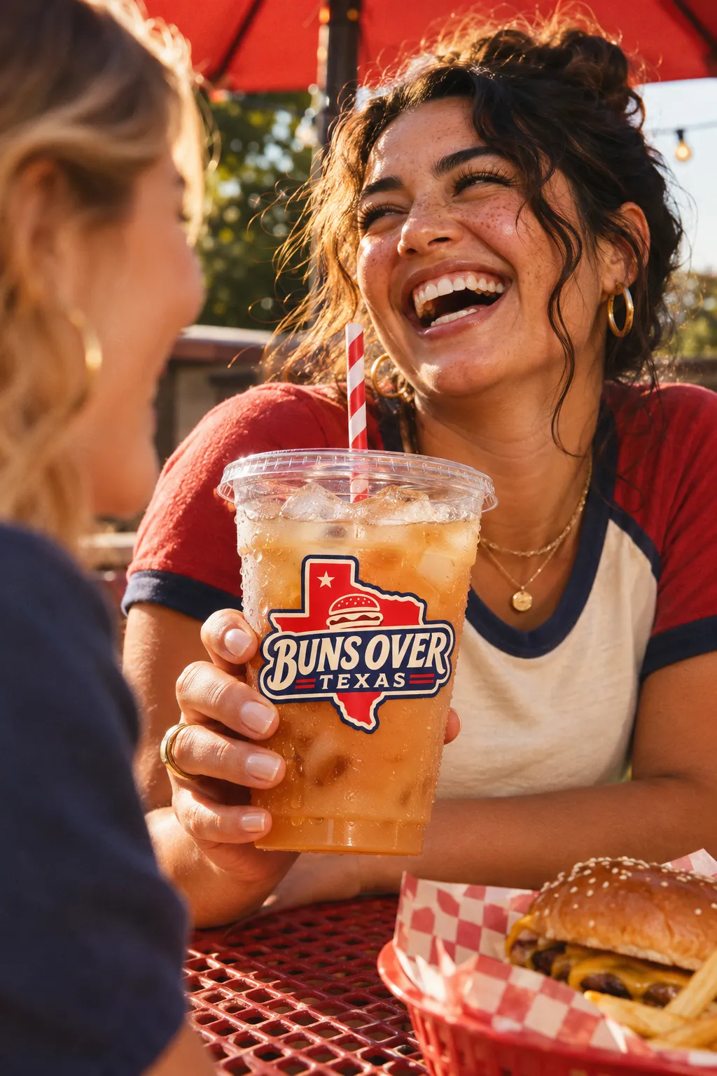
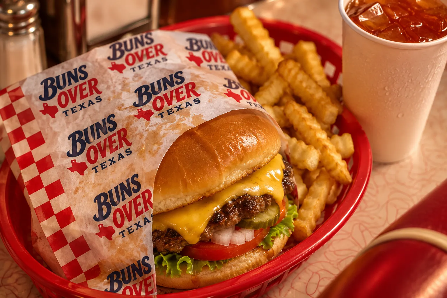
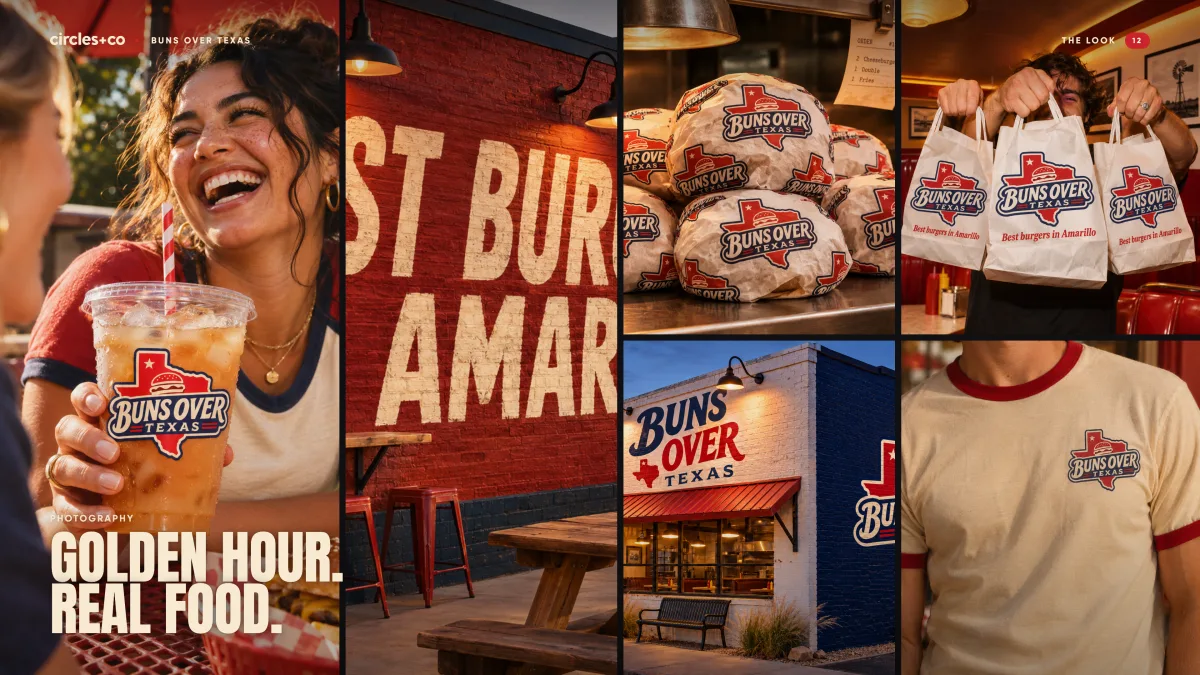
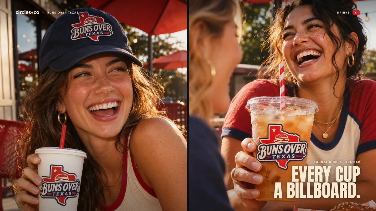
Golden hour. Real food.
A library of photos for the menu, the site and the feed, directed with AI from written briefs, then picked and graded by hand to one warm look.
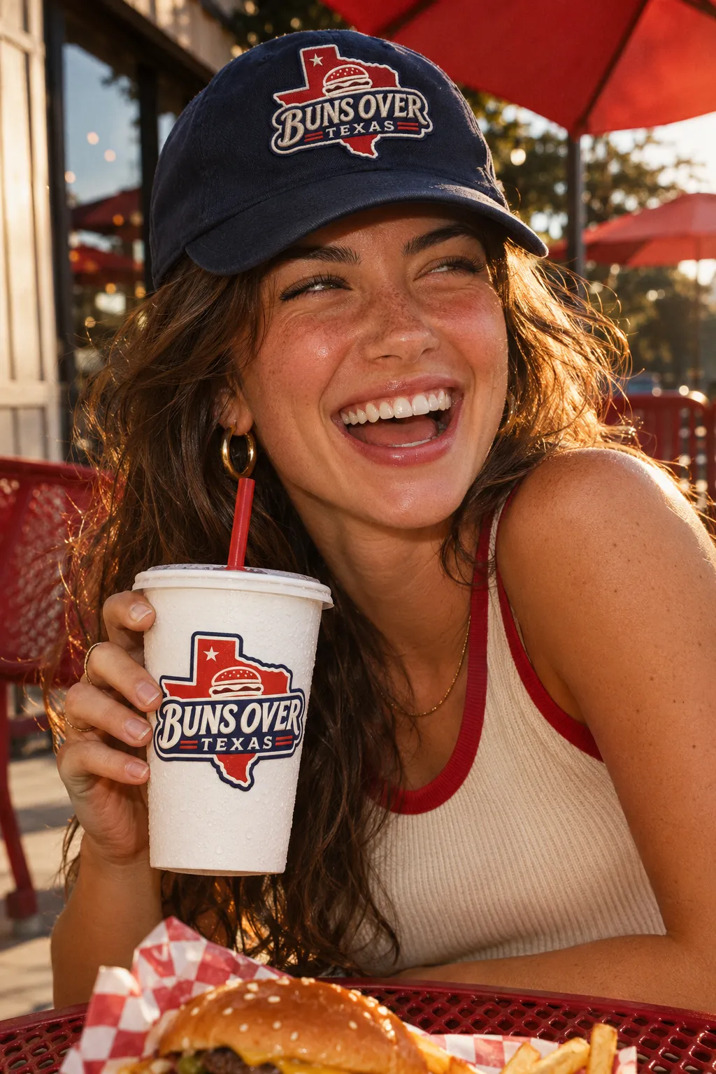
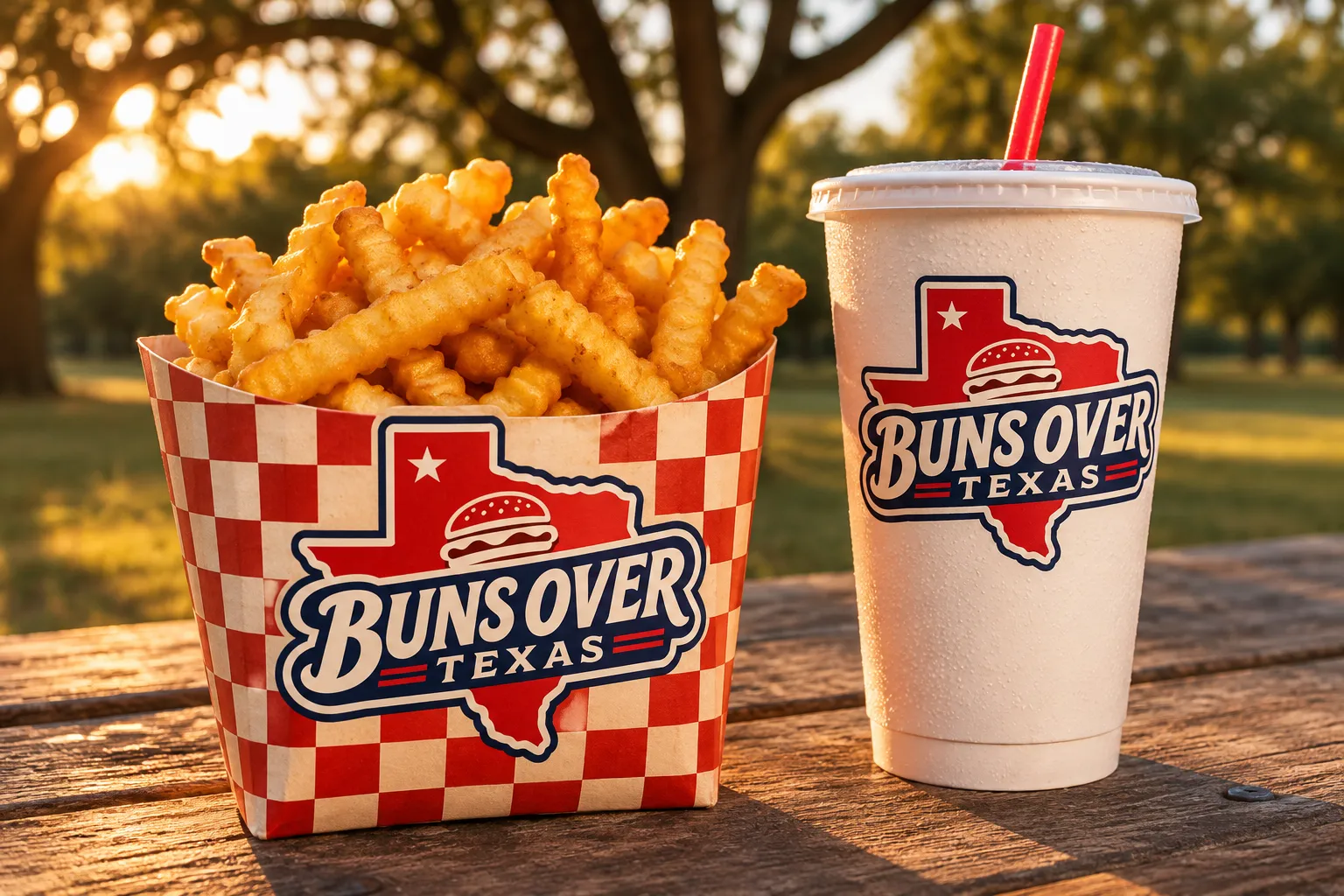
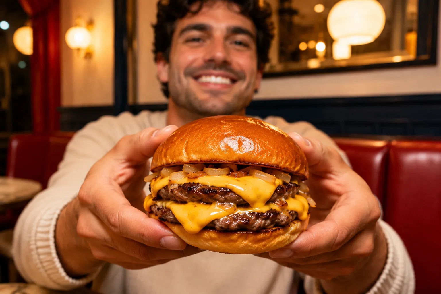
Warm, late-afternoon light. Food close and messy, cheese mid-drip. Real regulars, flat-top steam, the basket check in frame.
NEVER: white studio backdrops, perfect stock smiles, cold blue light.
25 frames in the library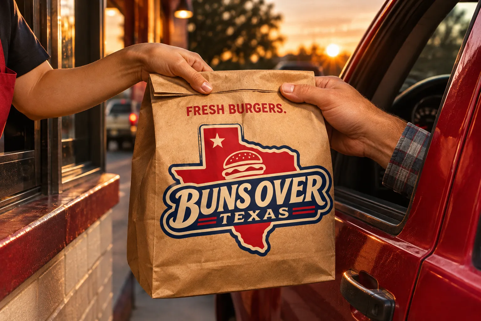
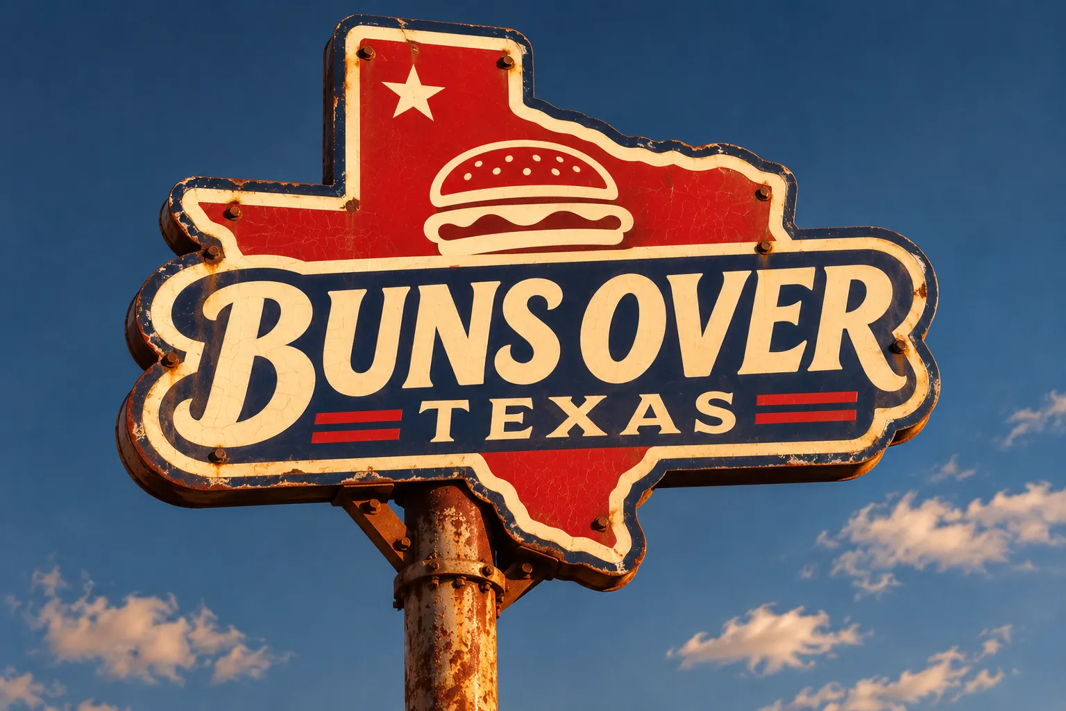
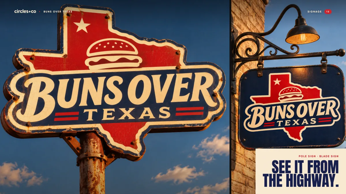
See it from the highway.
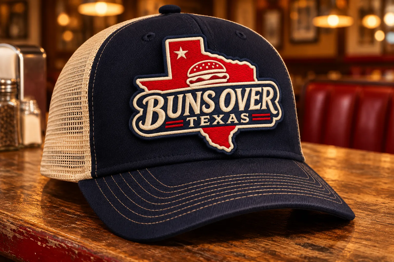
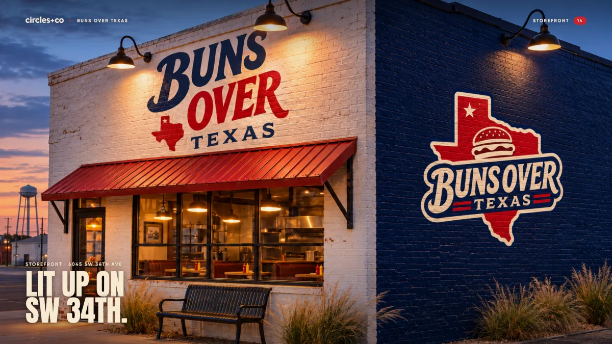
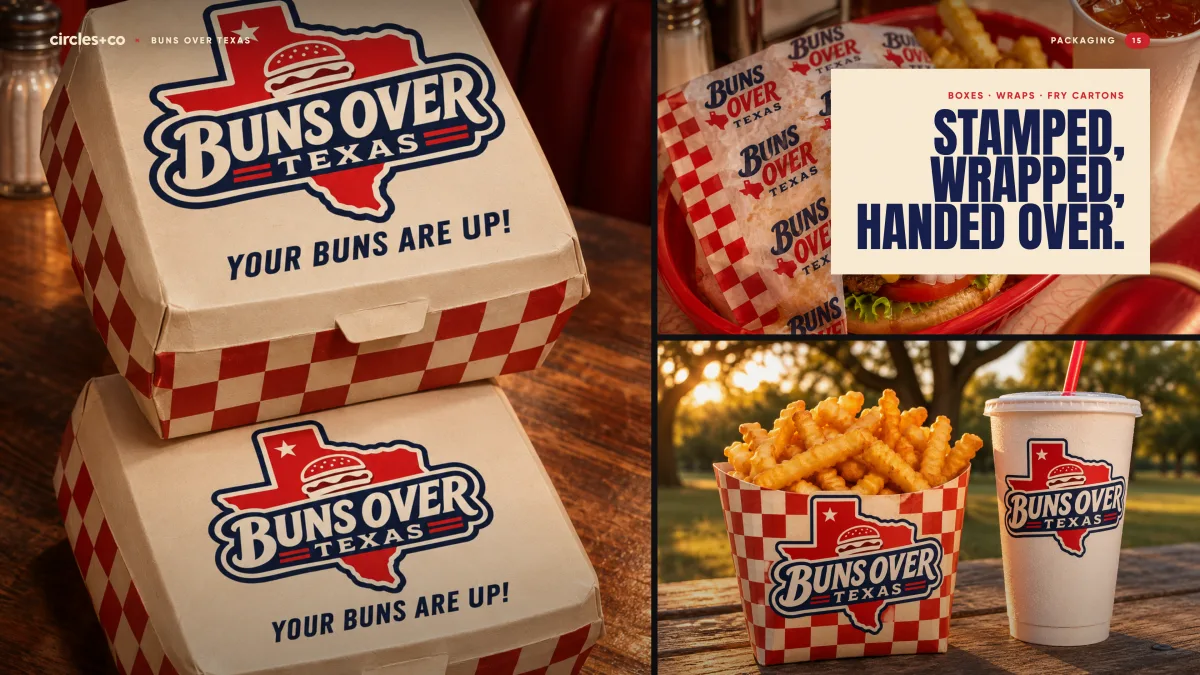
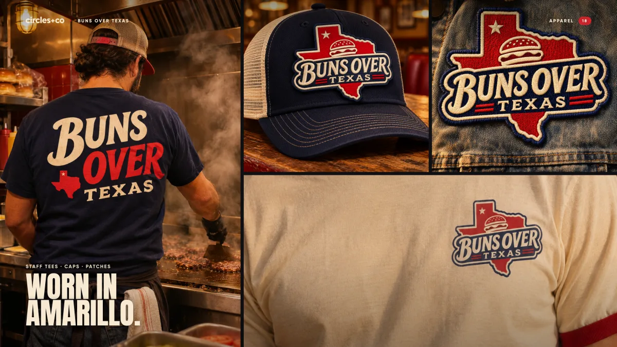
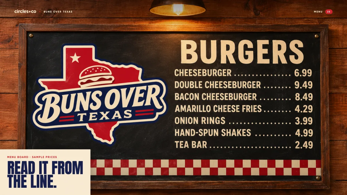
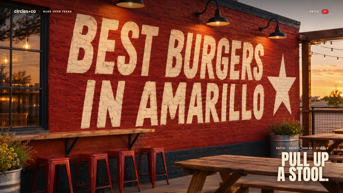
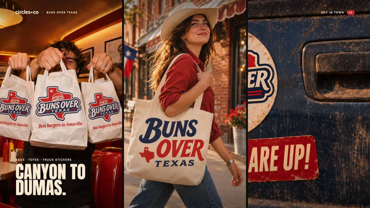
Signs, boxes, wraps, the menu board, tees and walls. Every piece uses the same three moves: the wordmark, the basket check and one big word.
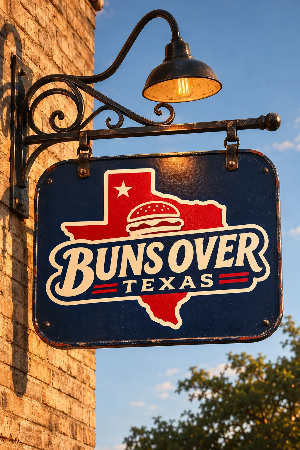
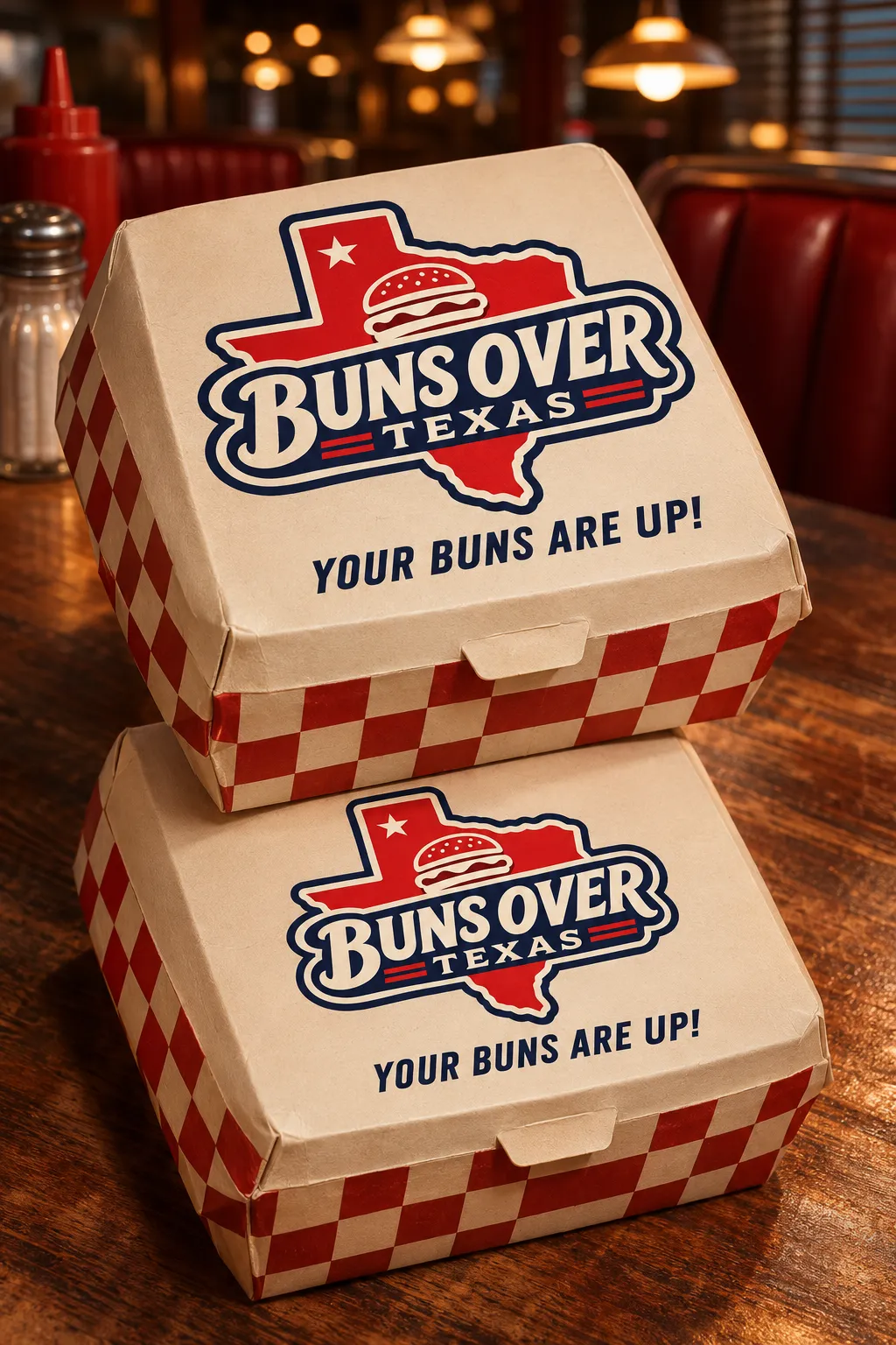
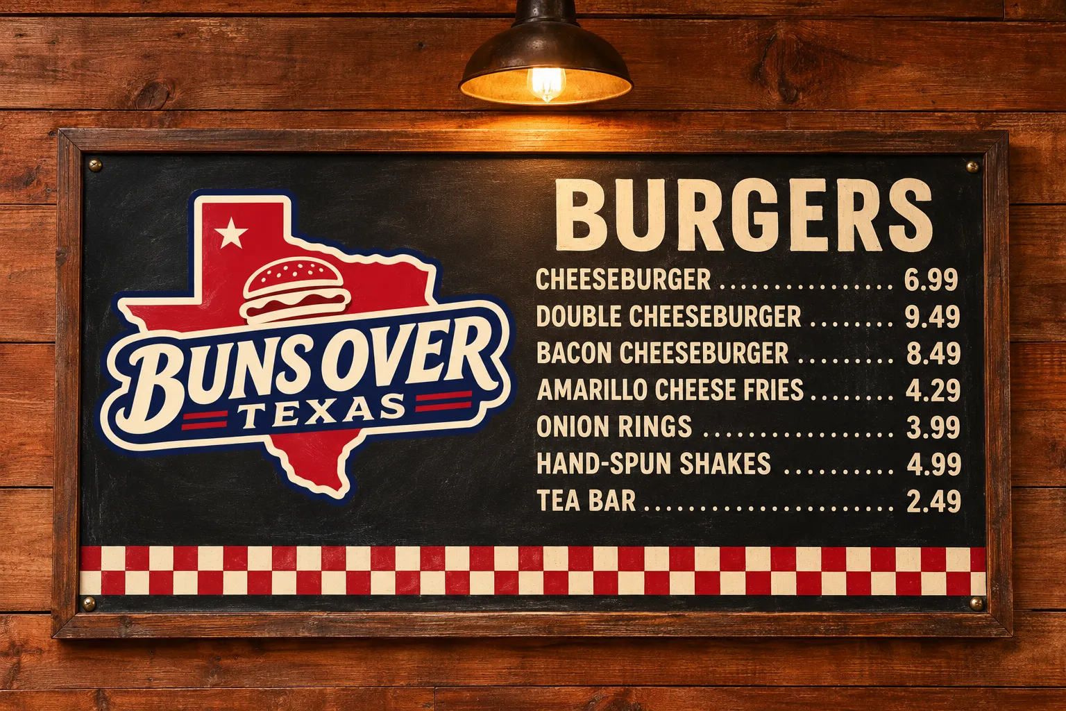
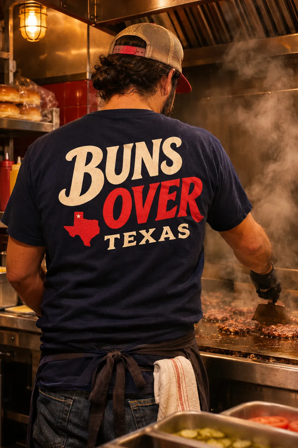
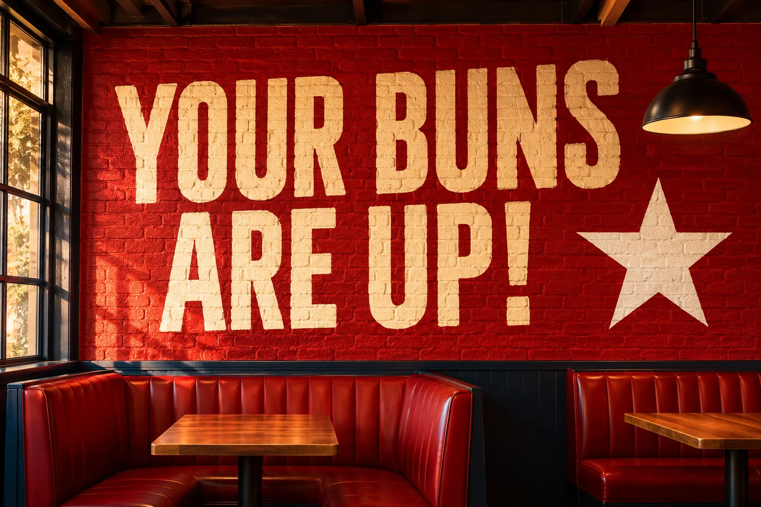
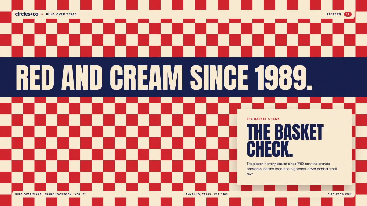
Three papers. One basket.
From the counter to the phone.
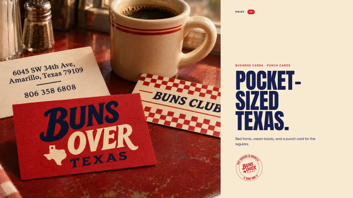
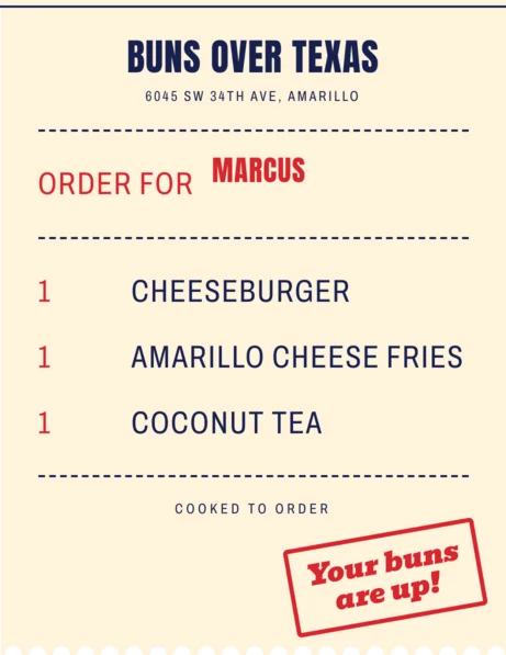
Made-up pieces drawn in the new brand to show how it carries into the small stuff: the pickup ticket, the punch card, a review reply and a catering request.
- 01Order up
The pickup ticket calls your name the way the counter does.
- 02Punch card
Stars on the basket check, one per burger.
- 03A review
Five stars and a reply in the same friendly voice.
- 04Catering
Feeding a crowd in three lines.
- 1Double cheeseburger9.49
- 1Amarillo cheese fries4.29
- 1Large sweet tea2.49
Best burger in Amarillo, hands down. They call your name and it is hot every single time. Get the cheese fries.
See you Monday, Carlos. Bring the kids!
- Date
- Fri, Dec 12
- Pickup
- 11:30 AM
- Order
- 40 burger boxes, 4 trays of fries, tea for 40
Thirty pages, one burger joint.
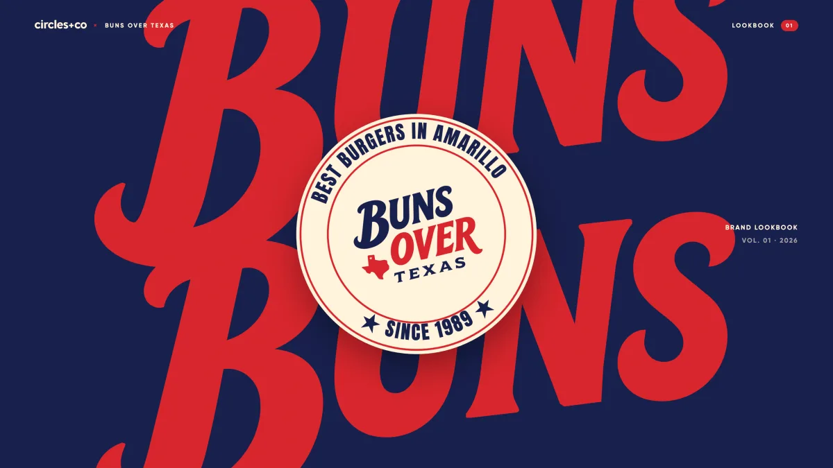
Everything above, written up in a 30-page brand lookbook the team can hand to a sign shop, a printer or a new hire: the logo rules, color, type, photography and every piece in the wild.
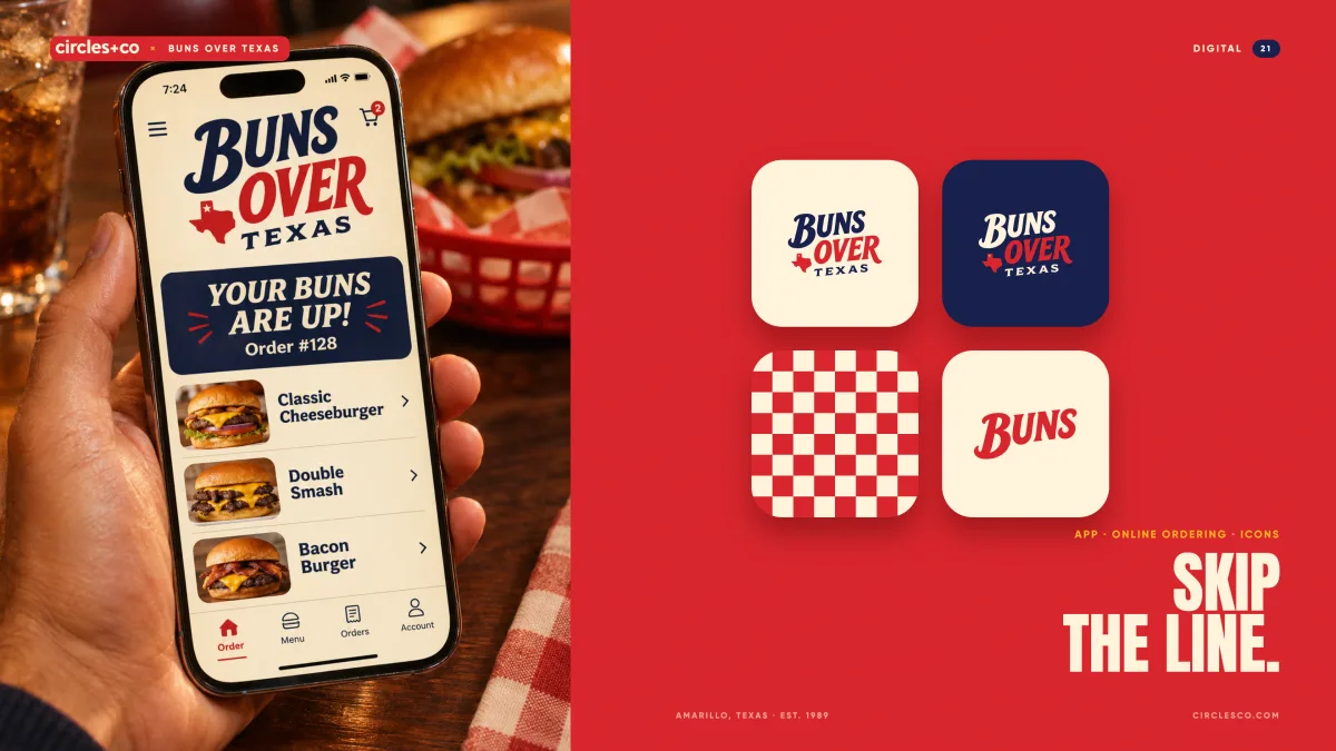

Order from the couch.
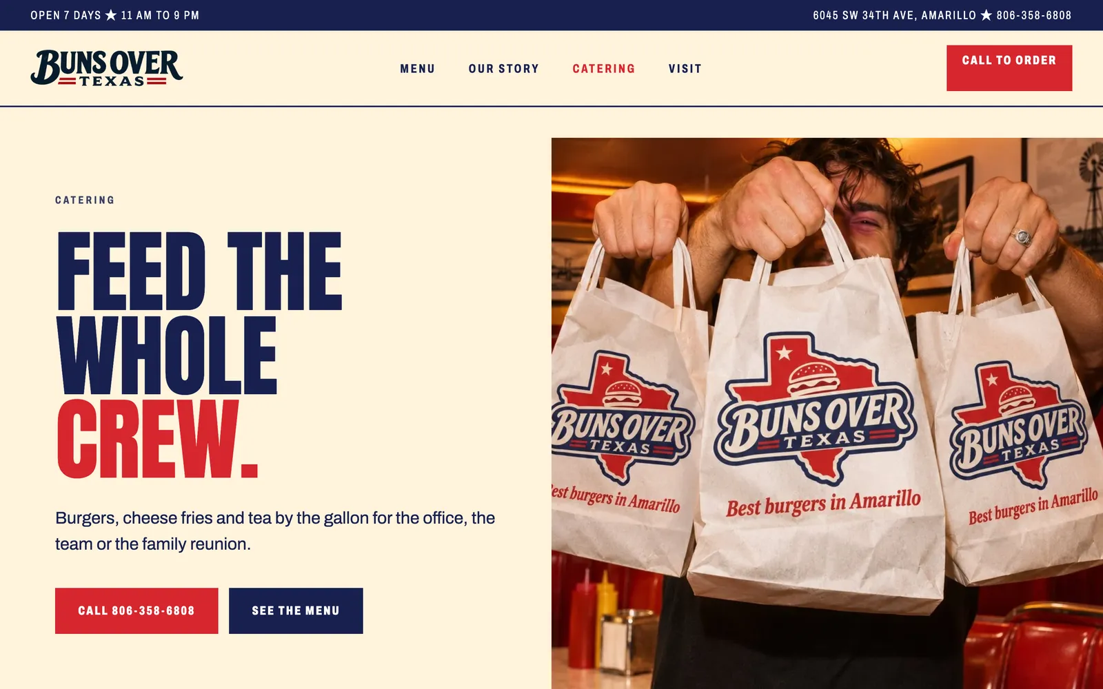
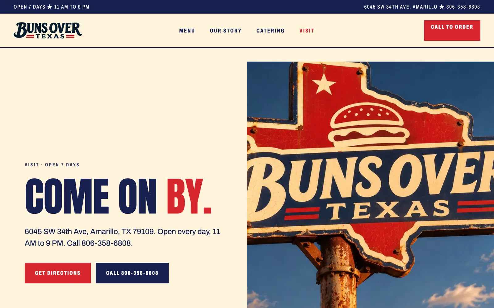
Cream, navy and red, the menu up front and Call to order never out of reach. Five pages on the Circles Framework, a burger that builds itself as you scroll, and a counter ticket that calls your name.
Visit Conceptual Website
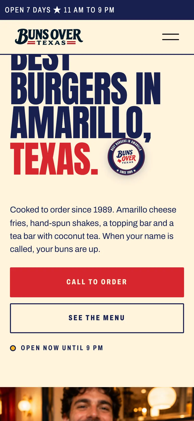
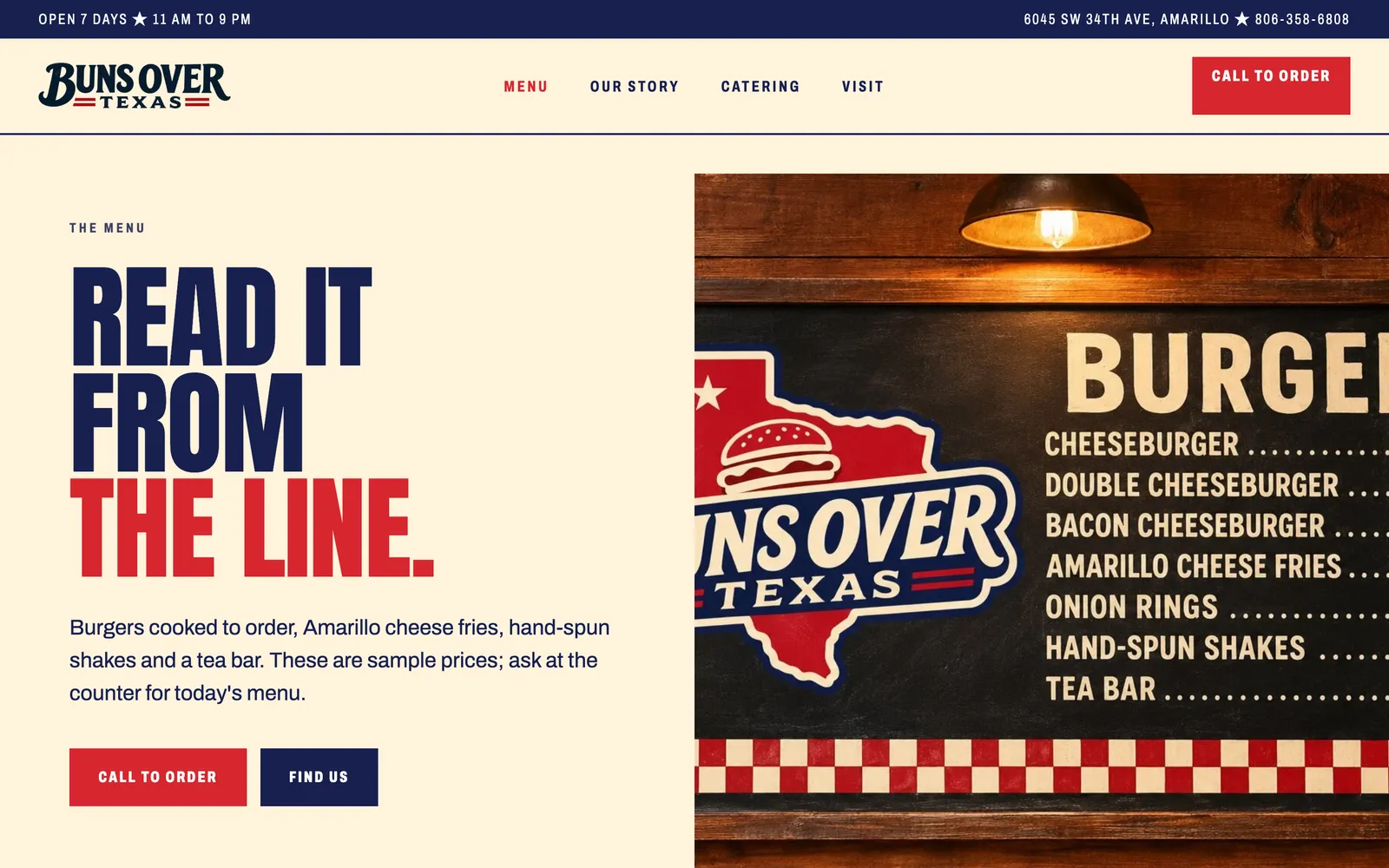
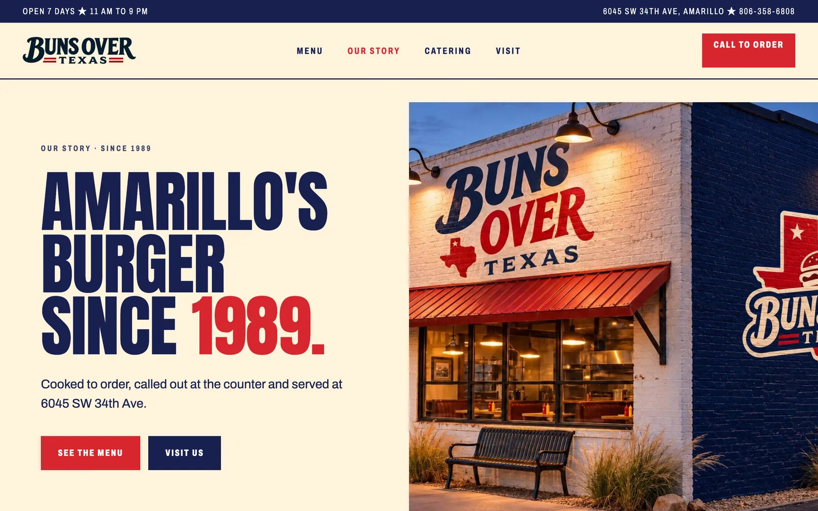
Every page, one thumb away.
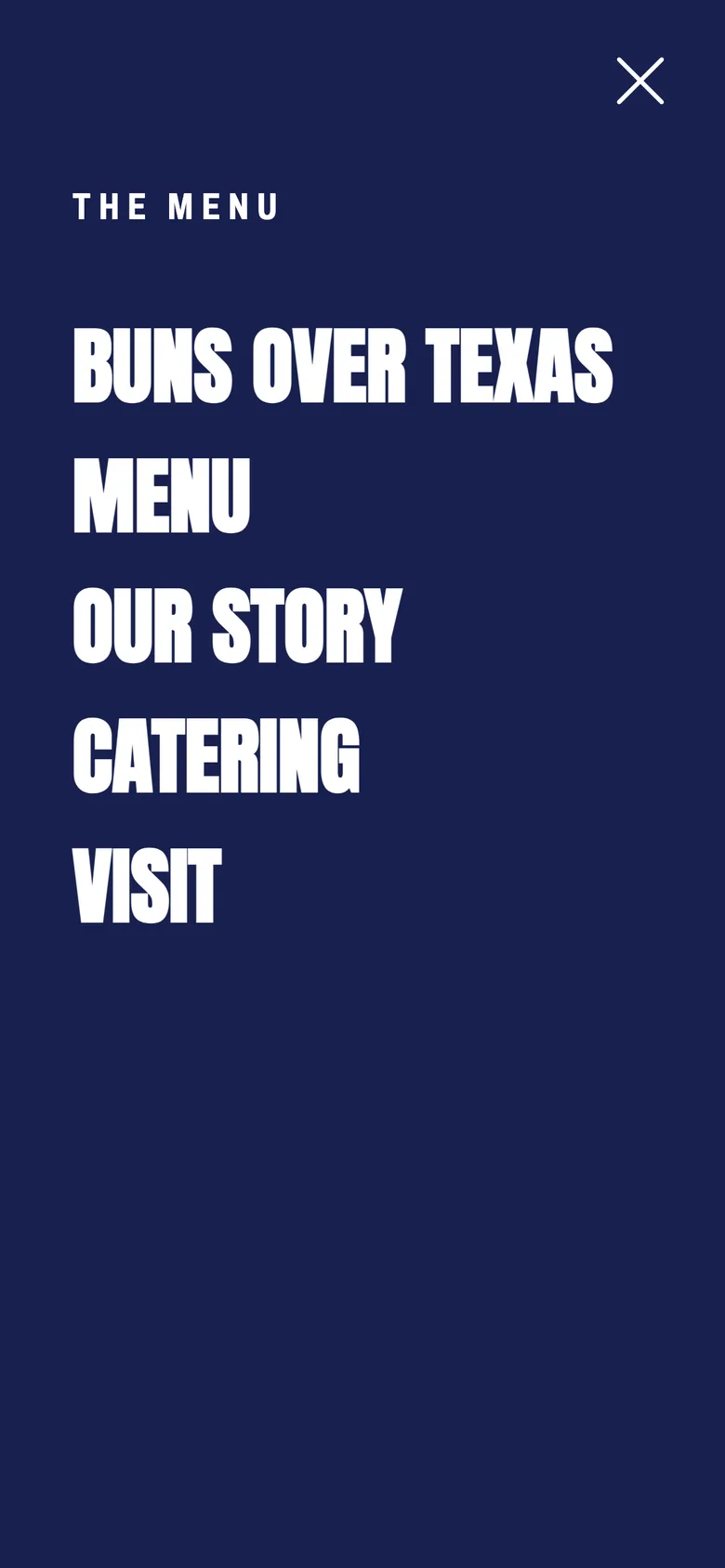
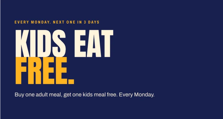
On a phone the menu opens full screen in navy, with Call to order pinned under it. Mondays get their own card, because kids eat free.
circlescosites.com/bunsovertexas
Lubbock Game Changers
Let’s create something amazing together.
From brand identity to design direction, we partner with you to build a creative foundation that feels aligned, professional, and easy to grow with.


Built for the feed.
Big words, real food and the basket check, so every post reads at thumb speed. Kids Eat Free Mondays, the punch card and a new shake each get a look that is unmistakably Buns.
Posts, captions and likes are a mockup.