The
Solution
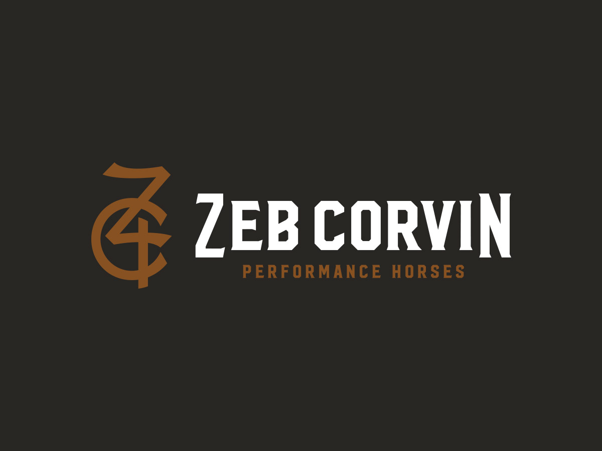
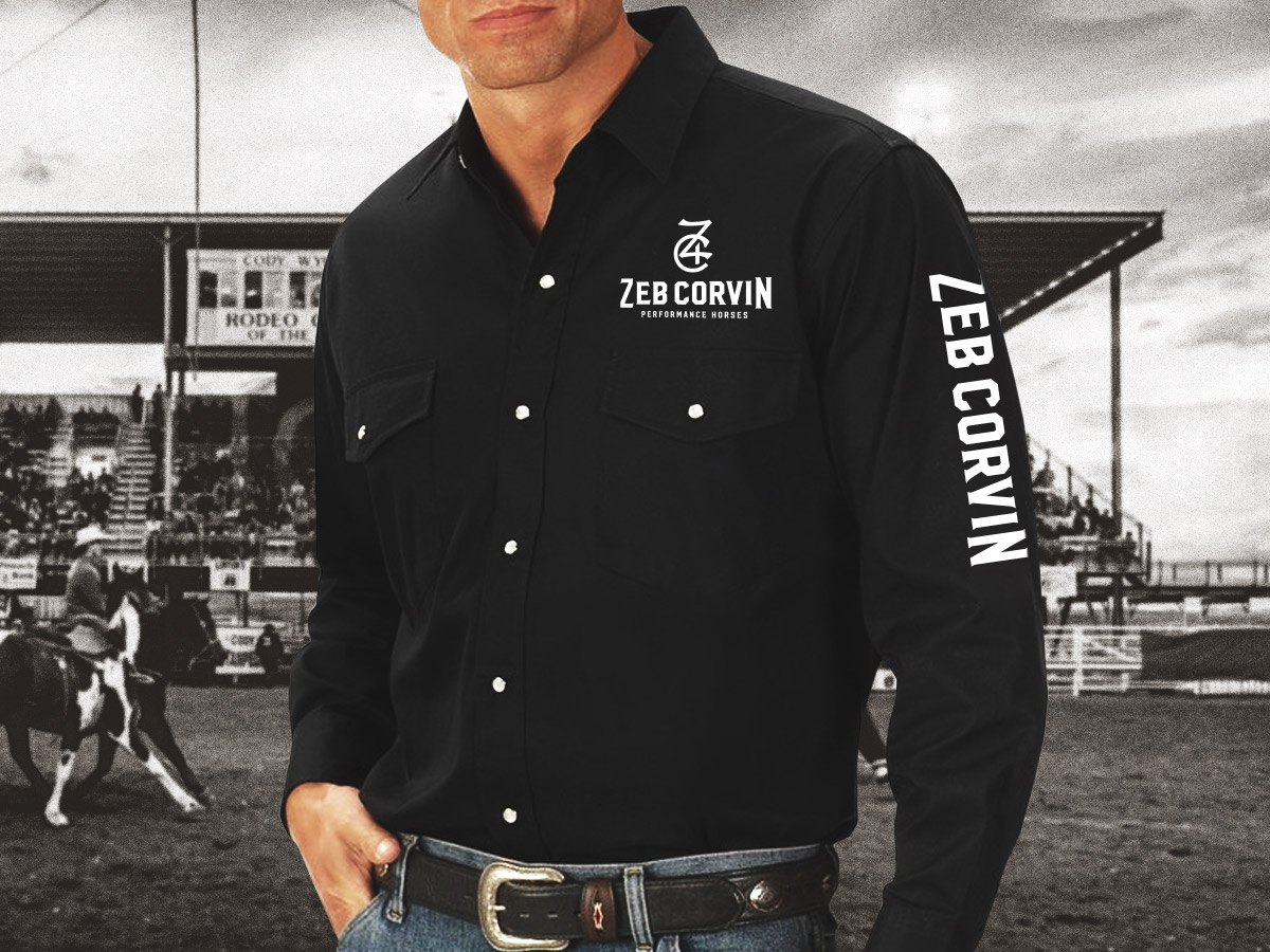
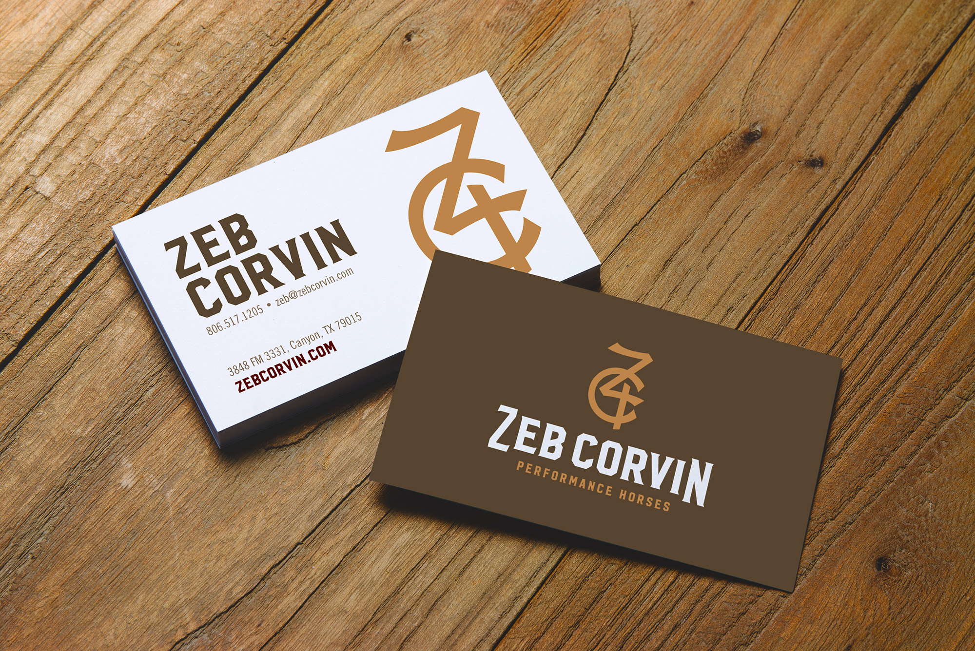
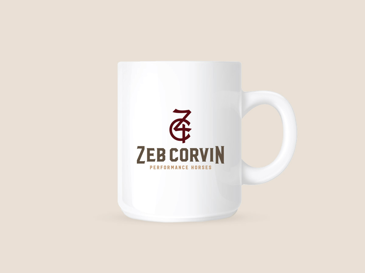
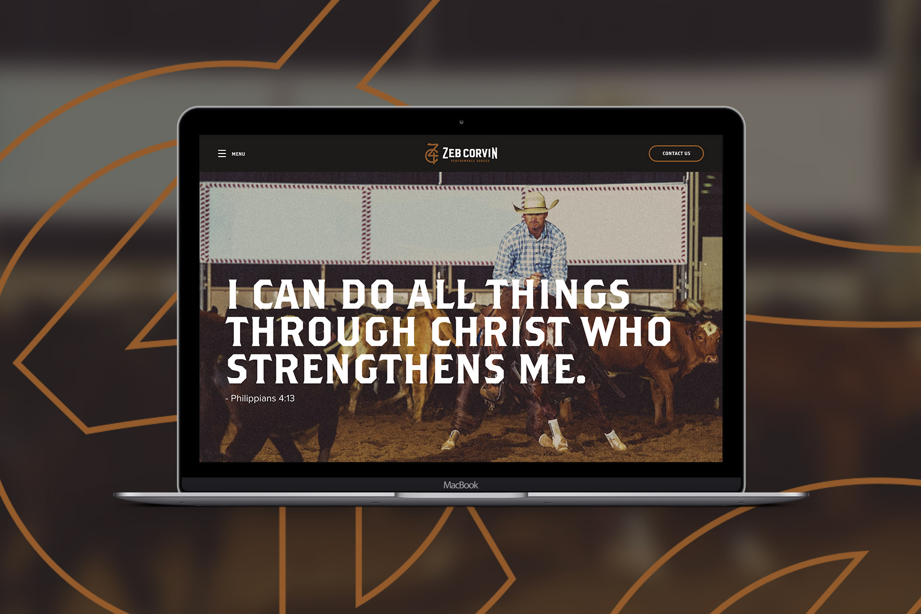
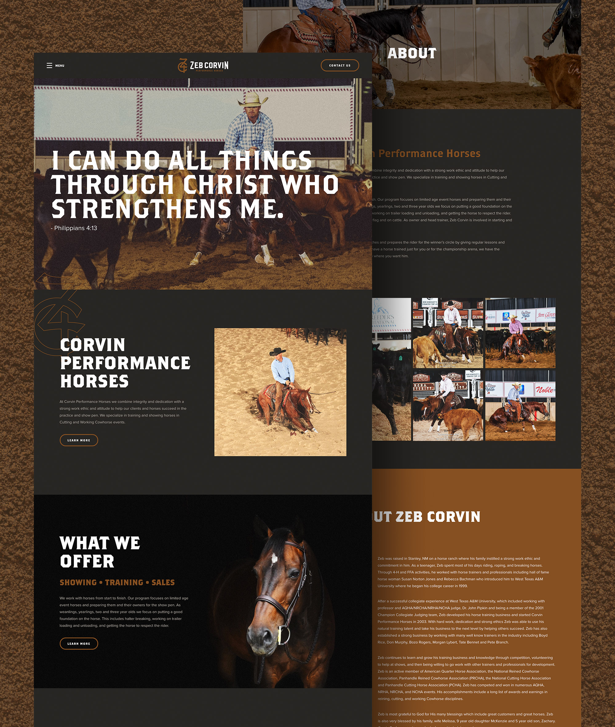
We wanted to honor Zeb’s work ethic through classic, warm design. The homepage highlighted one of his team’s favorite scriptures in a bold typeface. We then wove in action-shots from Zeb’s horse events. When it came to logo design, our job was straightforward: create a bold, authentic logo that stands out from his competitors. Our designer drew inspiration from classic cattle brands to create the look.
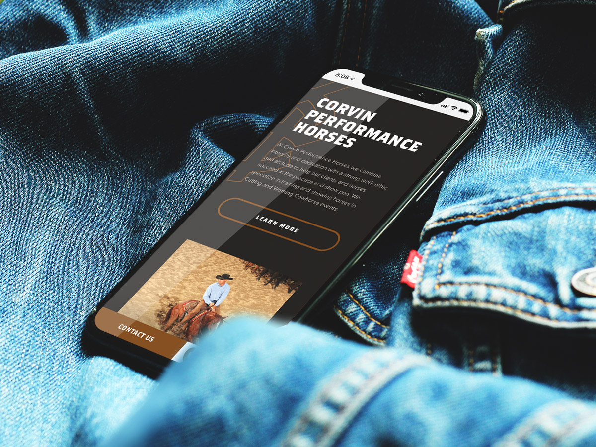
Zeb travels through the country for cutting and working cow horse events, so a mobile-friendly site for visitors to monitor upcoming events was a must. After pairing our user-friendly design with a warm color palette, the finished product is one to rival that of other horse trainers across the globe.
Let's Collaborate
Want to discuss a new project? Chat about design? Get a quote? Compare favorite movies or tv shows? Drop our Circles inbox a line, and let’s get this convo rolling.
