
The
Solution
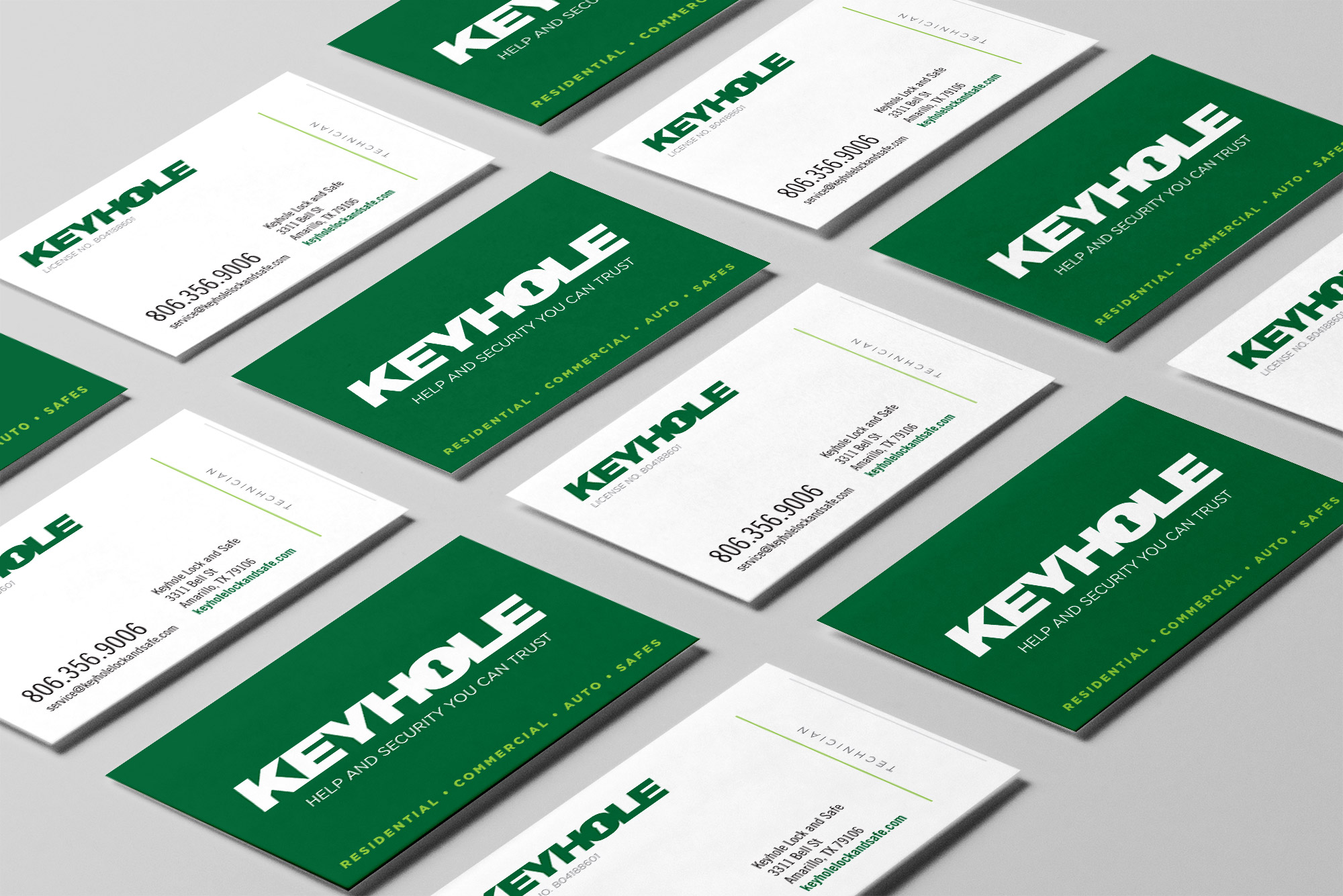
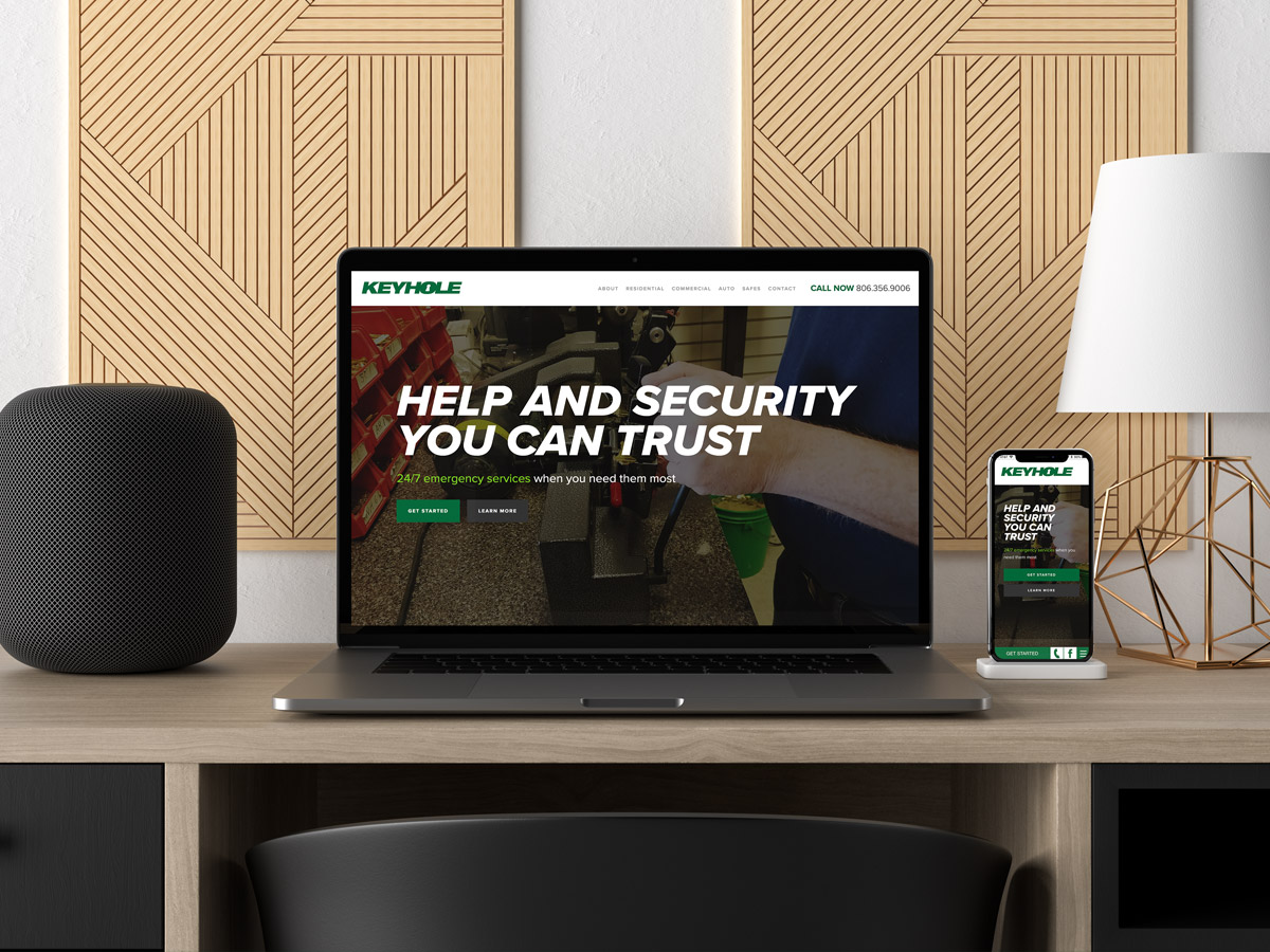
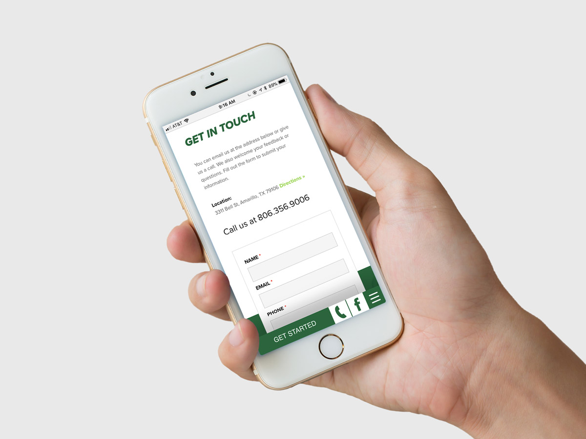
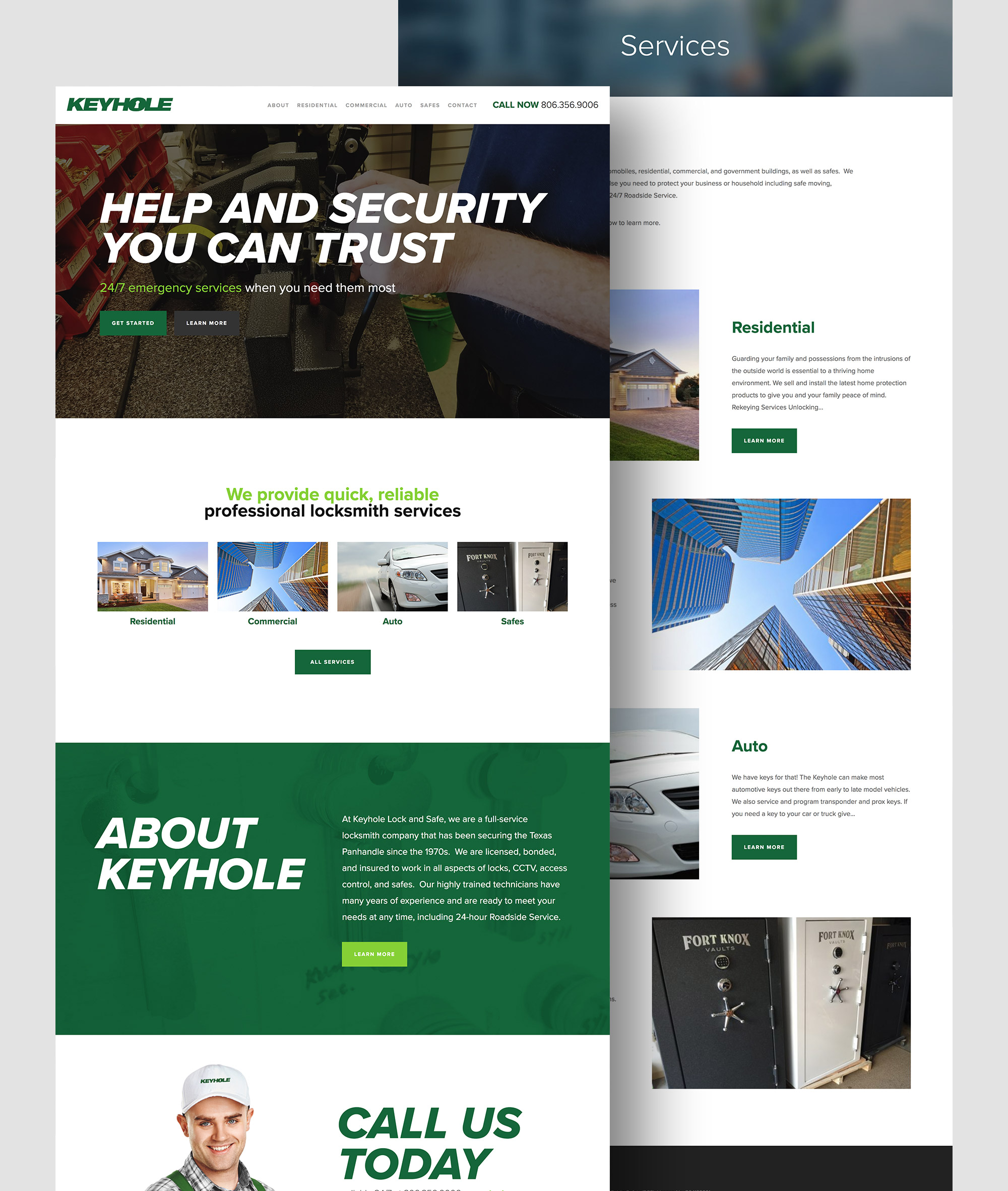
We met with the Keyhole team to discuss their branding and content needs. The information on the Keyhole website was scattered. We redesigned the website from the ground up, organized the content, created a visually cohesive look and a bold logo. We created a mobile-responsive website that reflected their polished new look. The new logo is simple, sleek and versatile.
Let's Collaborate
Want to discuss a new project? Chat about design? Get a quote? Compare favorite movies or tv shows? Drop our Circles inbox a line, and let’s get this convo rolling.
