Search
Studio
The workspace a small organization runs on: people, money, events and the work. We named it, drew the mark and the icons, gave each of its seven Studios a face, designed the marketing site and shot its commercials, then designed and built the web app, the iPhone and Android apps, the client portal and Stations, the check-in kiosk app.
- Client
- Studio, our own product
- Product
- One workspace for small organizations
- Launched
- Founding beta, 2026
- Scope
- Brand, icons, marketing site, commercials, web app, iOS and Android apps, client portal, Stations kiosk app
- Live
- usestudio.app
The task
Studio started as the tool we ran our own agency on and grew into a workspace for agencies, churches, nonprofits and missionaries. It needed a name people remember, a brand that works at sixteen pixels, and one design that holds together across a website, a web app, two phone platforms, a client portal and a kiosk at the door.
What we did
We drew the asterisk and the wordmark, set Instrument Sans and one blue, and drew an icon for every module on one grid. Then we designed and built usestudio.app, the web app, Studio for iPhone and Android, the client portal and Stations, all from one kit of parts.
One product, one look, everywhere.
- 011Mark
An asterisk, eight arms in one point
- 027Studios
Craft, Faith, Cause, Missions, Events, Store, Give
- 0336Modules
People to payments, one record
- 0466Icons
16 in the app, 50 on the site
- 0592Phone screens
Per platform, iOS and Android
- 068Films
A tour and one per Studio
- 0713Tools replaced
The measure we hold it to
- 08400AI tools
Skye and your own AI, same rules
Why we built it
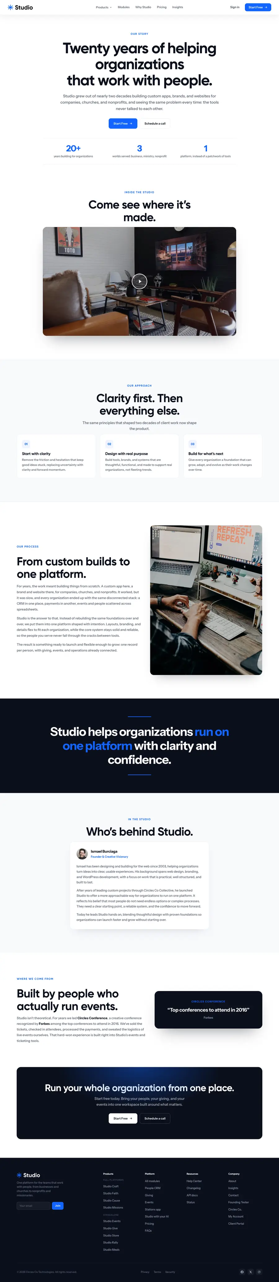
Twenty years of client work kept hitting the same wall.
- The story
- What it replaces
Every client had the same broken stack.
For nearly twenty years we built custom apps, brands and websites for companies, churches and nonprofits. Every one ended up with a CRM in one place, payments in another, and events and people in spreadsheets. We ran our own agency the same way. Studio is the foundation we kept rebuilding, built once, for everyone.
BasecampAsanaHoneyBookDubsado
Your clients don't live in six different tools.
Planning CenterPushpayTithelyChurchTracBrushfire
Ministry happens between the systems.
BloomerangDonorPerfectGivebutter
Your donor and your volunteer are the same person.
MPDXTntConnect
Support raising is a relationship, not a mailing list.
EventbriteBrushfireTito
The attendee list is the beginning, not the deliverable.
ShopifyGumroadBig Cartel
Your customers are people, not order numbers.
GivebutterDonorBoxGivelifyBrushfire
Giving should not cost your donors a tip.
- 01Clarity first
Take out the friction that keeps good ideas stuck. One clear next step on every screen.
- 02Built with purpose
Tools for real organizations, not trends. If a feature does not save someone an afternoon, it waits.
- 03Made to grow
A foundation that bends with the work. Turn a module on and it already knows your people.
Branding
A mark, an opener, one blue, a full icon set and seven Studios.
- The logo
- The opener
- Color
- Icons
- The seven Studios
A blue asterisk for a product that joins things.
Studio pulls people, money, events and work into one place, so the mark is eight arms meeting in one point. It reads at 16 pixels in a browser tab and at 200 on a billboard. Each product gets its own icon in its own color, set before Studio and its name, so Studio Faith and Studio Craft are clearly one family.
- Studio CraftFor businesses
- Studio FaithFor churches
- Studio CauseFor nonprofits
- Studio MissionsFor missionaries
- Studio EventsFor event organizers
- Studio StoreFor shops and makers
- Studio GiveFor online giving
The mark turns, the name slides out.
Every Atlas training video and every commercial starts here: the asterisk turns in on a night-to-blue field and the word Studio slides out from behind it. This is the real animation in code, not a video. Press replay.
One blue. A night mode.
Studio blue on a cool canvas by day, and a real dark mode for the people who live in the dashboard all day. Status colors stay quiet and only show up when something needs you.
One product, seven front doors.
Each kind of organization gets its own Studio with its own icon, color and photography, and the same app underneath. The icons come from the module set, the color carries into its page, its film and the app, and the photos show the real kinds of organizations it is for.

 Marketing and design agency
 Software and web shop
 Consultant or coach
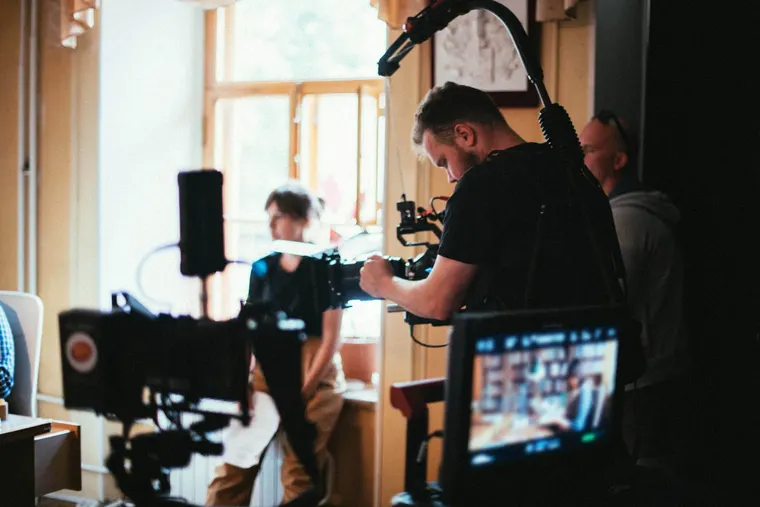 Photo and video production
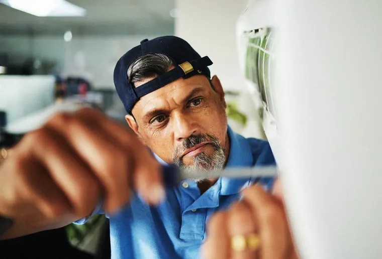 Contractor or trade
 Real estate and property
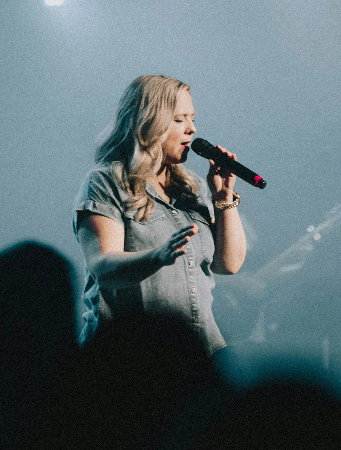
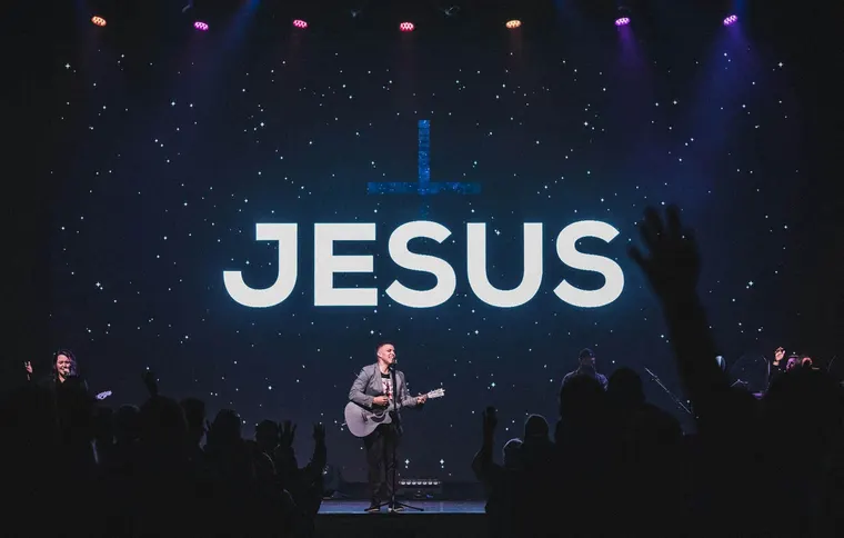 Local church
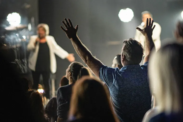 Multisite church
 Church plant
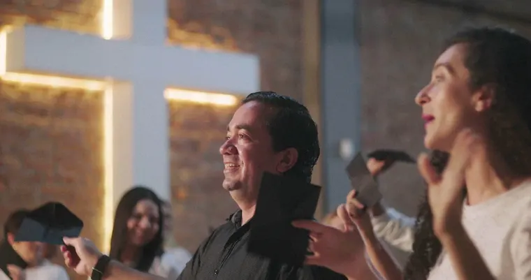 Spanish speaking congregation
 Youth and student ministry
 Camp or retreat center

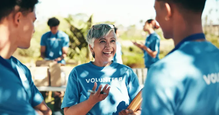 Faith-based nonprofit
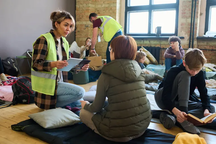 Homeless shelter or housing
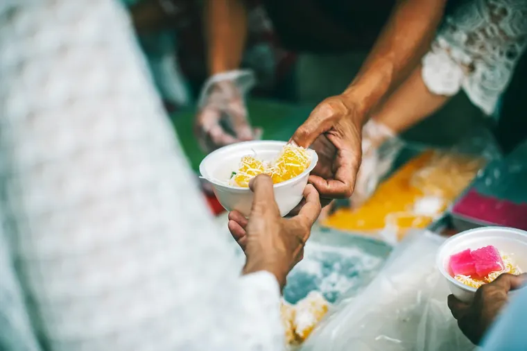 Food bank or pantry
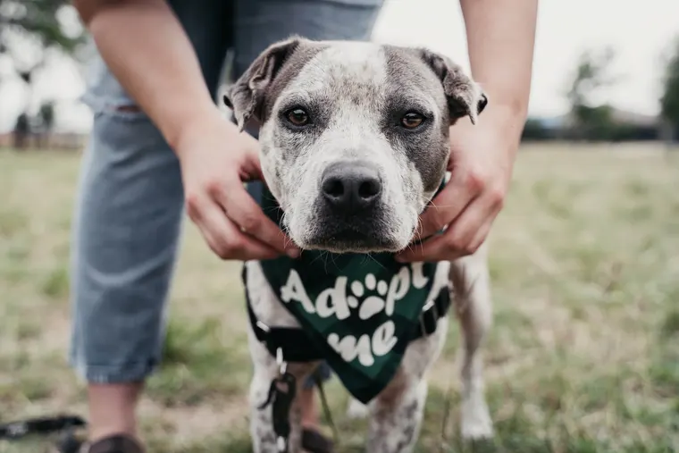 Animal rescue
 Youth or mentoring program
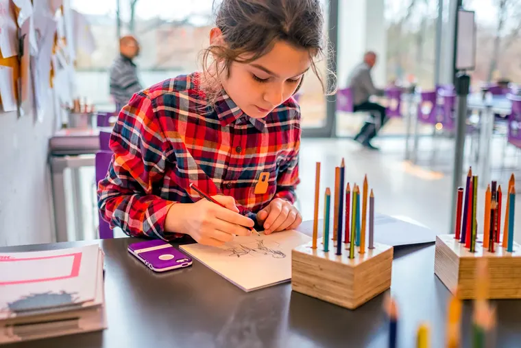 Arts or cultural nonprofit
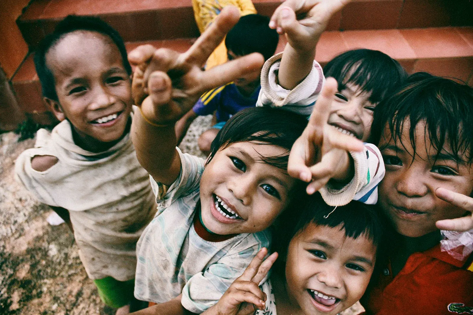
 Raising support
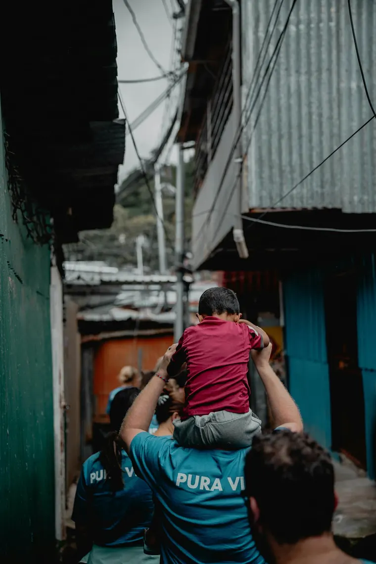 Missionary family on the field
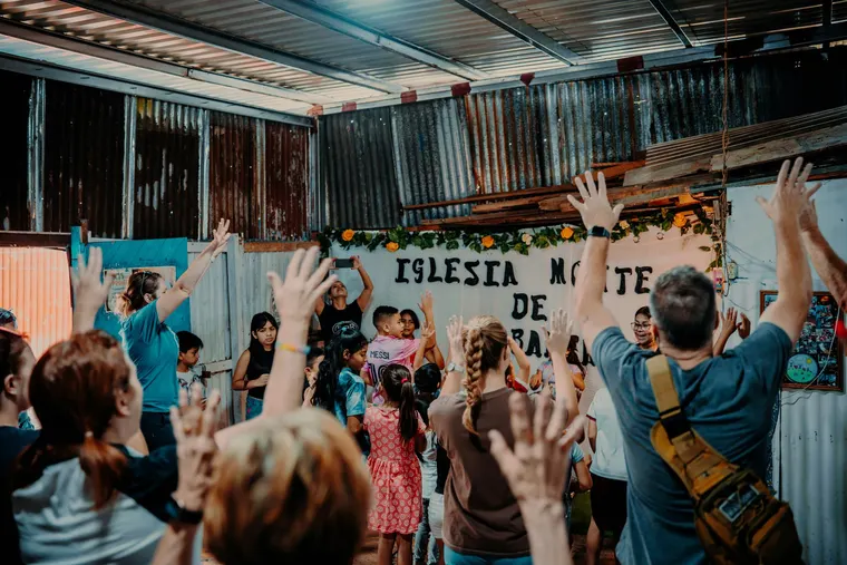 Church planter
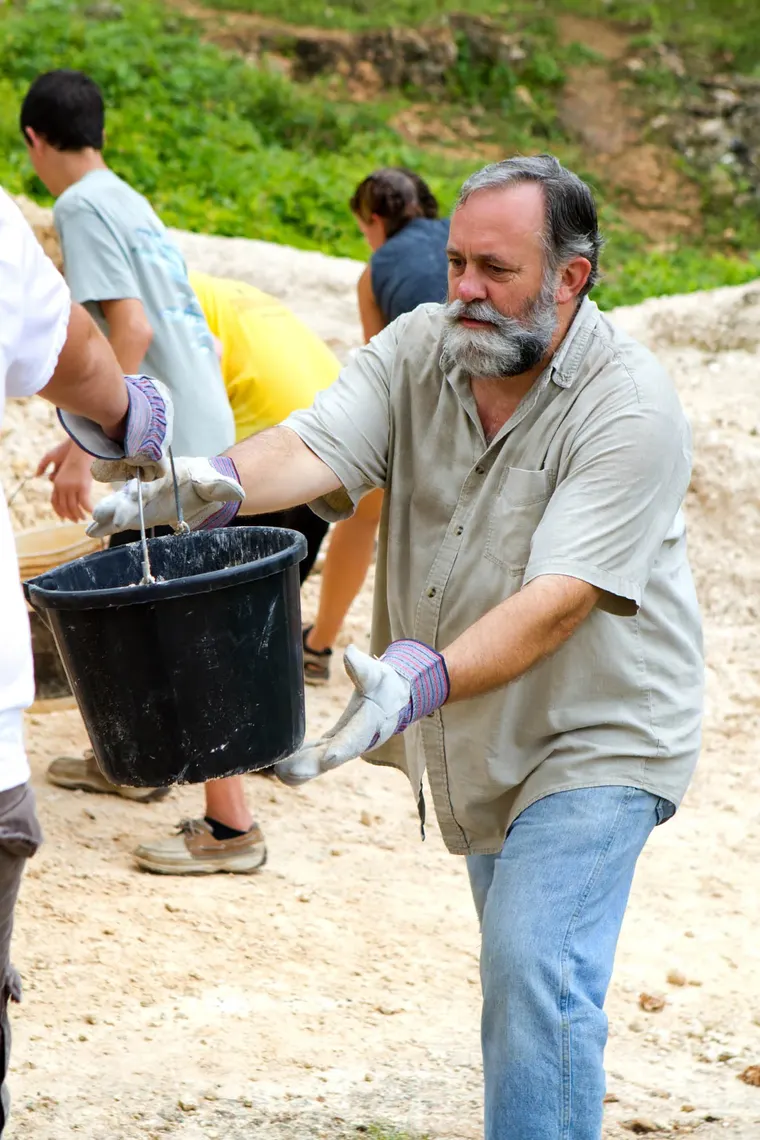 Sending agency
 Short-term trip
 Sponsorship program
 Conference or summit
 Workshop or class series
 Camp or retreat
 Fundraiser or gala
 Festival or community event
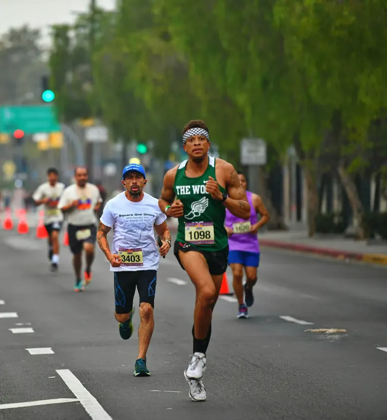 Race or tournament

 Online shop or maker
 Boutique or clothing brand
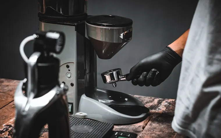 Coffee roaster or food maker
 Specialty shop
 Plant, home or gift shop
 Creator selling downloads
 Small church
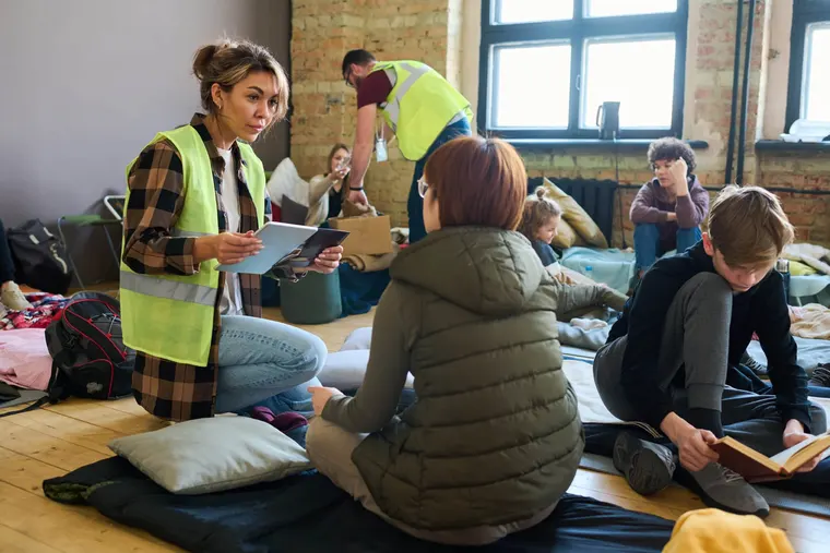 Small nonprofit
 School or PTA
 Sports league or club
 Association collecting dues
 Keep your current system
Marketing
The site that sells it, a page per Studio, and eight films.
- usestudio.app
- A page per Studio
- Commercials
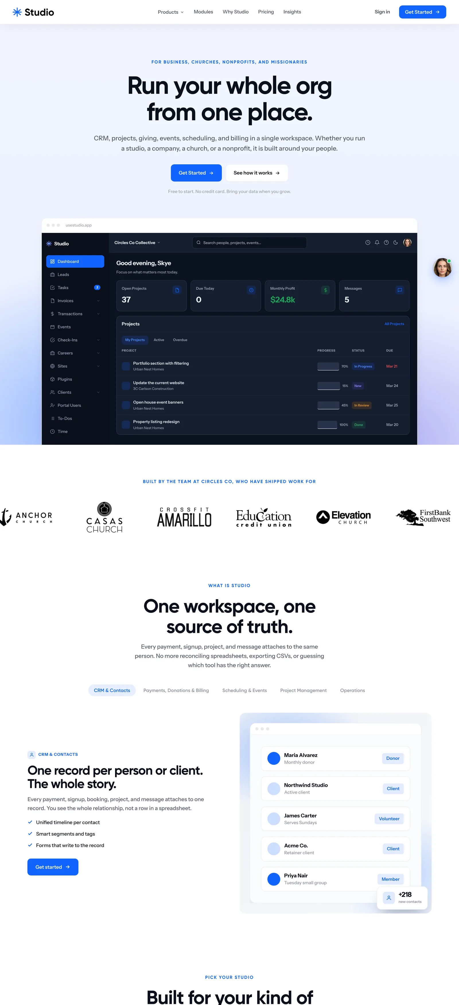
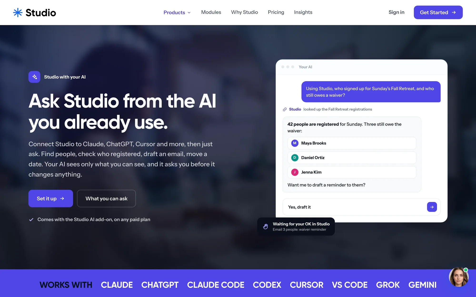
usestudio.app sells it in one line.
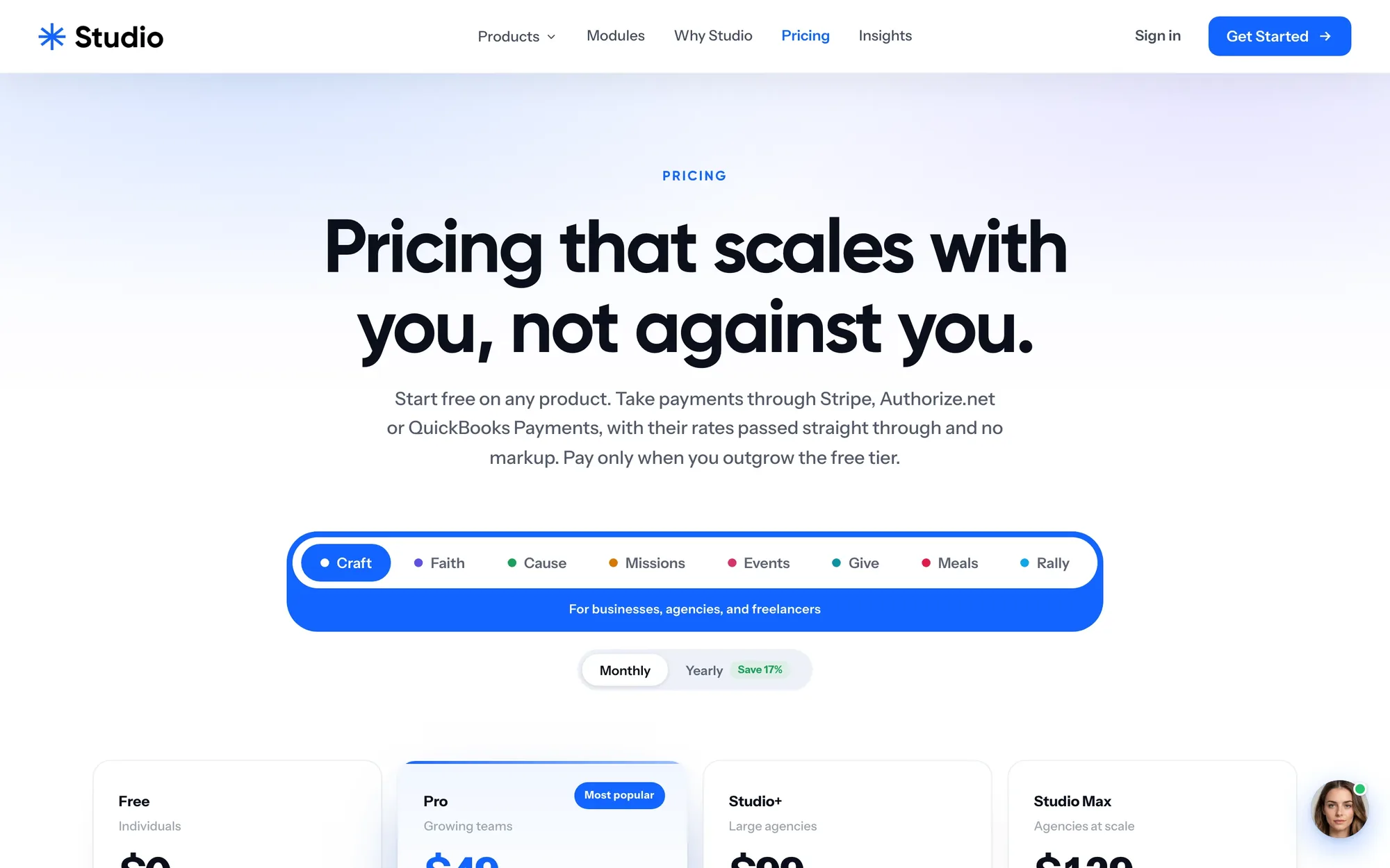
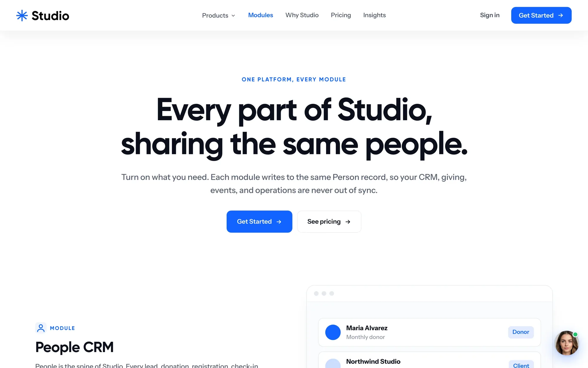
The brand starts before sign-up. One promise up top, the modules sharing the same people, pricing that shows the fees, the AI page and the insights. Skye answers questions in the corner and books the call.

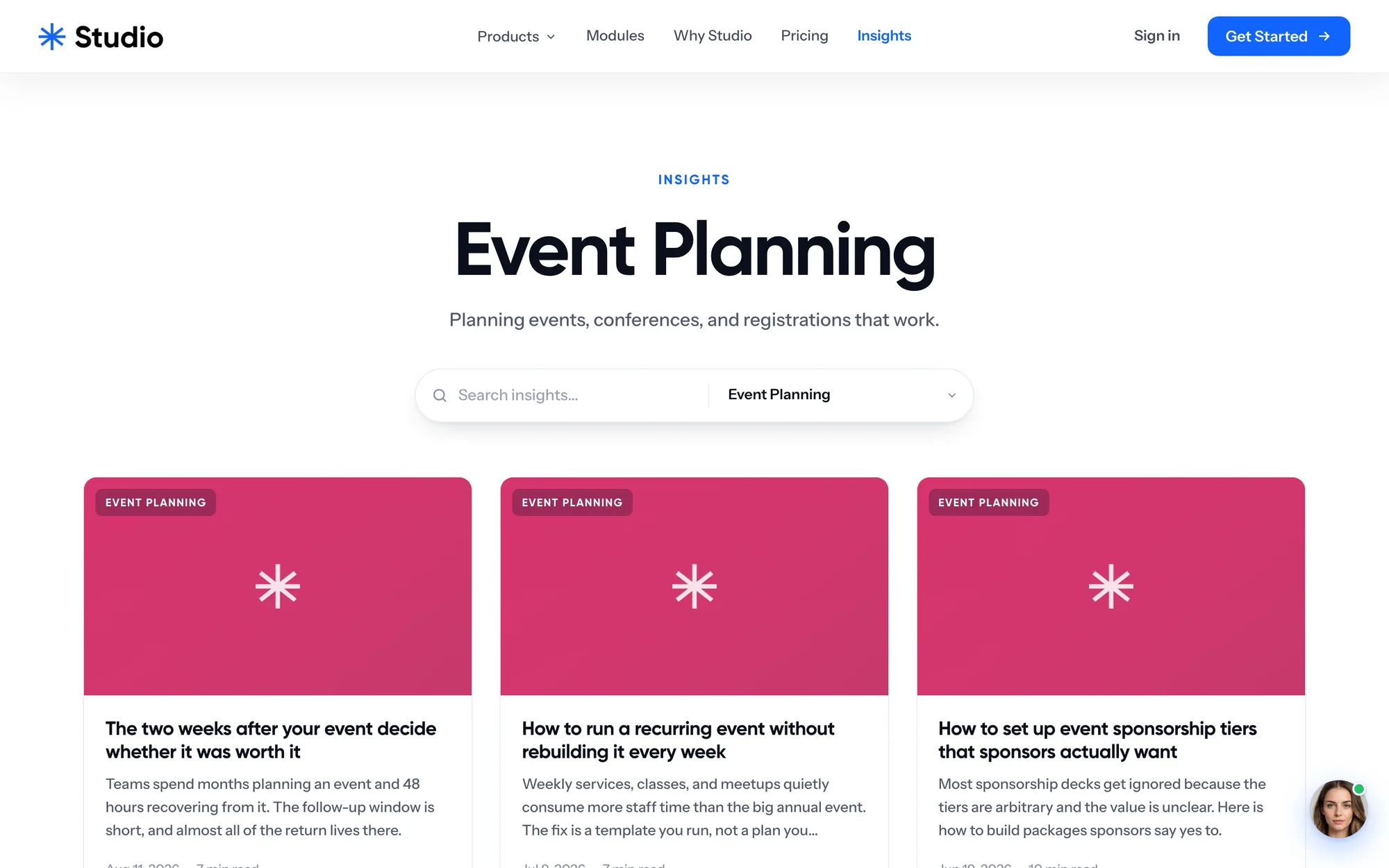
Nine pages, one system.
Every Studio has its own page: its promise, the tools it replaces, its film, the kinds of organizations it serves and every module it includes, in its own color. Same parts, different story. Stations and the About page round it out.







Ninety seconds, then one for each Studio.
We wrote, voiced and cut eight films for usestudio.app: a ninety-second tour, then a short spot for each Studio in its own color. They play on the homepage, on each Studio's page, and as share links. Tap one to watch it here.
The app
One app on the web, iPhone and Android: builders, a store, events and a portal for clients.
- The web app
- Inside the app
- iPhone and Android
- The client portal
- The kit
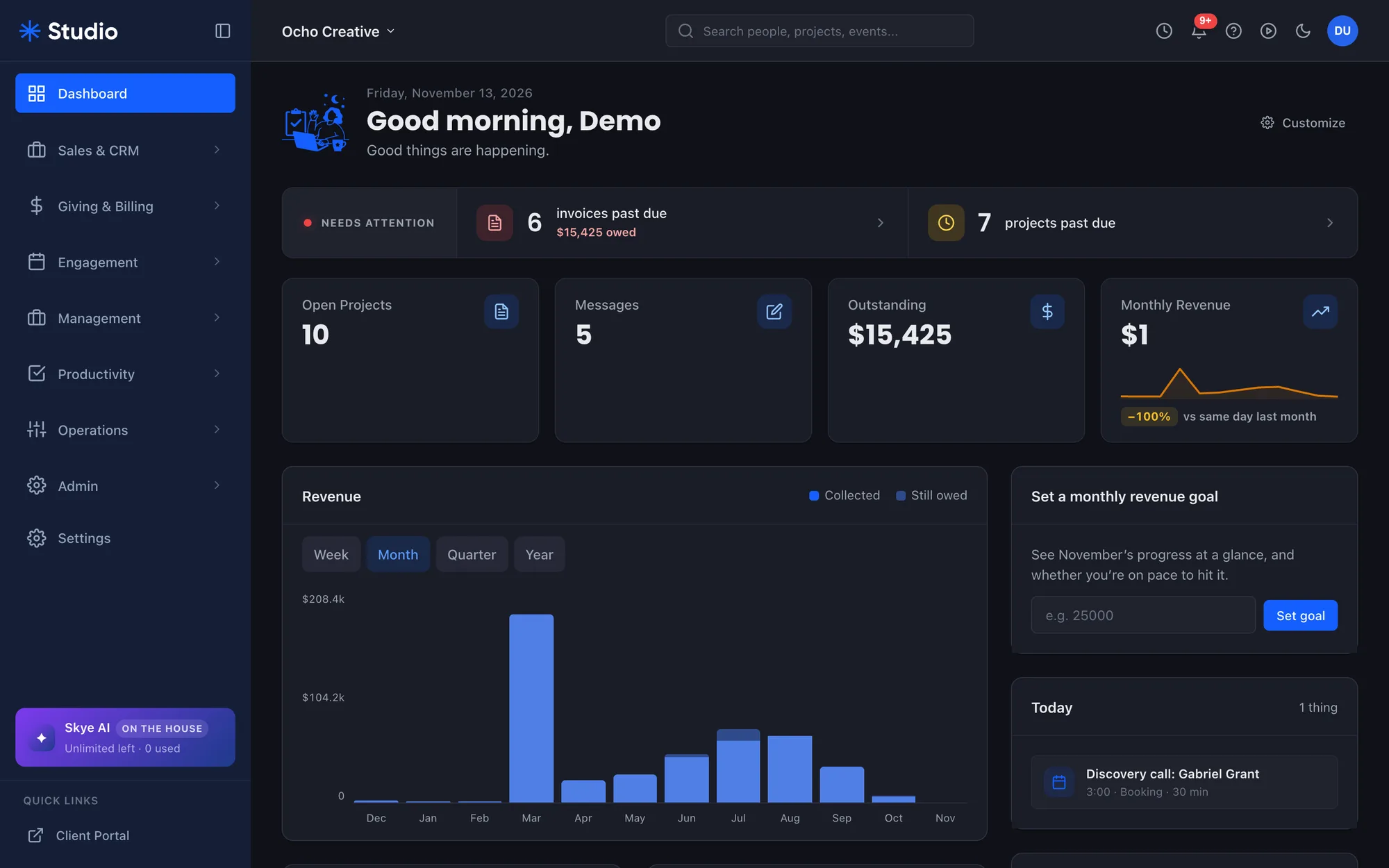
The whole org on one screen.
The real dashboard at my.usestudio.app: what is due, what came in and what needs you, with every module one click away in the sidebar. The pieces around it are made up to show the moments it is built for.
- 01One person, one record
Giving, events, projects and invoices attach to the same people. Turning on a module never makes a second list.
- 02Editions, not plans
A church sees Members and Gifts, an agency sees Clients and Invoices. Same app, different words.
- 03Light and dark
The whole app in both, picked by the browser or by hand, down to the charts.
- 04Search from anywhere
People, projects and events in one box, a keystroke away on every page.
Four tools most teams pay for separately.
A website builder, an email builder, a store and event management with microsites, all inside the same app and all working from the same people. These are real screens from Studio's demo workspaces.
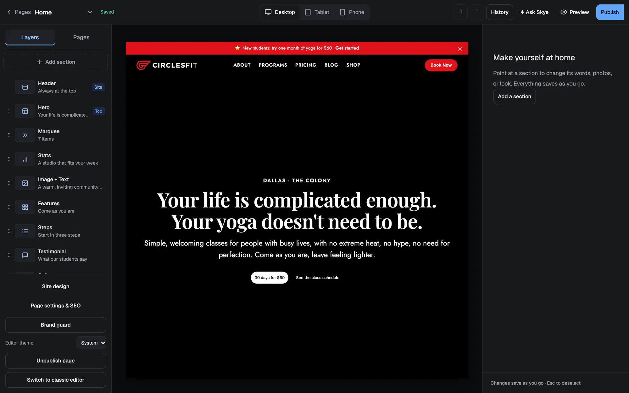
Build the site where the work happens.
Pick a template, then click any section to change its words, photos or look. Desktop, tablet and phone previews, history, and Skye on hand to write a section for you. Forms, giving, events and the store drop in as blocks that already know your data.
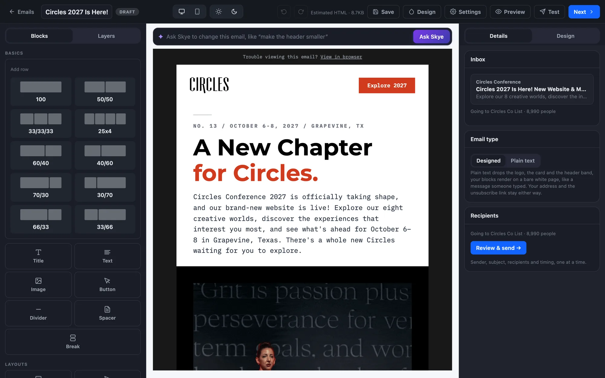
Write it, send it, see who opened it.
Drag in rows, images and buttons, or ask Skye to change the email in plain words. This is the Circles 2027 launch email we built in it: it went to 8,990 people and 6,716 opened it.
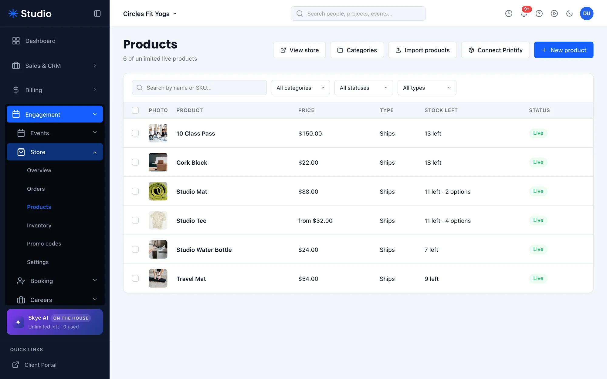
A real shop on your own site.
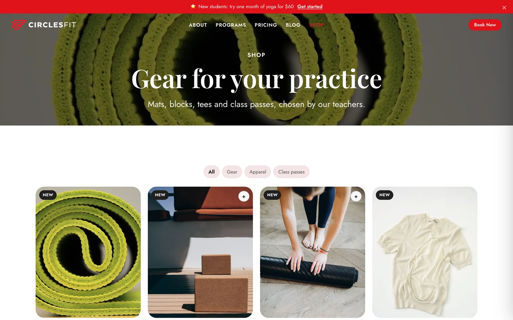
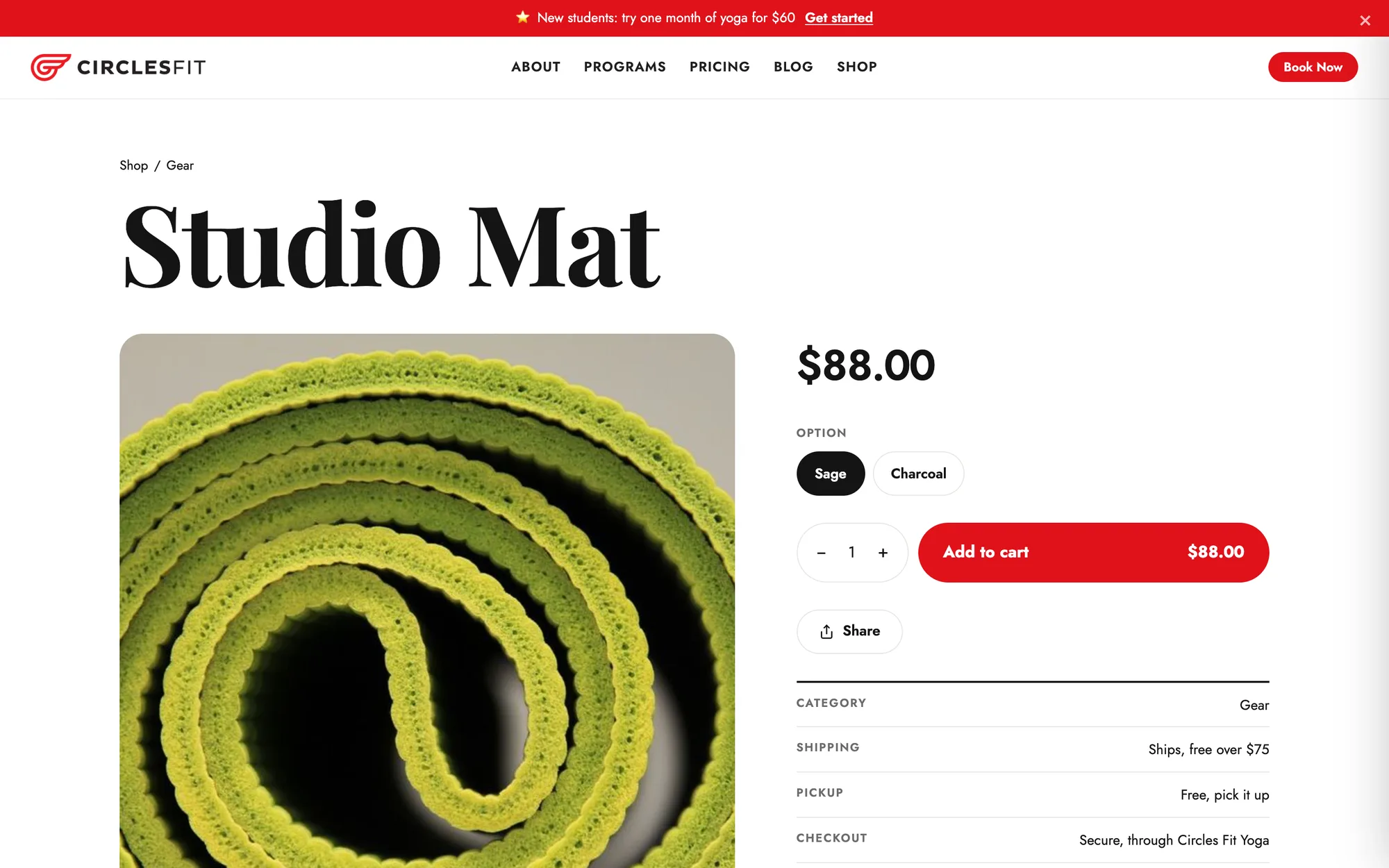
Products with options and stock, orders to ship or hand over at pickup, and a storefront that lives on the organization's own domain. This is the Circles Fit Yoga demo store: mats, blocks, tees and class passes.
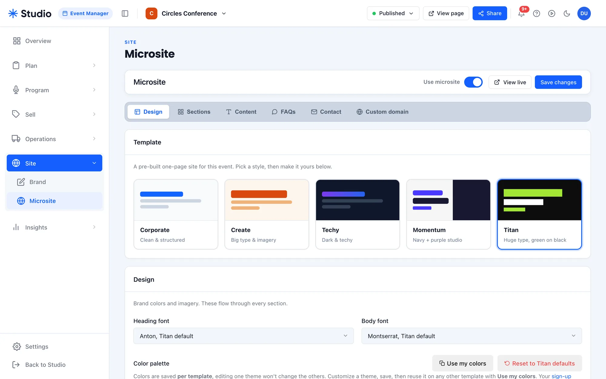
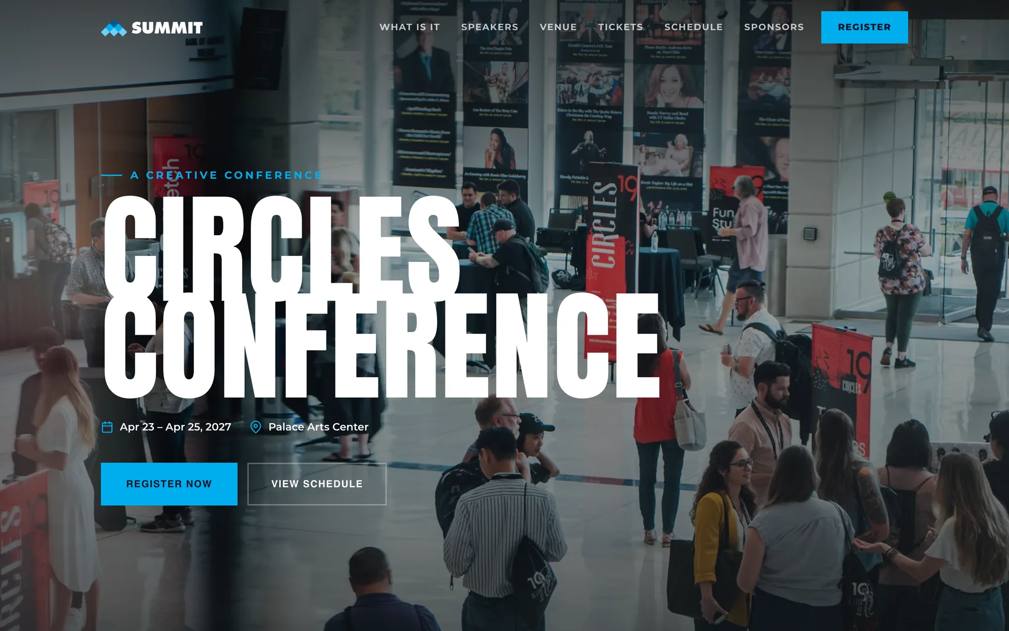
Plan it, sell it, give it a site.
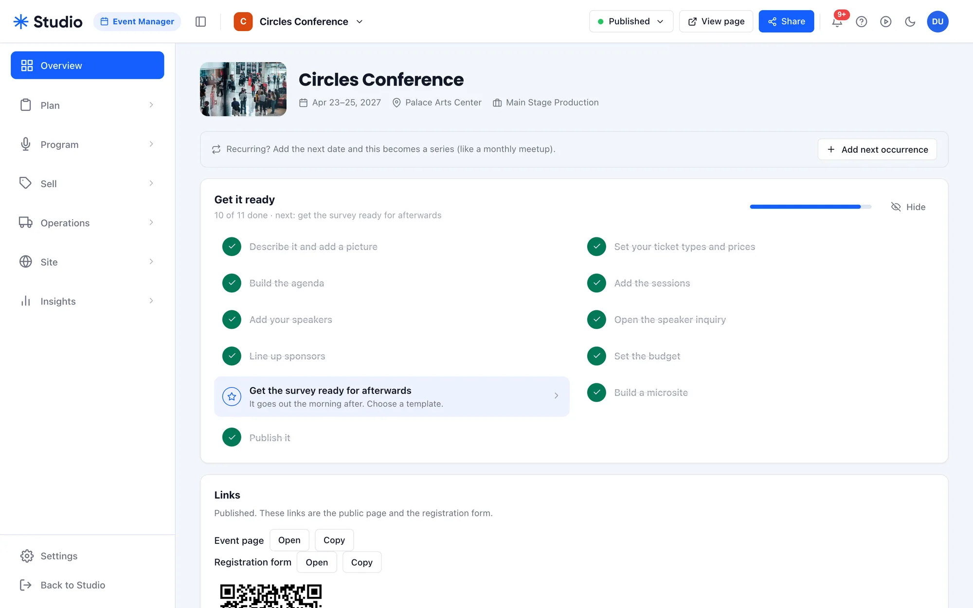
Each event gets its own workspace: a checklist to launch, the program, speakers, sponsors, tickets and budget. One switch turns on a microsite from five templates, in the event's own fonts and colors, on its own domain if you want one.
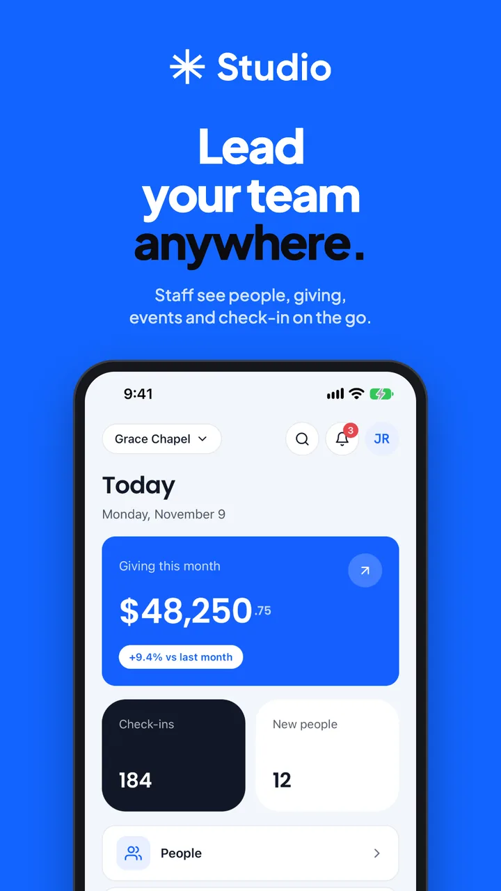
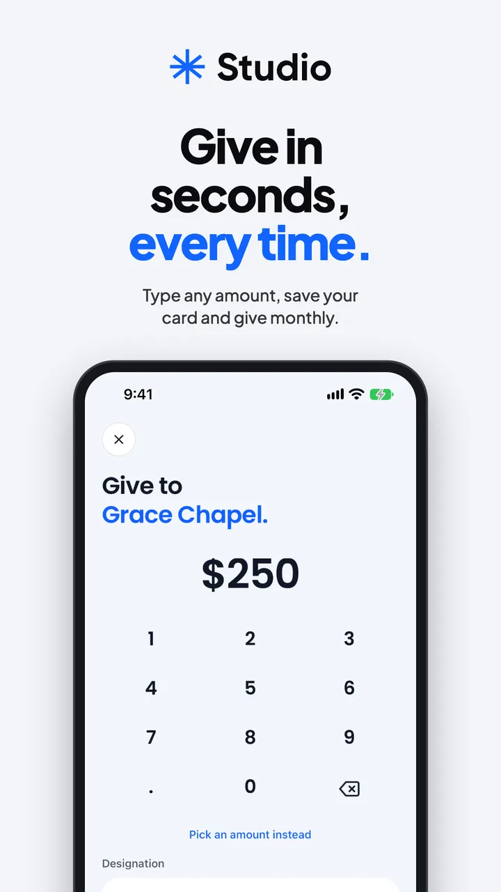
The same app in every pocket.
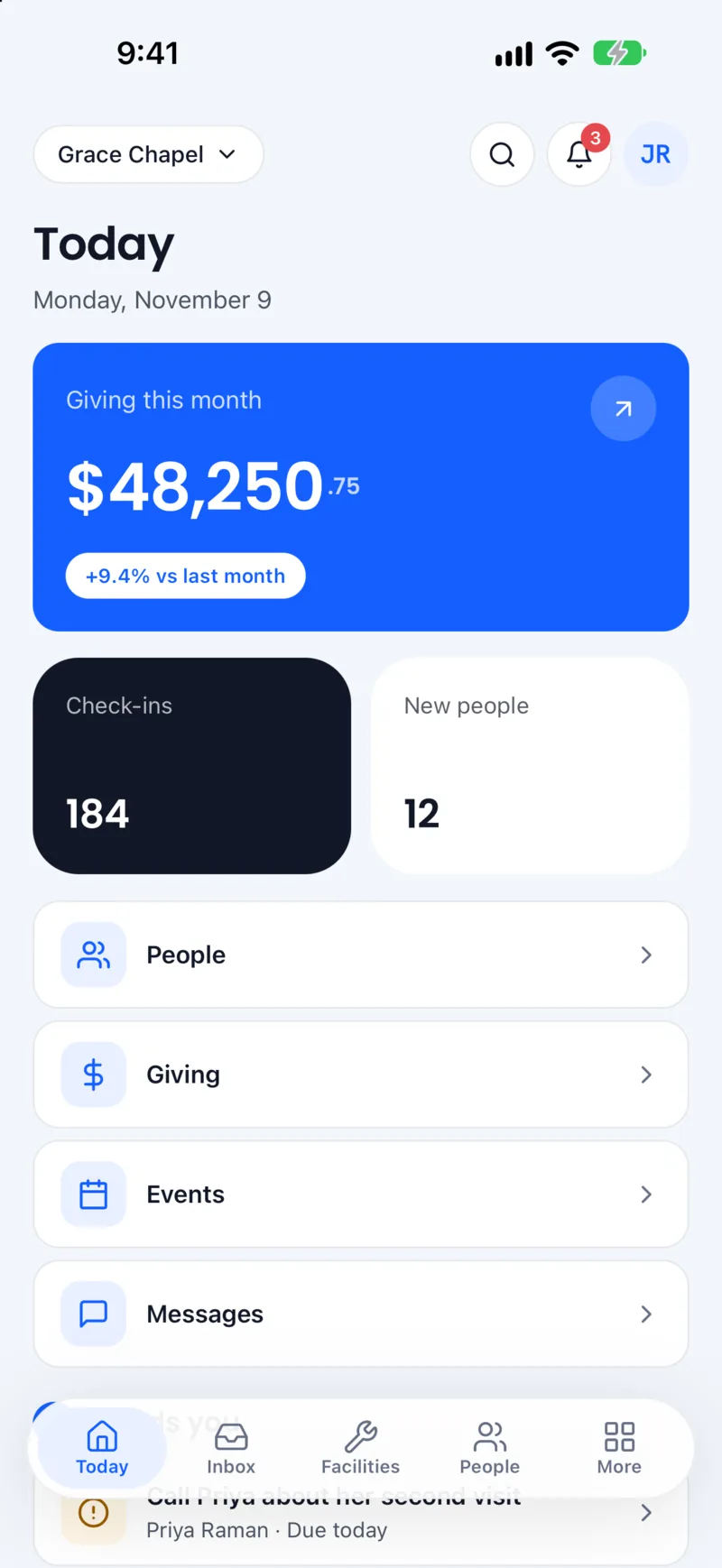
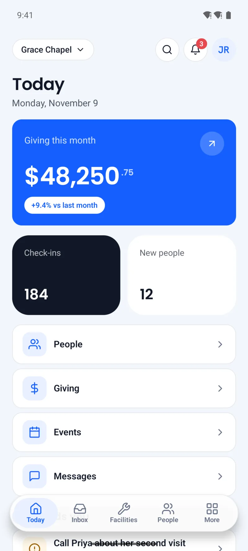
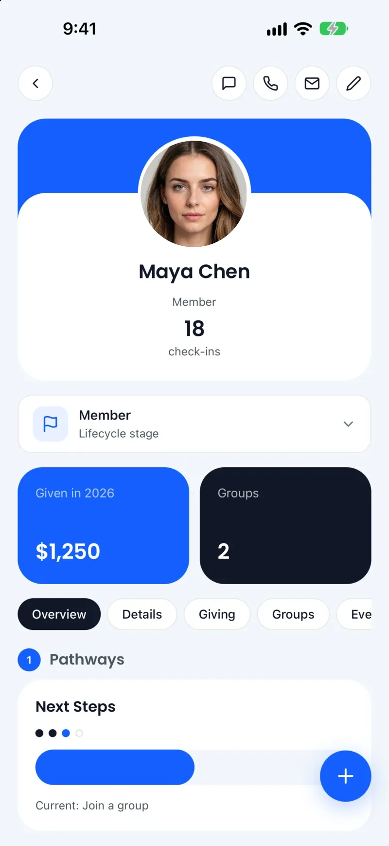
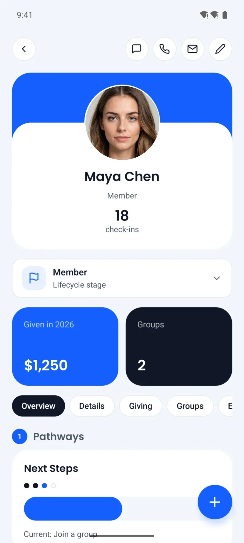
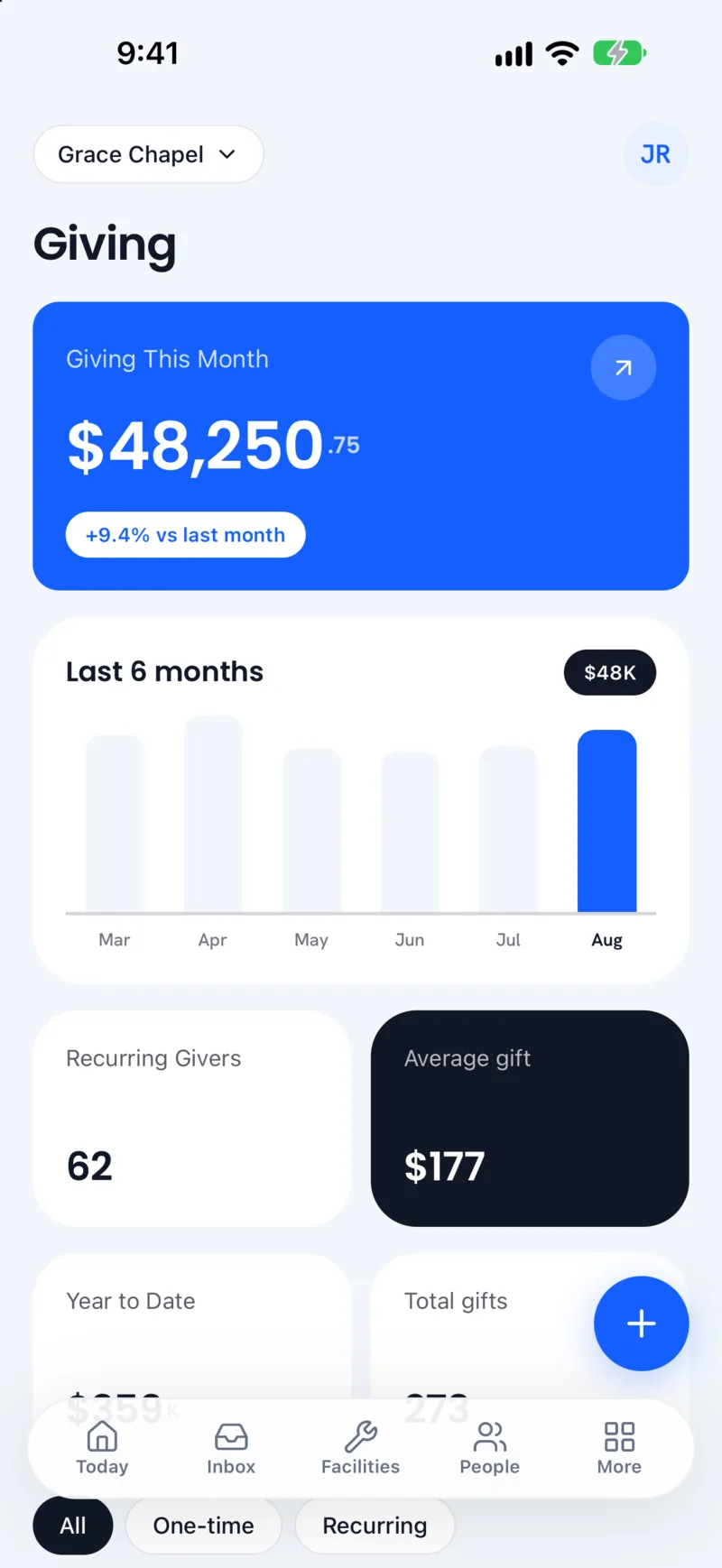
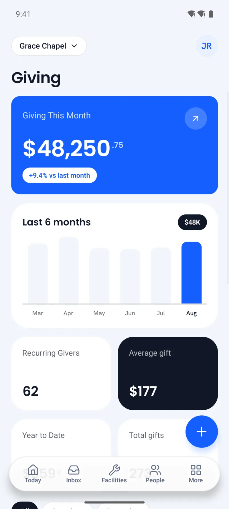
One app for staff, donors and members, built once in React Native and tuned for each platform. Big numbers, round cards and one blue, so a volunteer on Android and a pastor on an iPhone see the same Studio. We made the store pages too.
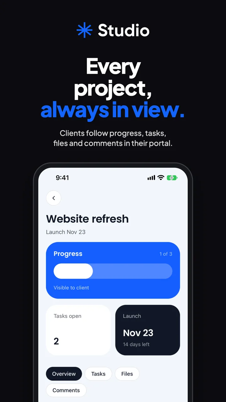
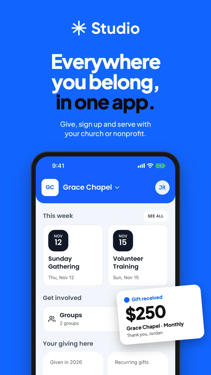
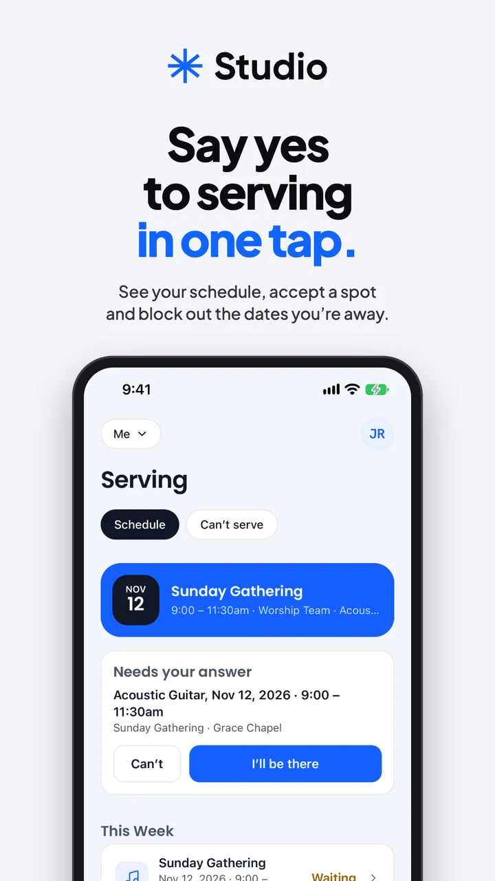
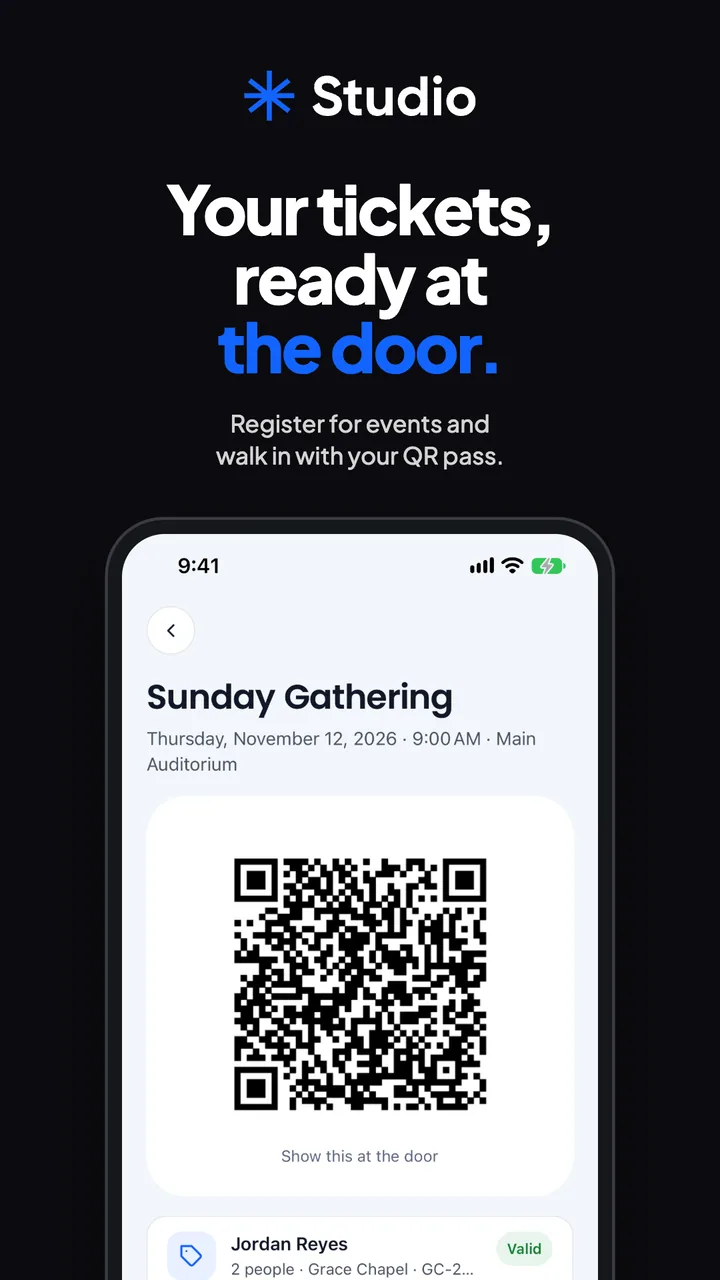
Clients see their project, not your inbox.
Agencies on Studio Craft give every client their own portal: progress they can see, tasks waiting on them, approvals, messages, forms and files. It is the same app with a client sign-in, so nobody downloads anything new.
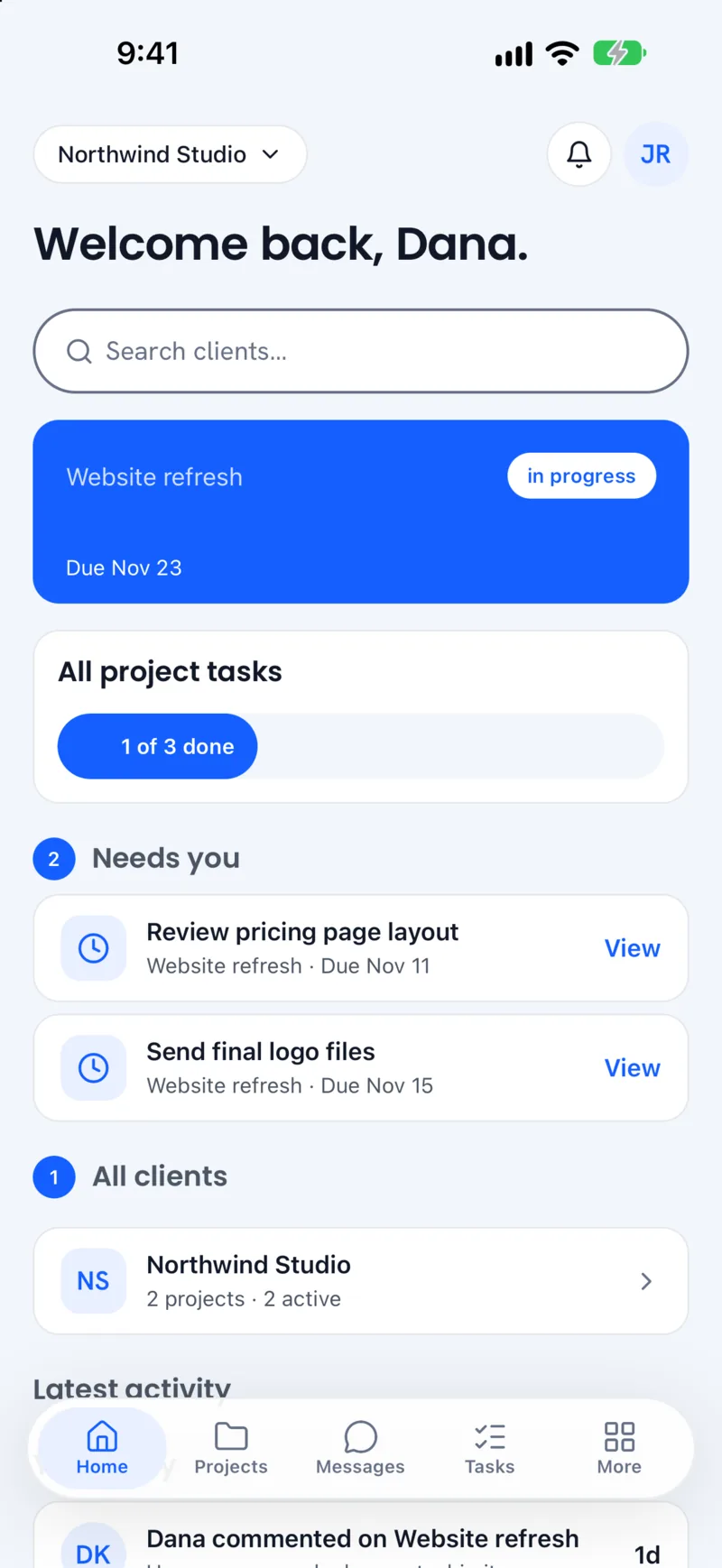
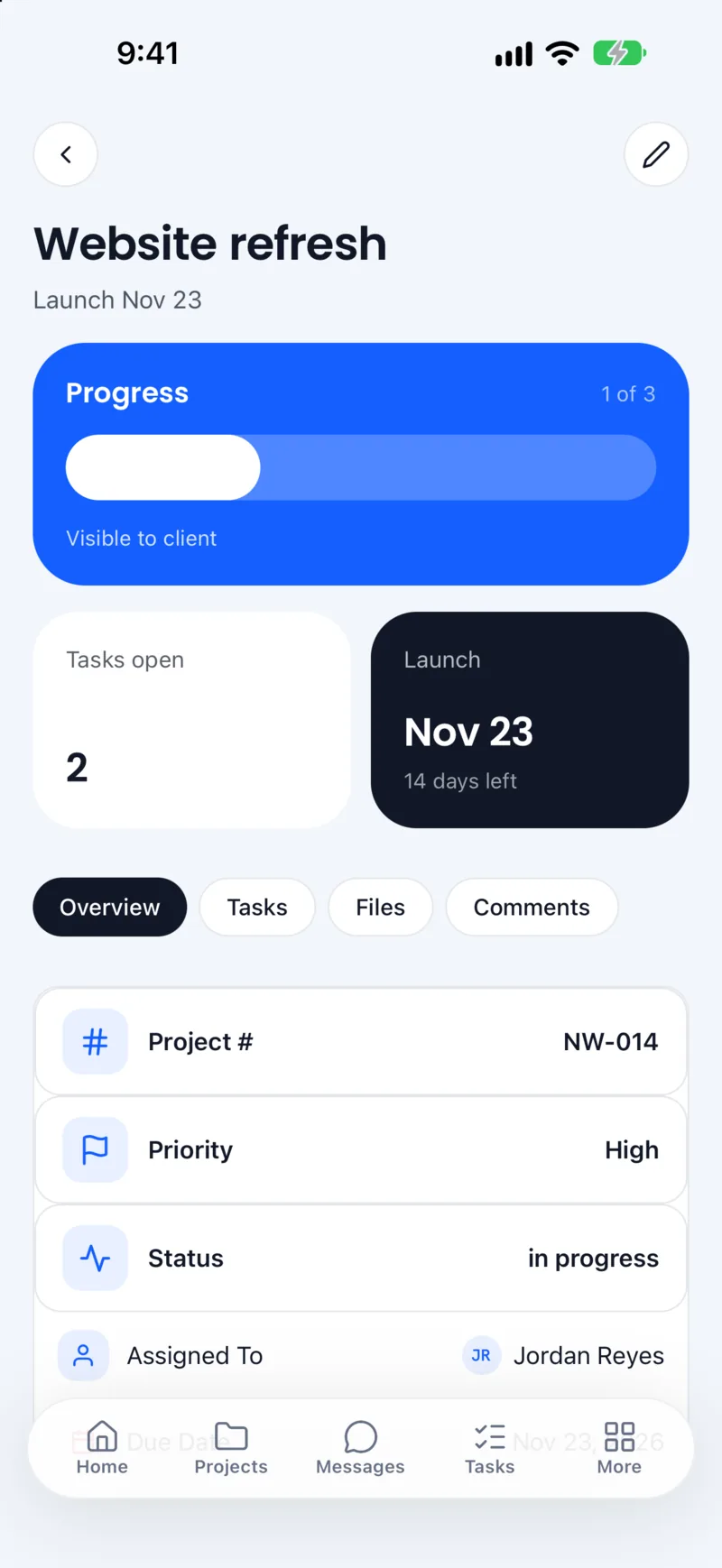
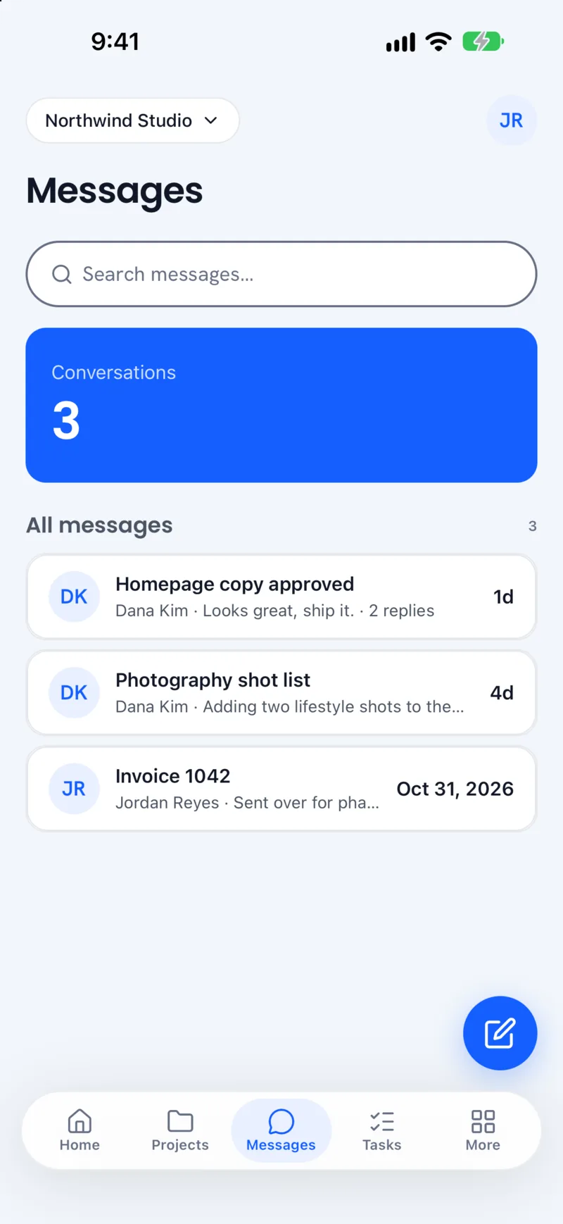
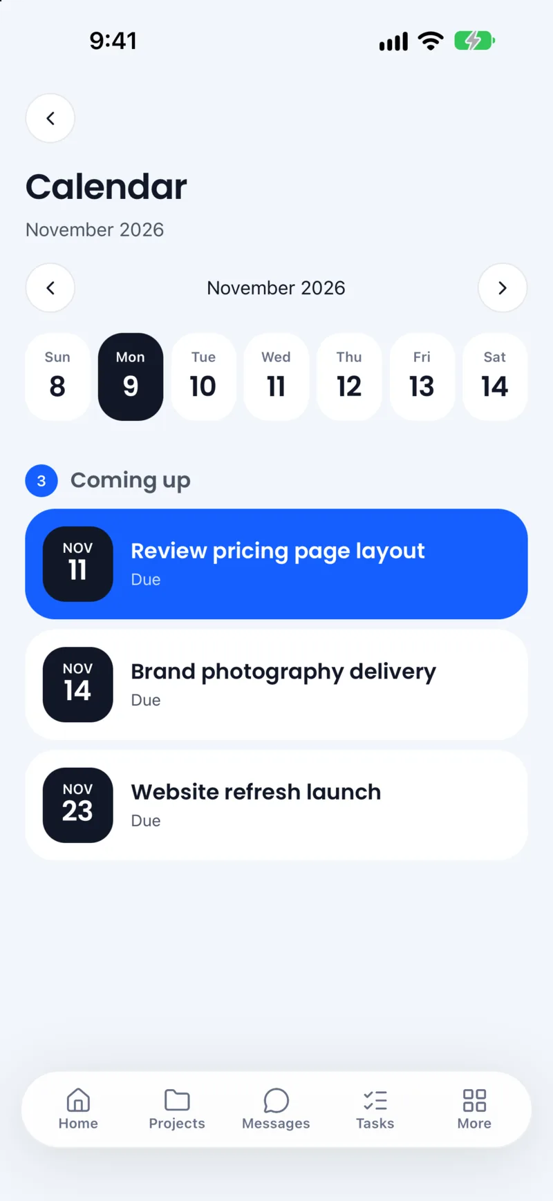
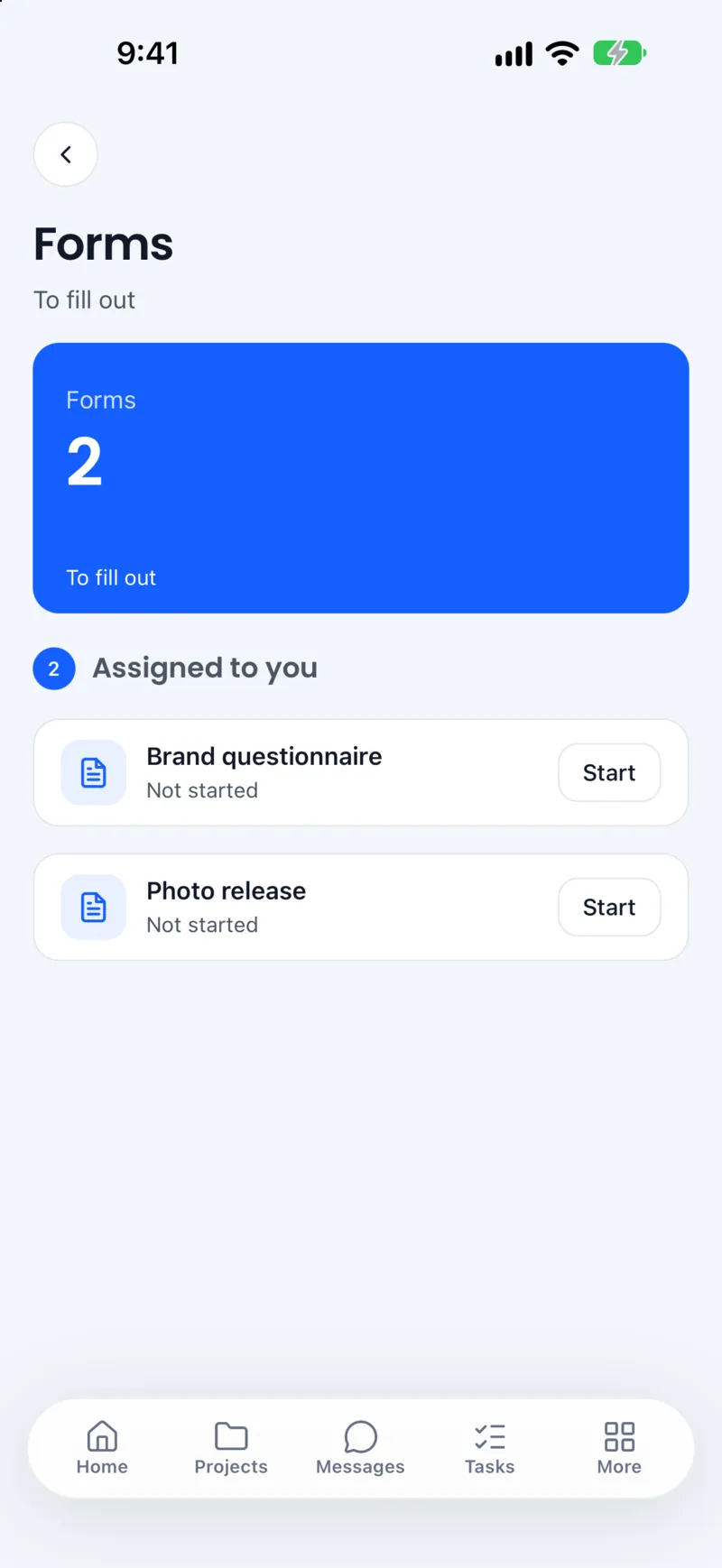
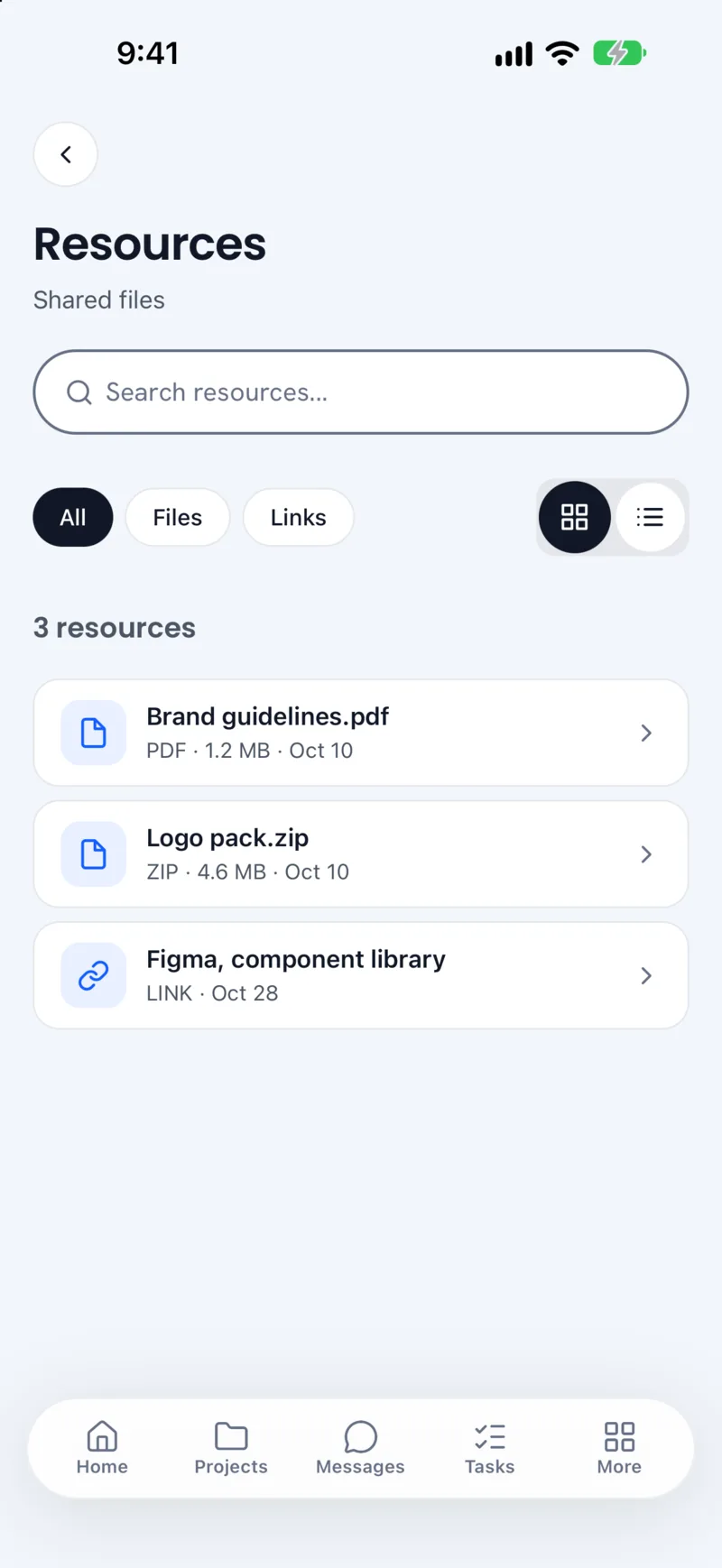
Made up, but the moment the portal is for: the client signs off in one tap, and the team sees it the same minute.
Six moments, one kit.
One set of parts across the web app, the phones, the portal and the kiosk: the same blue, the same radius, the same pill. These are made up, built from the real parts.
- 01People first
Every module writes to one record, so a donor, a volunteer and a client are the same card.
- 02Money in one tap
Giving pages, funds and monthly gifts, paid straight into the organization's own Stripe.
- 03A pass for the door
Tickets with a QR code that Stations or any phone checks in.
- 04Time becomes invoices
Hours roll into an invoice, the client pays by card, the timeline fills itself.
- 05A portal per client
Progress, approvals and files, with the next thing the client owes on top.
- 06AI that asks first
Skye finds the answer and drafts the work, then waits for your OK.
- Sent Nov 3
- Viewed Nov 4
- Paid by card Nov 5
42 people are registered. 3 still need a waiver: Maya B., Daniel O. and Jenna K. Want me to email them a reminder?
Stations
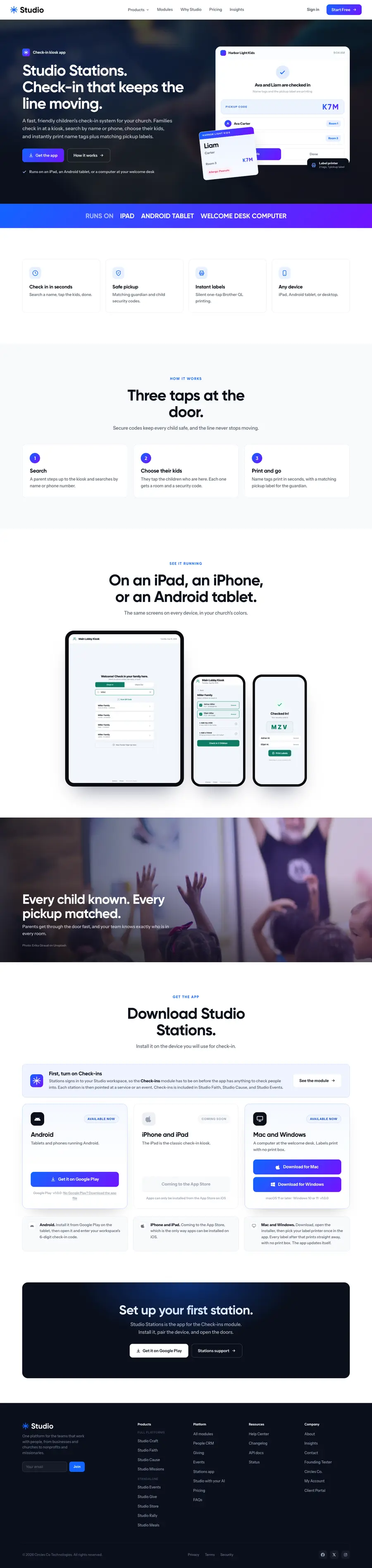
A native kiosk app, because a browser cannot print a name tag.
- Why native
- Three taps
- In the stores
A browser can't print a name tag.
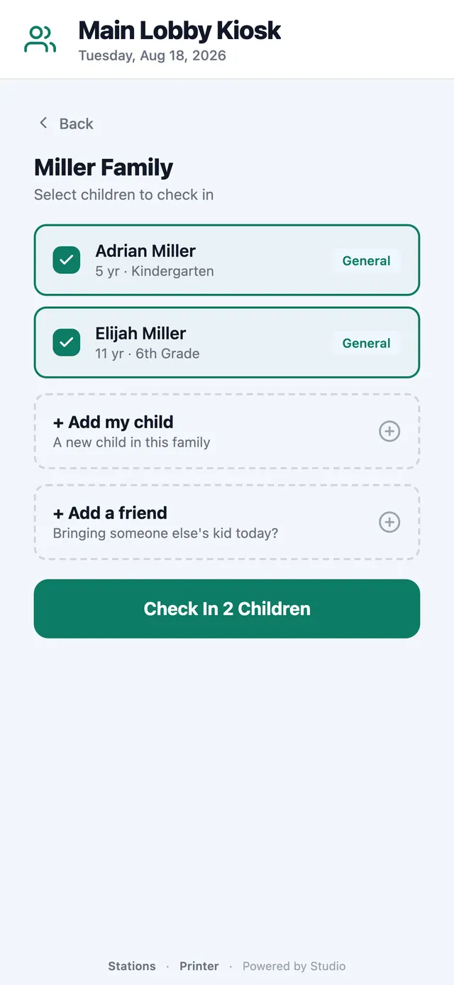
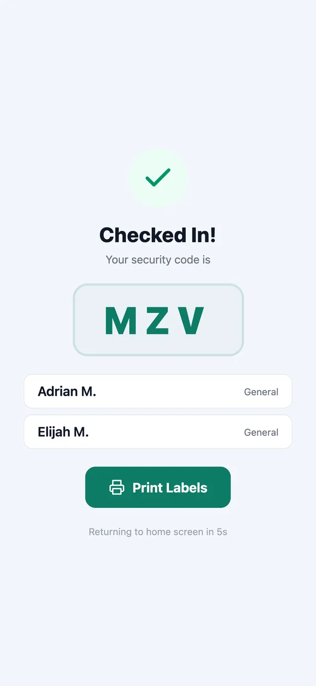
Check-in started as a web kiosk inside Studio, and it worked right up to the printer. Every browser stops for a print dialog on every label, and nothing turns it off for good. At a church door at 9:28 on a Sunday, one dialog per child is a line out the door. So we built Studio Stations, a native app that talks to the label printer itself.
MZVAva M., Liam M.Sunday Service · Nov 16 · 9:30 AM
Present this label at pickup
- 01Printers
Brother QL first, on 62 mm tape with auto-cut, through Brother's own SDK. Then DYMO and Zebra, with AirPrint as the fallback.
- 02Connections
Bluetooth, Wi-Fi or USB. Pick the printer once behind the station PIN; every label after that just prints.
- 03Devices
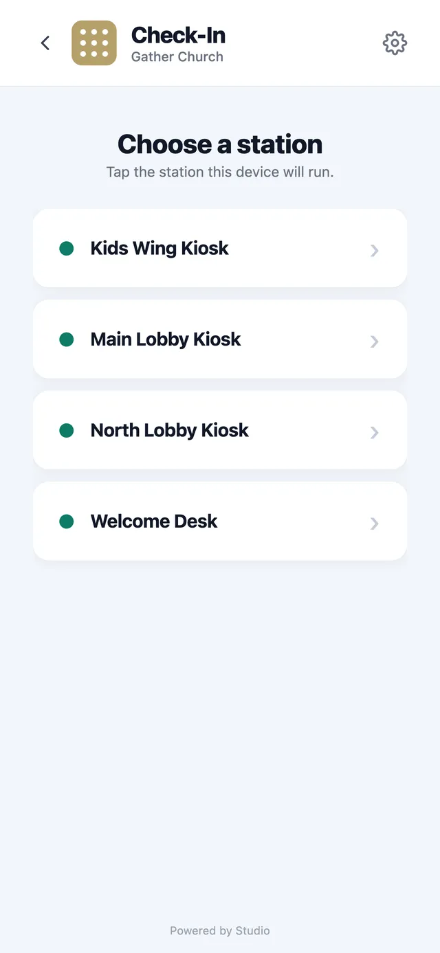
iPad, iPhone, Android tablets, and a Mac or Windows computer at the welcome desk.
- 04Same Studio
It signs in to the workspace with a six-digit code and runs the same check-in as the web kiosk.
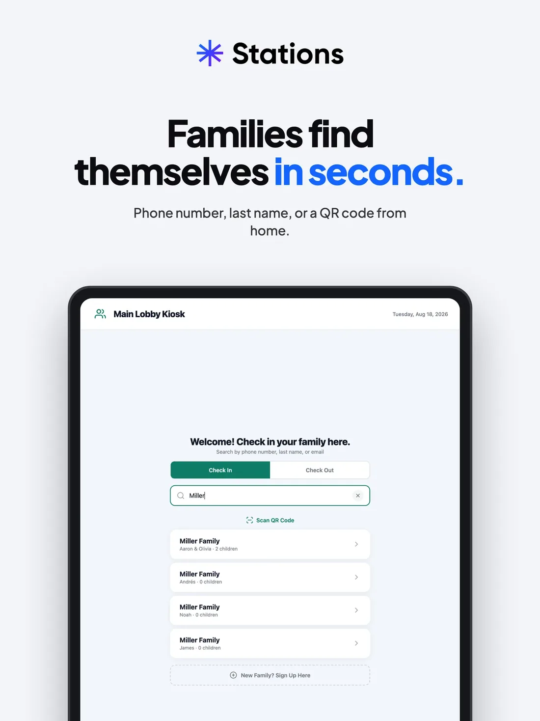
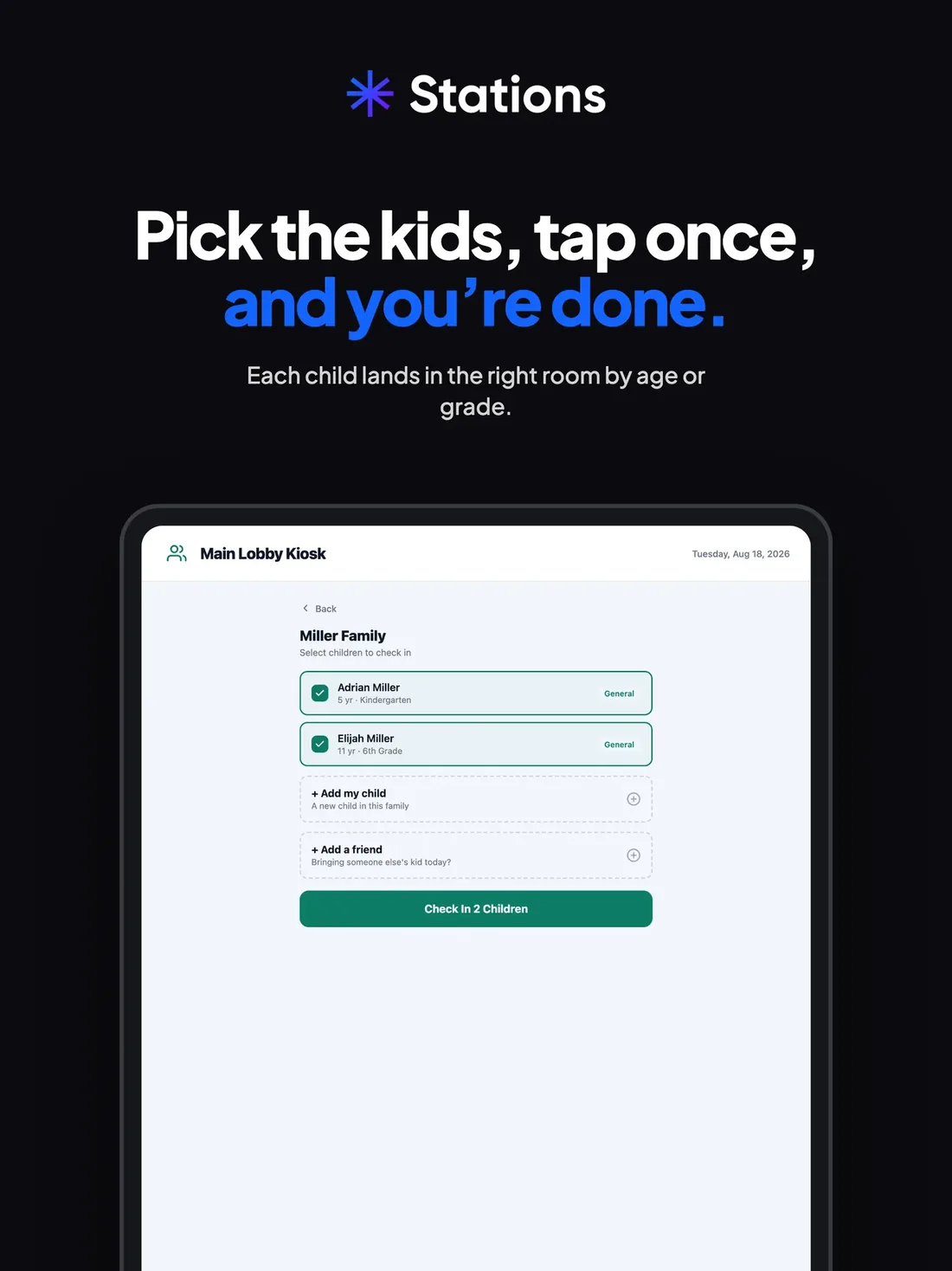
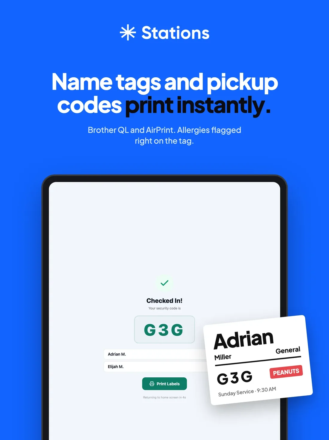
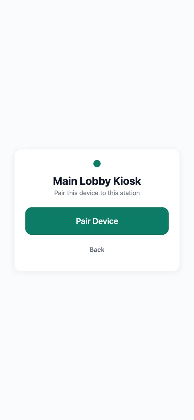
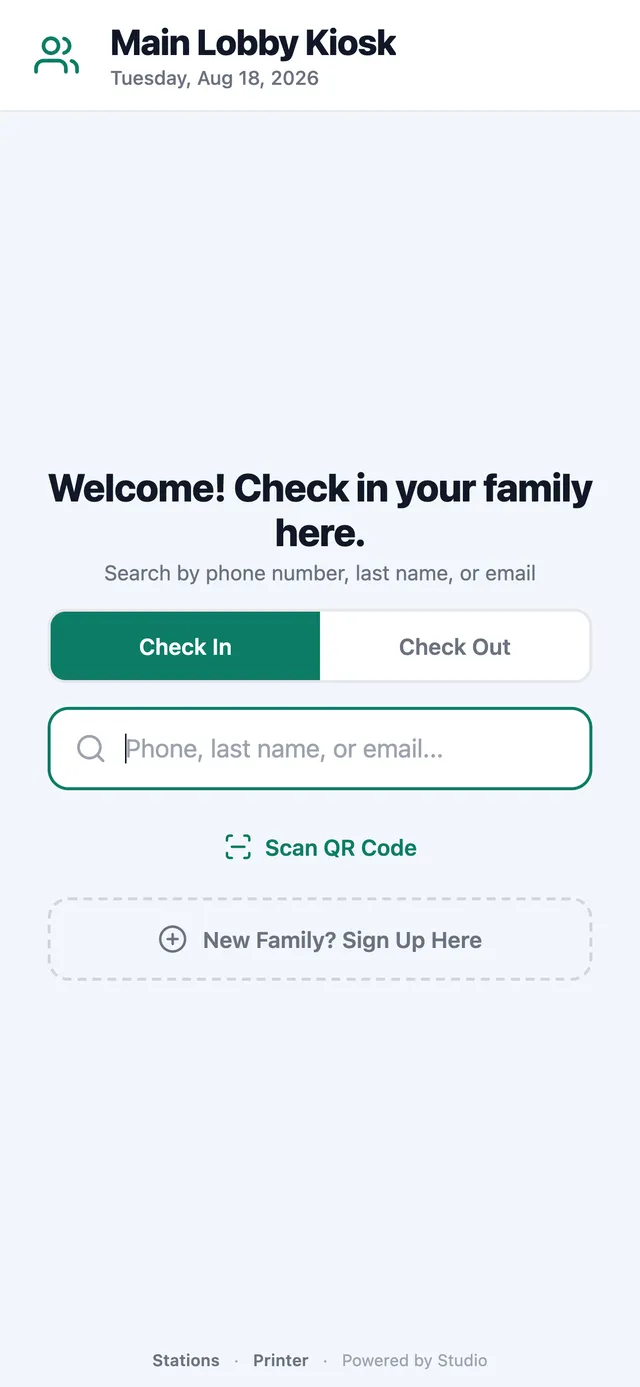
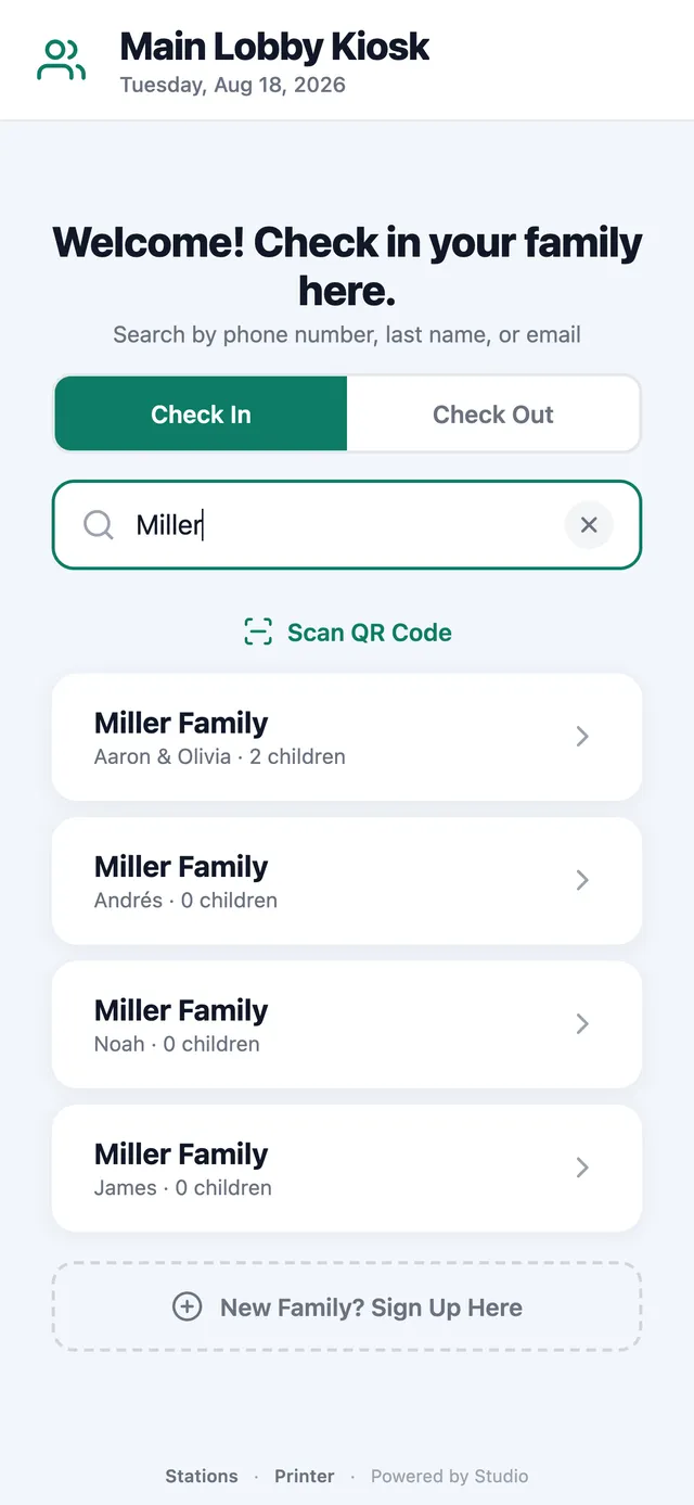
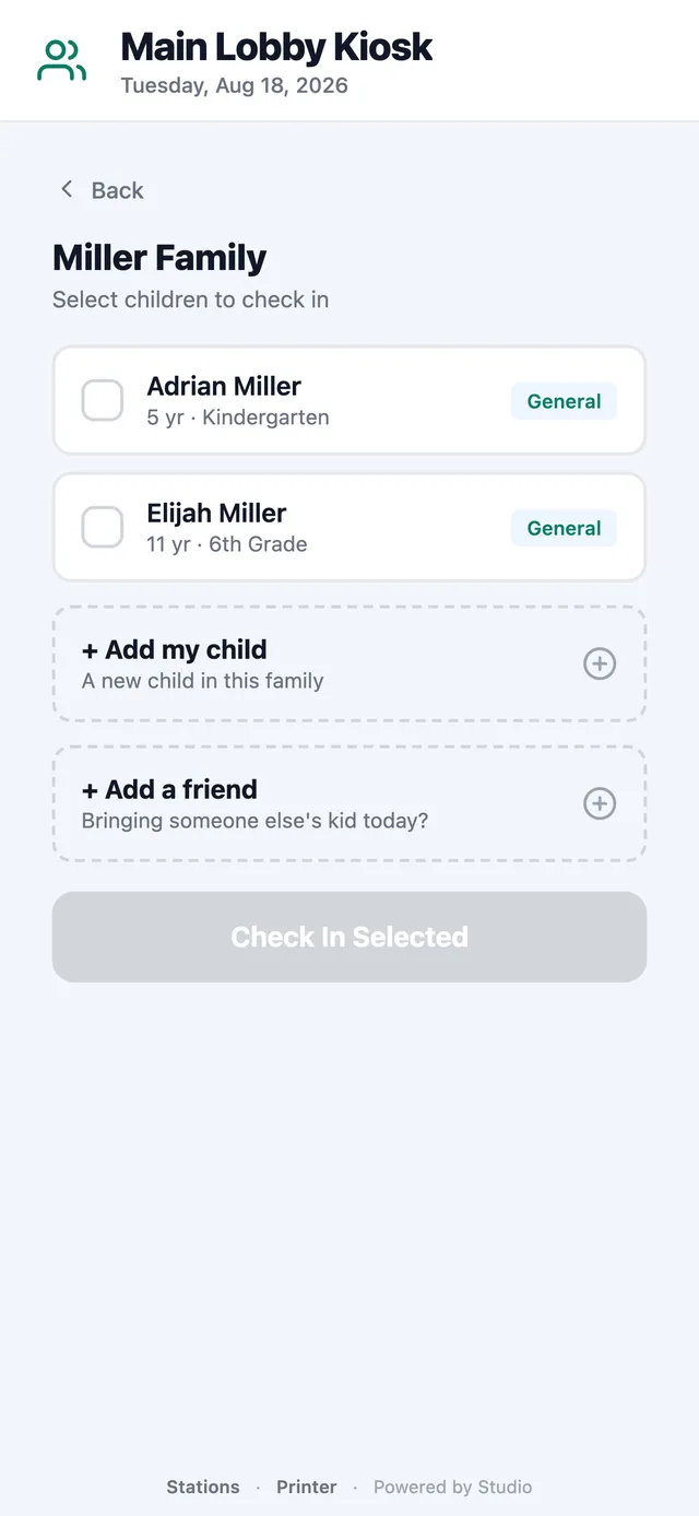
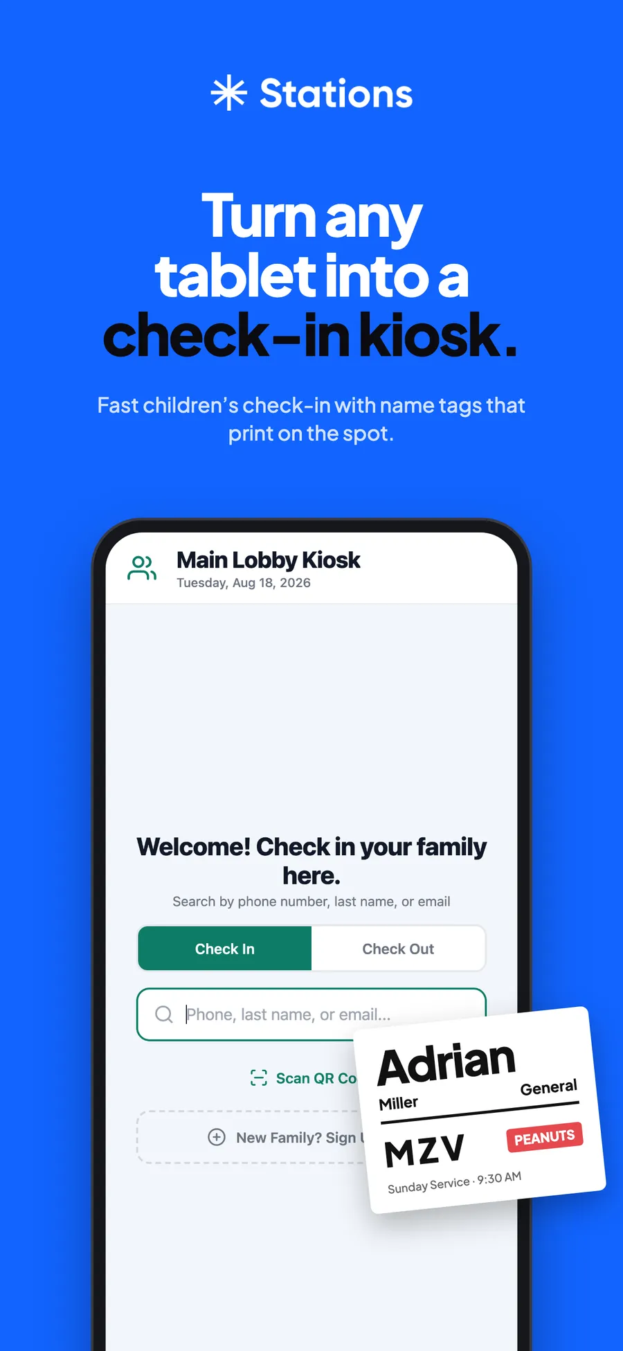
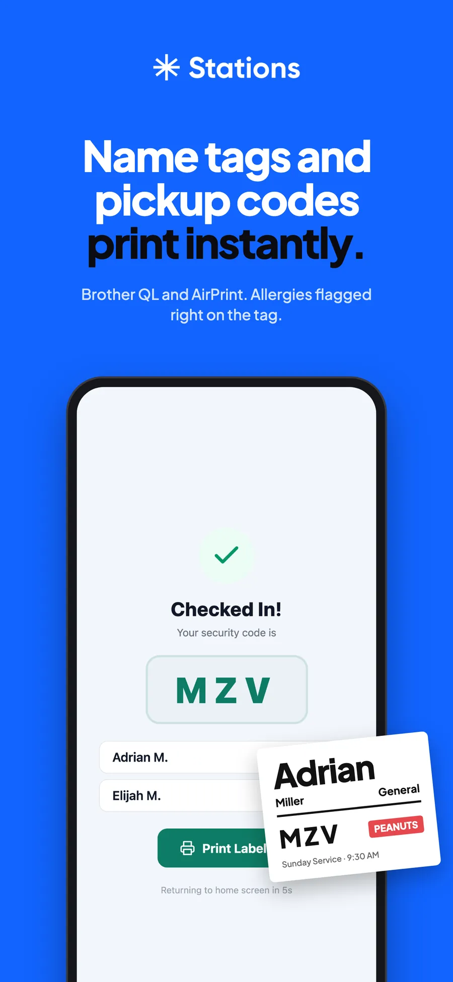
Find the family. Tap the kids. Tags print.
Families search by name or phone, tap their kids, and walk away with name tags and a matching pickup code. Big targets, one decision per screen, and the welcome screen comes back on its own. It wears the church's colors with Studio's type and pills.
Its own icon, its own listing.
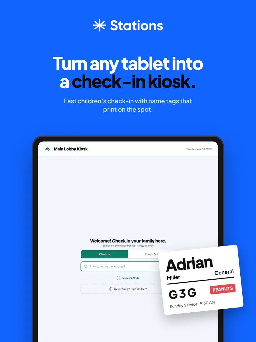
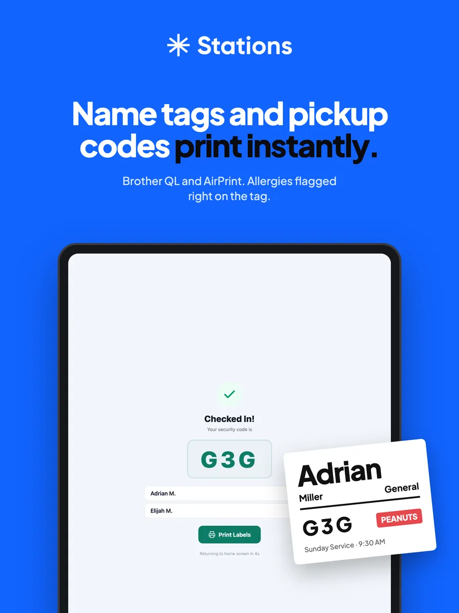
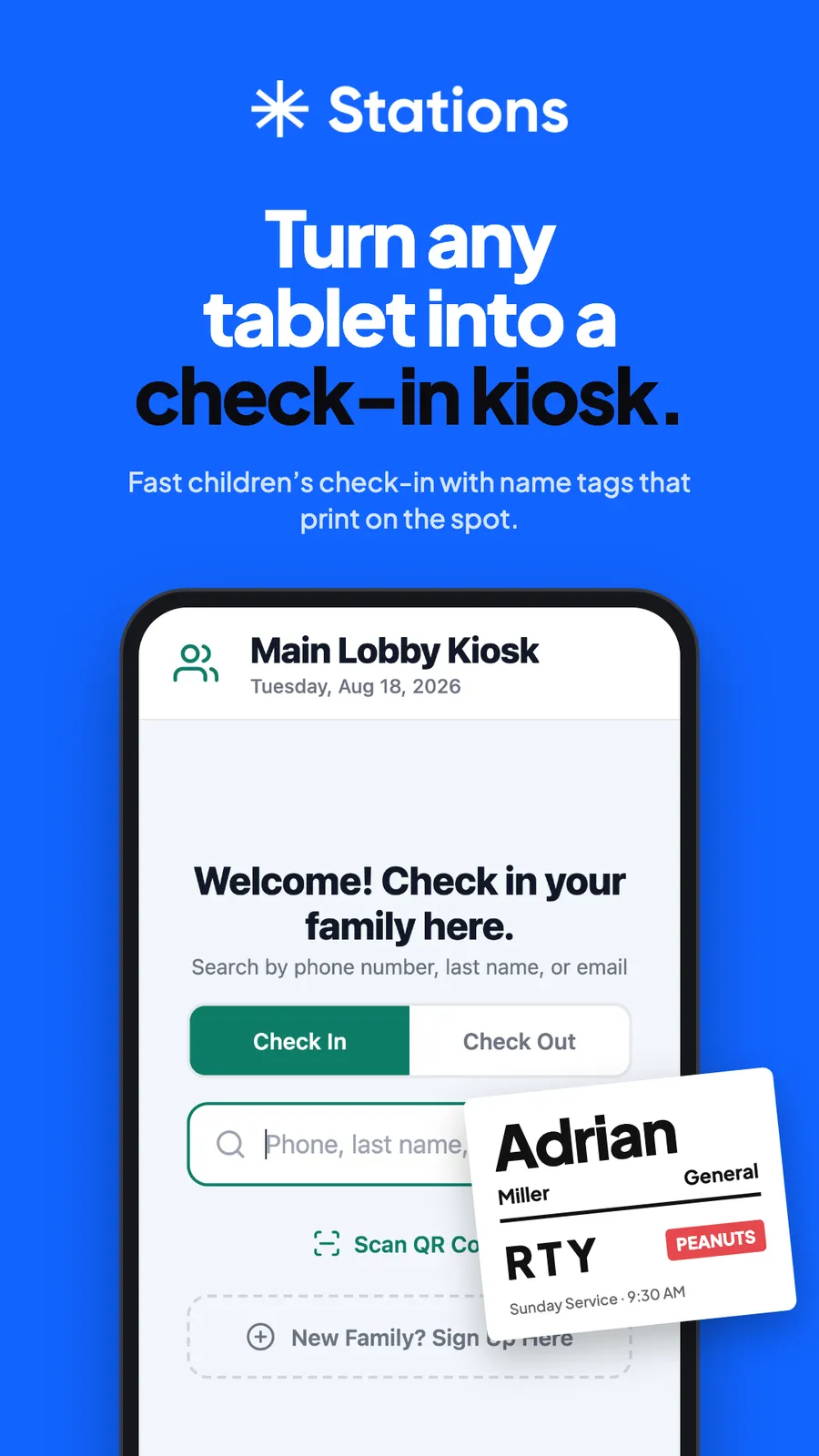
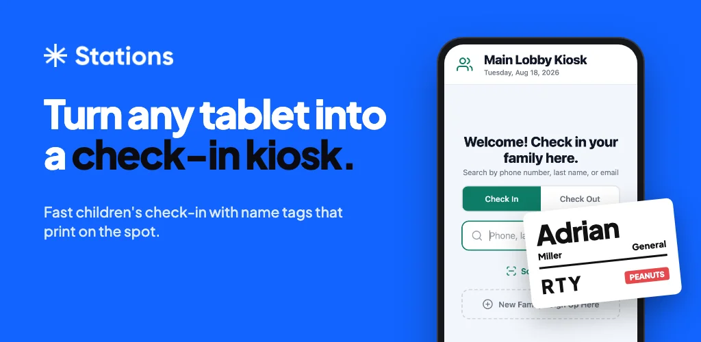
Stations ships as its own app in the App Store and Google Play, with a Mac and Windows download on usestudio.app. We made the icon, the listing art and the feature graphic: the asterisk, Studio blue, and the name tag as the hero.
usestudio.app
Studio Atlas
Let’s create something amazing together.
From brand identity to design direction, we partner with you to build a creative foundation that feels aligned, professional, and easy to grow with.