Wed · Oct06
Workshop day
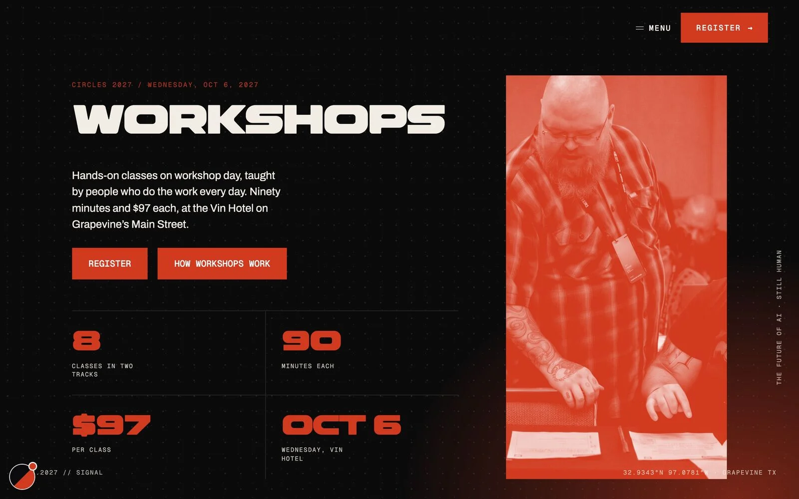
Eight hands-on classes in two tracks, ninety minutes each, at Hotel Vin on Main Street.
8 classes · 2 tracksA creative conference brand built from one typeface, eight website worlds and a launch people shared.
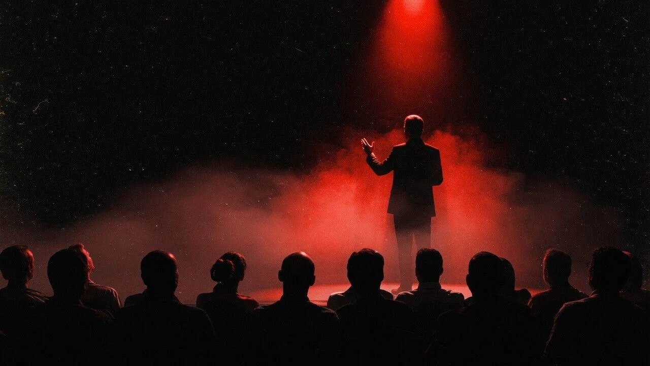
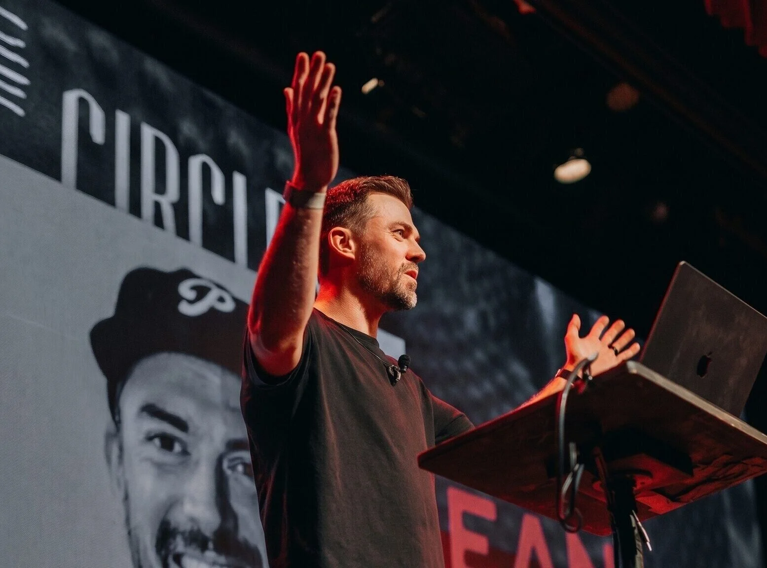
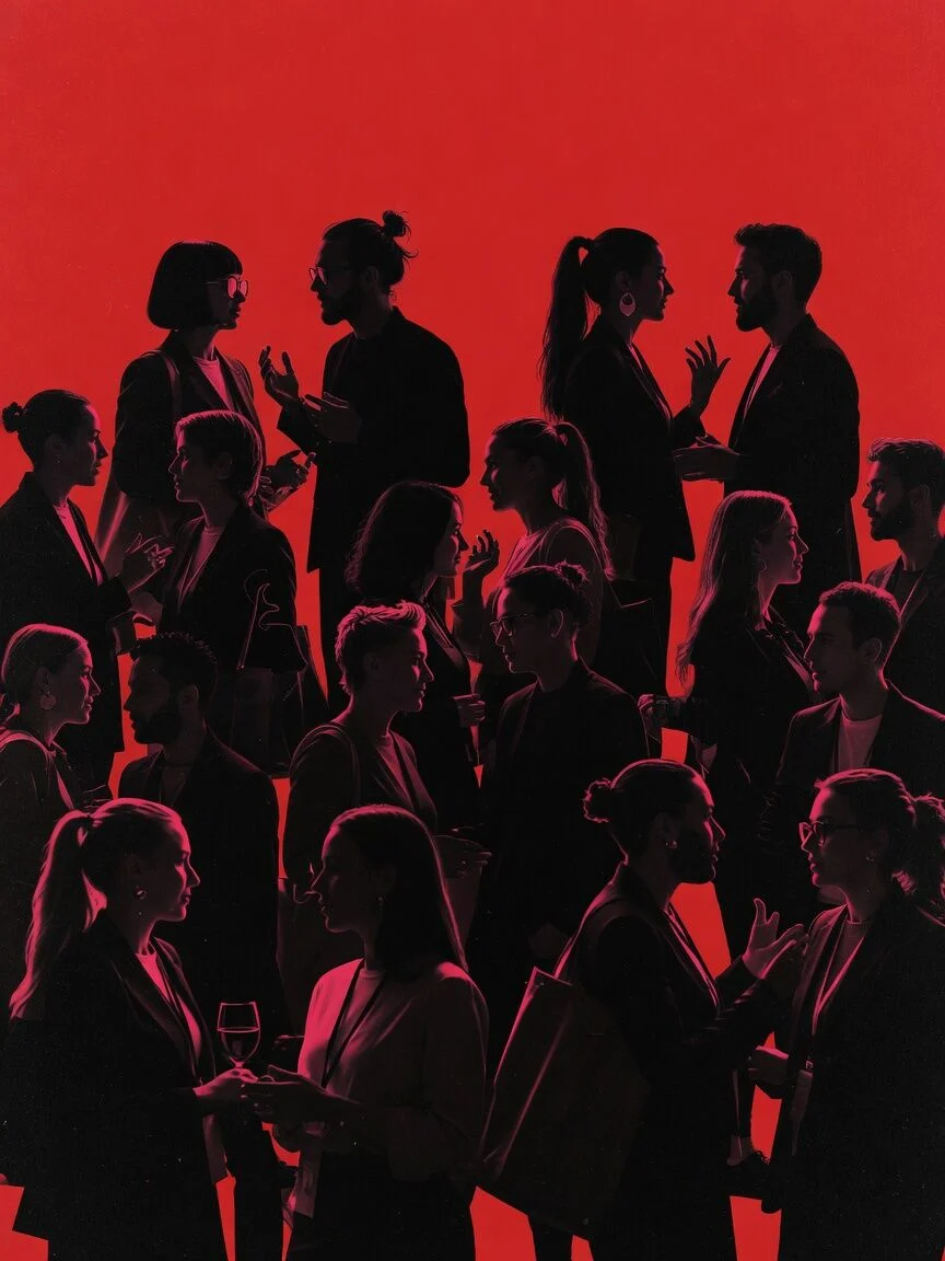
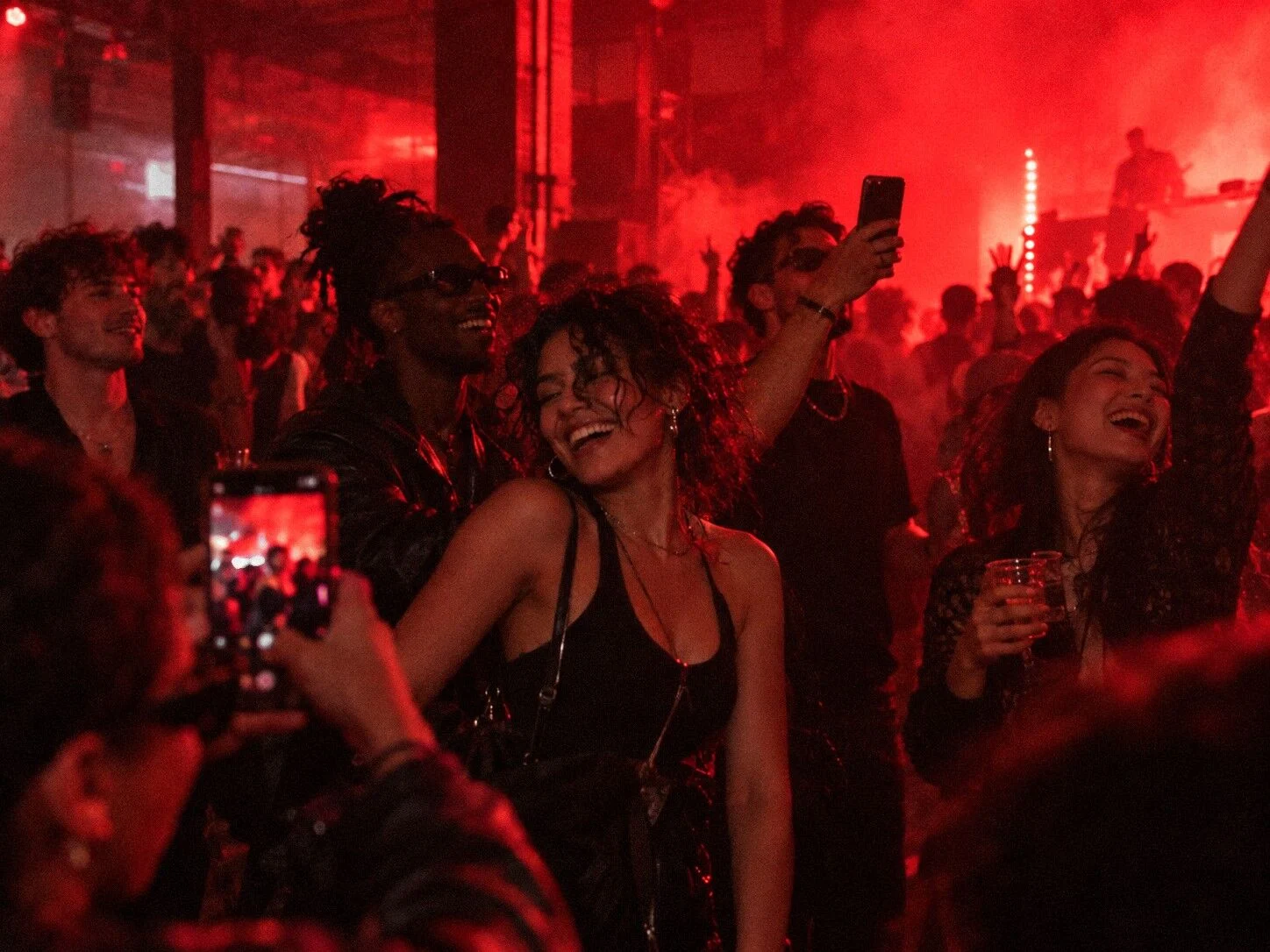
Circles is our own creative conference, now in its 13th year. The 2027 theme, Creativity Is Changing. So Are We., asked a hard question about AI and the people who make things. The brand had to look like the future without looking like a tech company, and the site had to sell passes from day one.
We drew a typeface, built a website with eight complete looks, made an image library with AI and graded every frame by hand, then launched it all with a social kit and two short films.
A typeface, Bold and Thin
Logo system in three colors
One red, the rest earned
Graded by hand, plus AI
Social kit, feed and story
Elements for new posts
One website, eight looks
The brand page with both kits
Circles 2027 Display started as the CIRCLES wordmark. We drew the rest of the alphabet from its shapes: wide letters with flat shoulders and tight counters that still read from the back of the room. Type the word CIRCLES and you have the logo, so every headline, pass and post carries the brand.
Bold 700 · The name, headlines, every big word
Thin 100 · 2027, dates and counts · 701 letter pairs spaced by eye
Pull the CIRCLES lockup apart and every layer has a job. Put it back together and you get the logo.
Bold, wide and square-shouldered. The word CIRCLES is the logo, so the font had to start here.
Every pair spaced by eye. 701 pairs per weight, moved until CREATIVITY sat evenly.
Bold for the name, Thin for the year, set a touch smaller so the pair reads as one.
Red, black and paper. Nothing else on the site, the posts or the films.
Circles 2027 Display was drawn from the CIRCLES wordmark. Bold for words, a hairline Thin for numbers. 701 letter pairs spaced by eye.
| Weight | Use | Rule |
|---|---|---|
| Bold 700 | The name, headlines | Always uppercase |
| Thin 100 | 2027, dates, counts | A little smaller than Bold |
| Never | Stressed | Retired |
One red does the work. Black and paper hold everything else. Circles Display for the big words, Gilroy for reading.
Dates, passes and speakers up front, in a site that feels like the conference it sells.
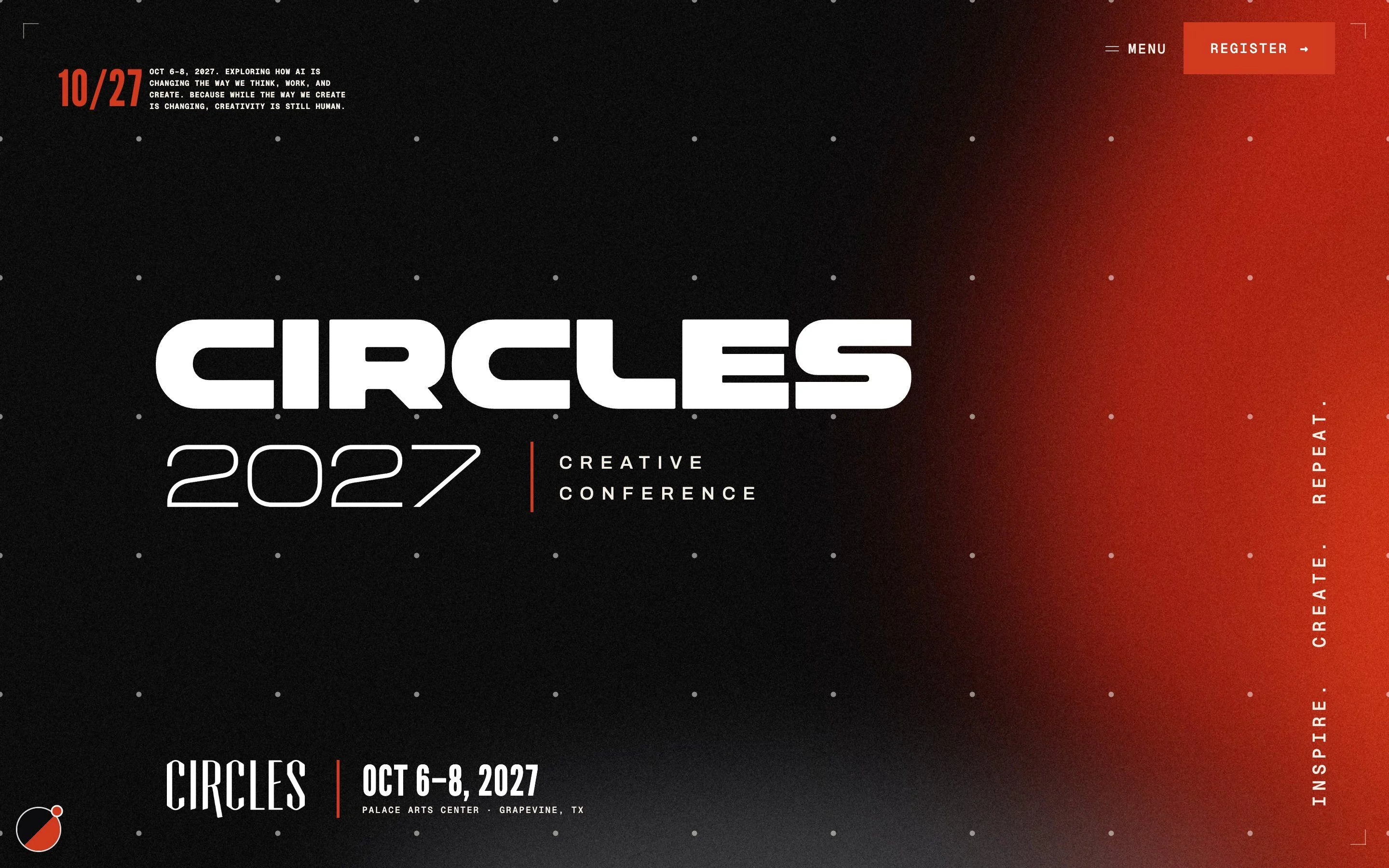
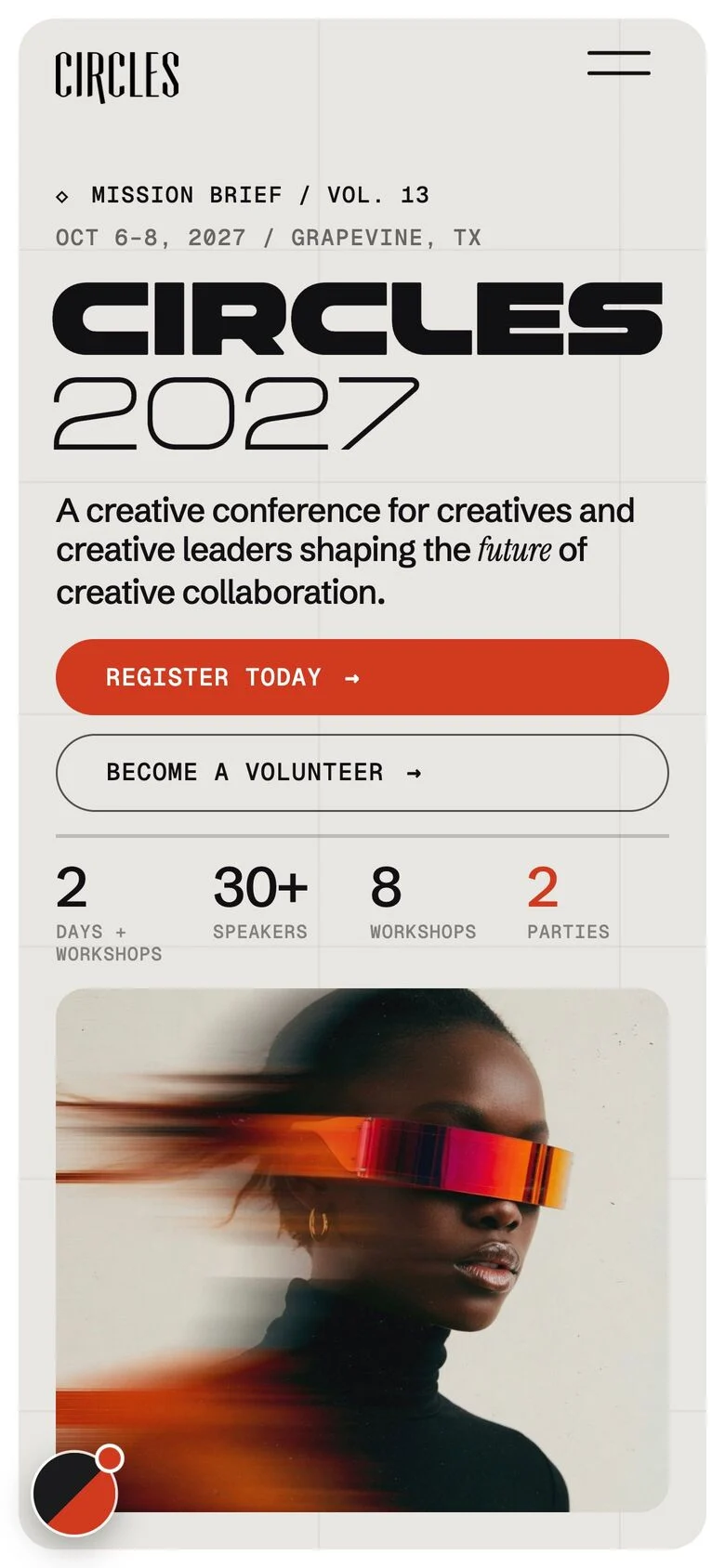
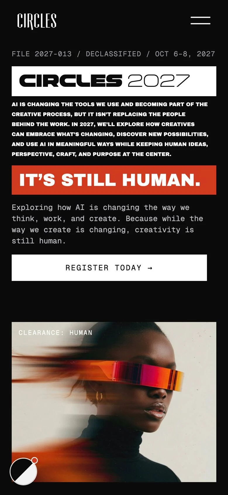
Every world keeps the pass button in reach, from the first screen to the footer.
Each pass is drawn as a real ticket with its price, perks and a number.
Switching worlds shows a short build screen that types the world’s name, then welcomes you in.
The look you pick is saved, and every inner page opens in it.
Attendance, speakers and sessions from last year do the convincing.
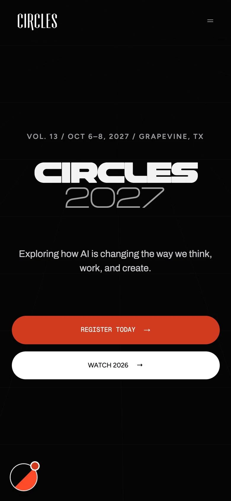
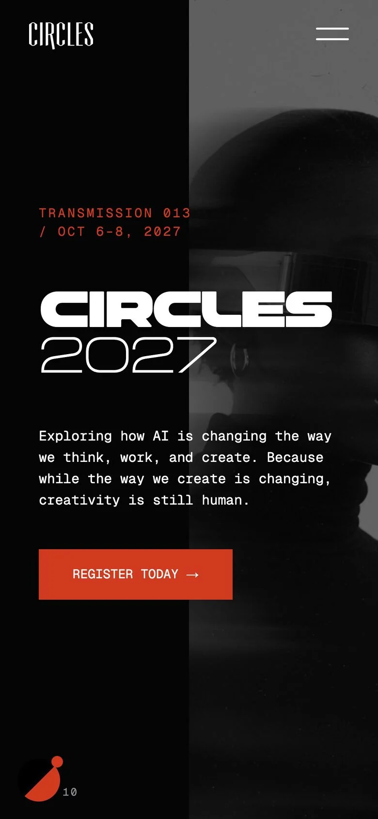
Each world is tuned for a phone first, with light images and motion that respects reduced motion settings.
Every Get a pass button opens the picker with the right pass already chosen, and the site greets each new pass the moment it lands.
Every visitor picks how Circles 2027 looks. Same content and same passes in eight complete designs, from a keynote stage to a declassified file. The pick is saved, and the inner pages follow it.
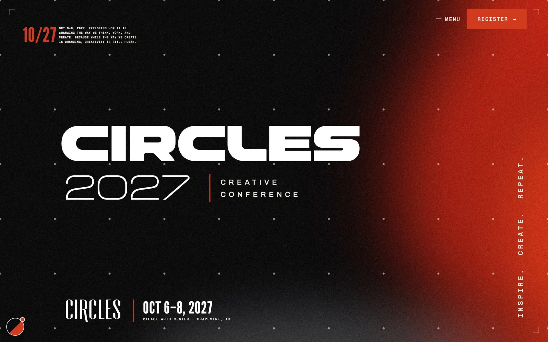
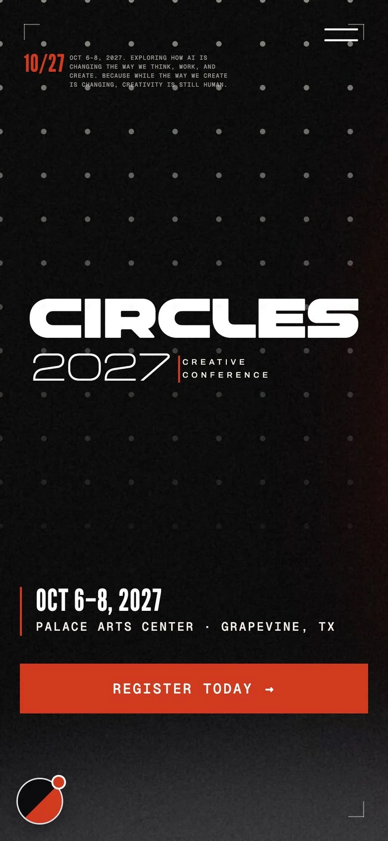
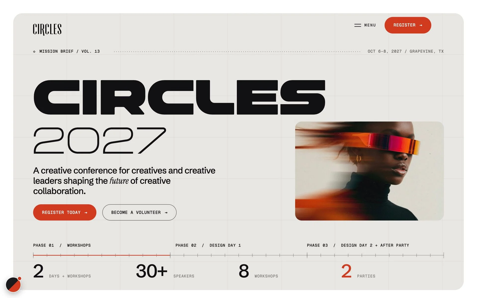
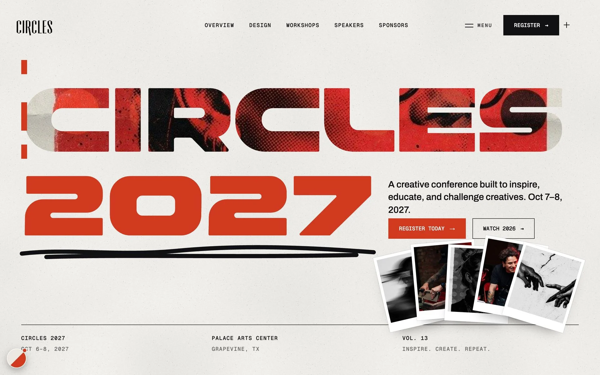
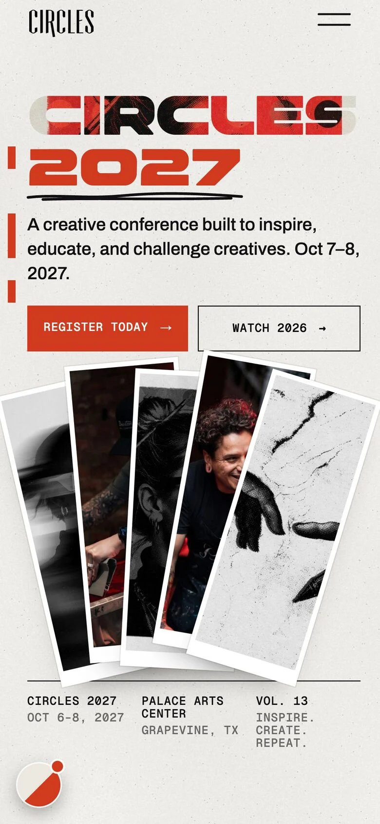
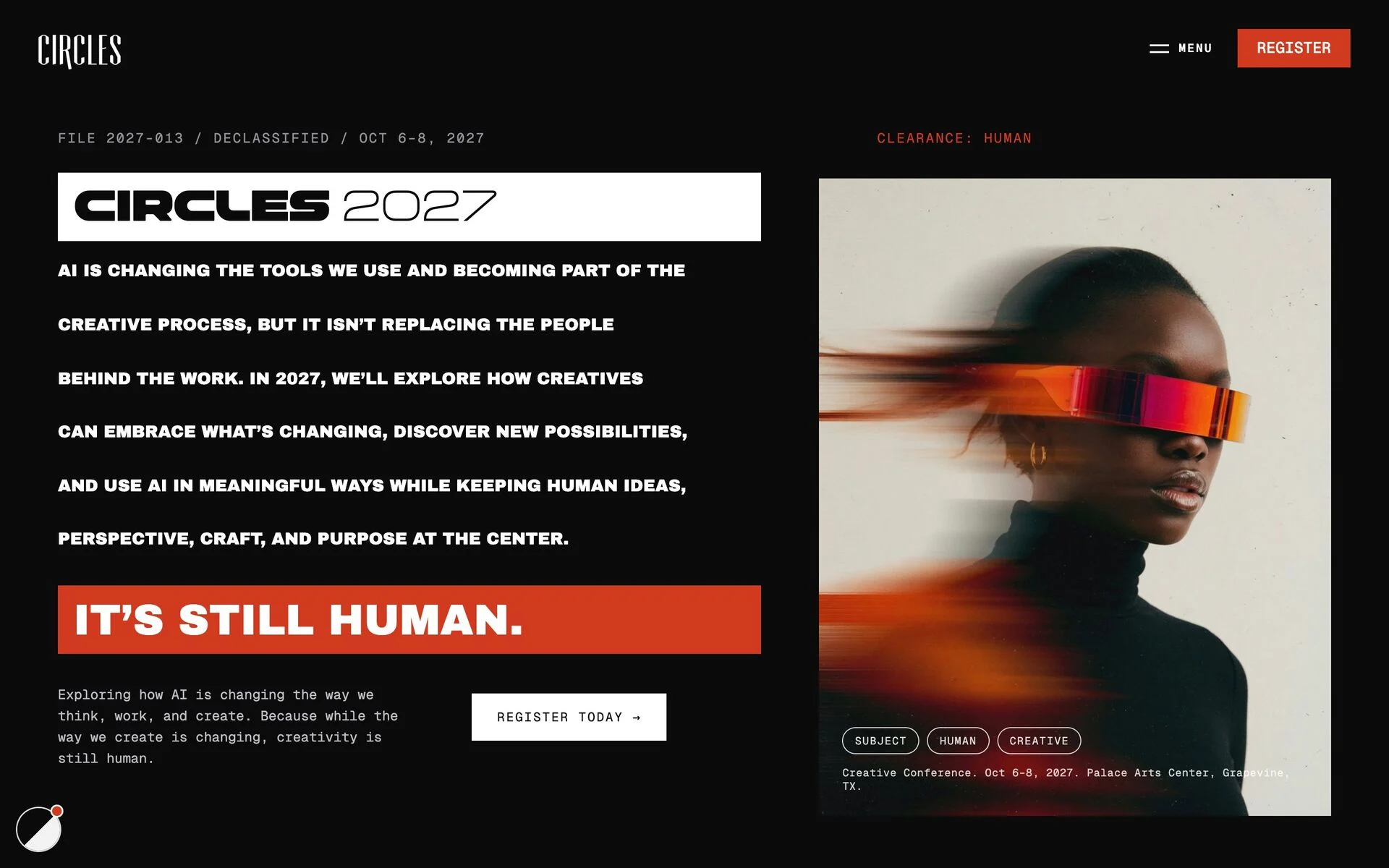
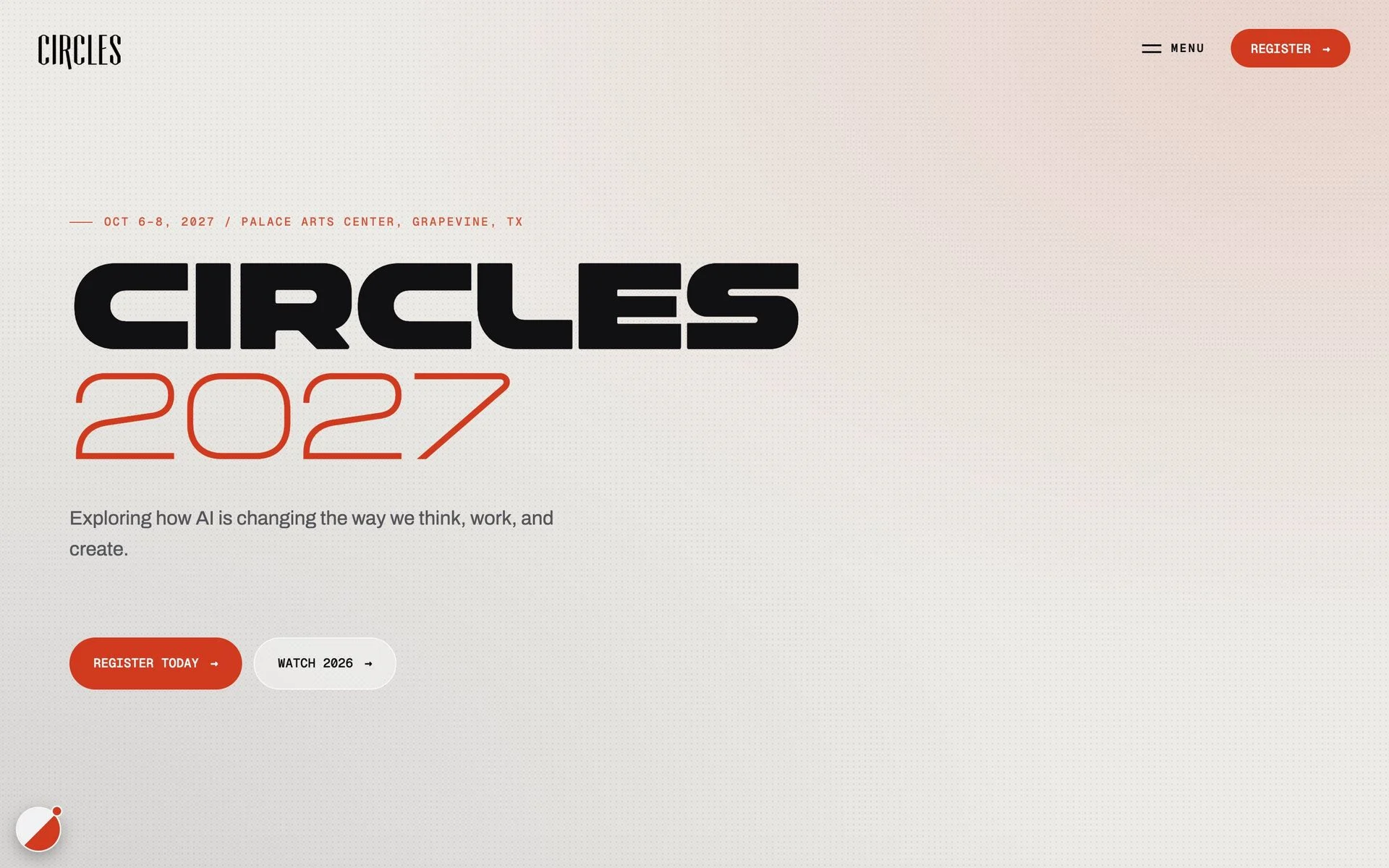
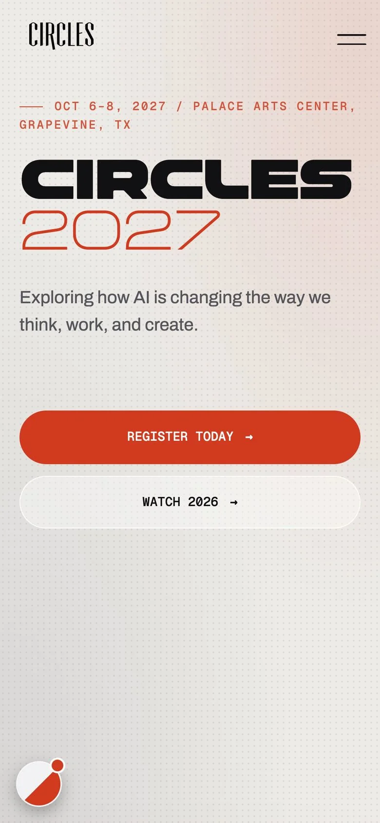
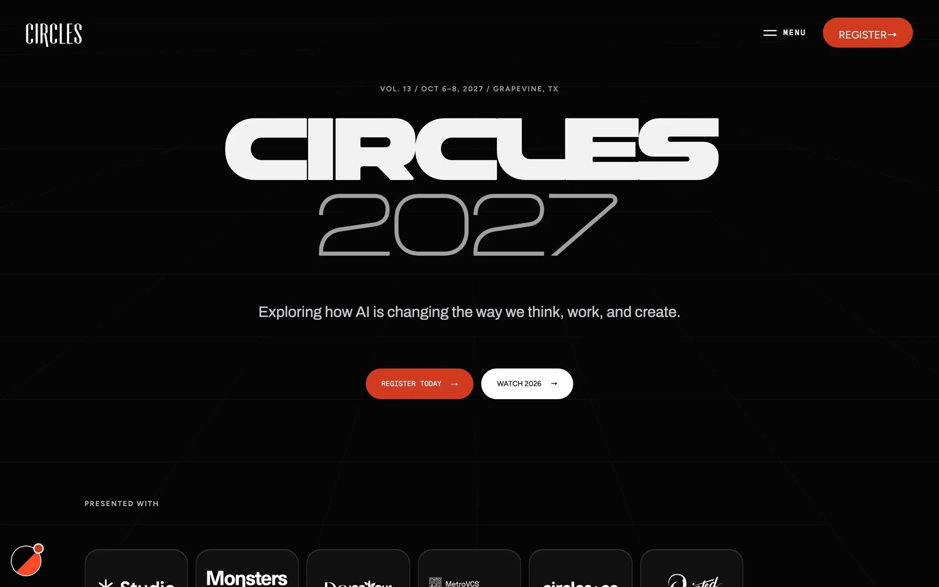
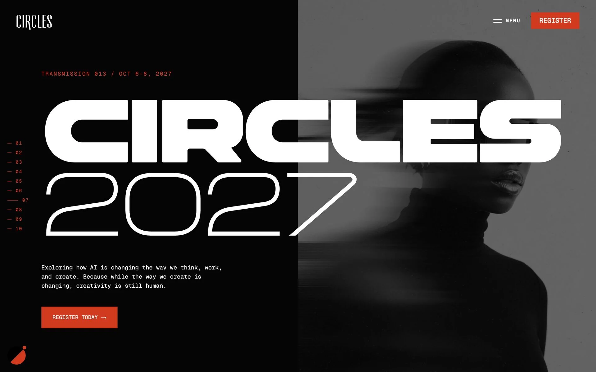
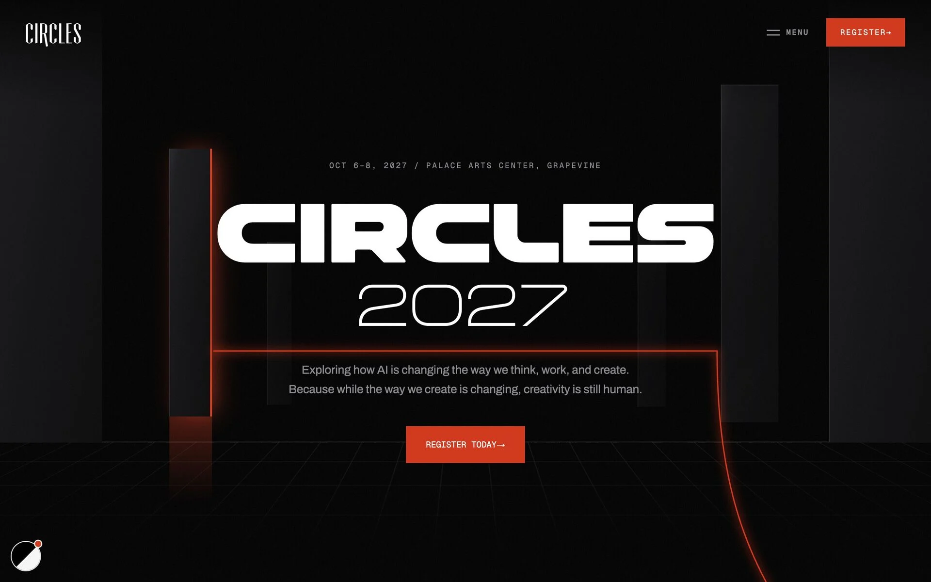
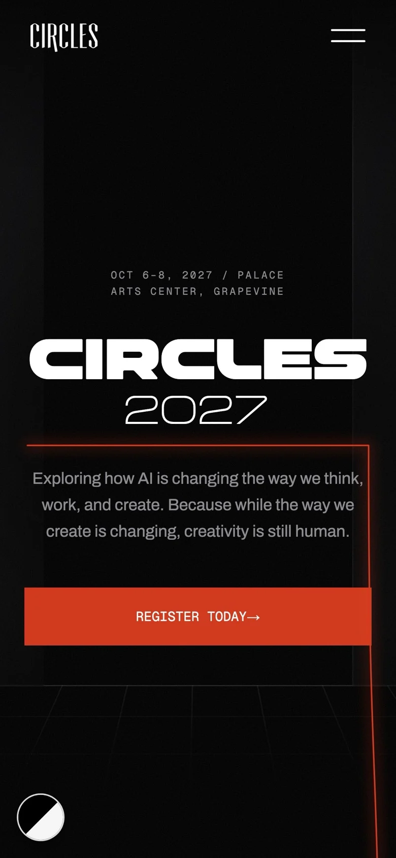
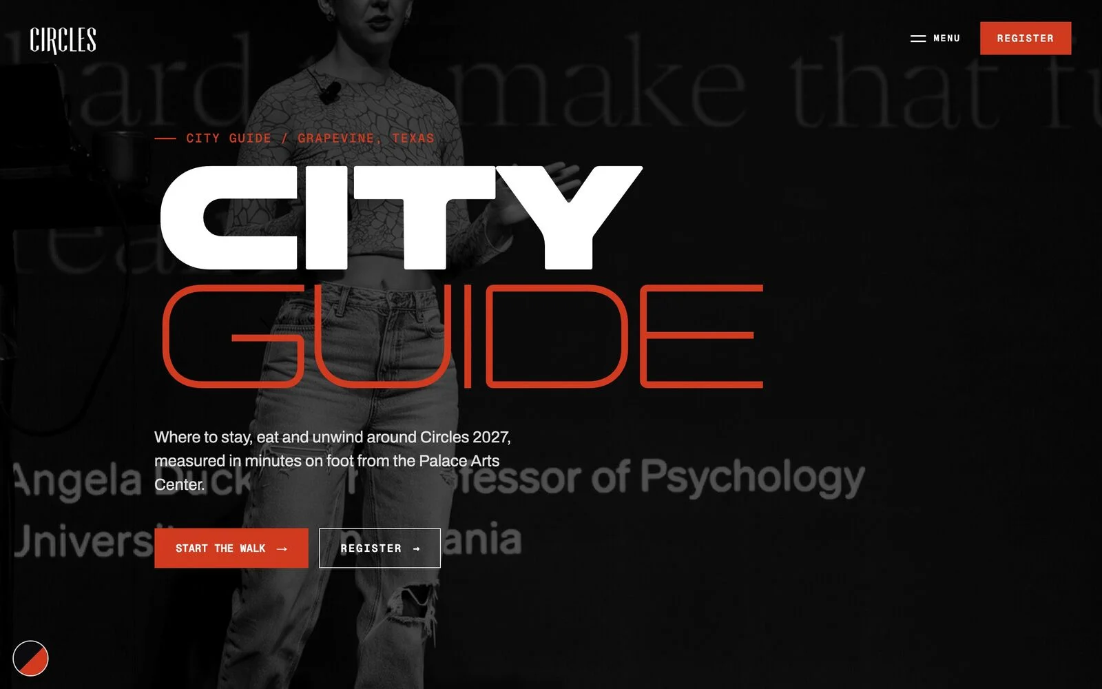
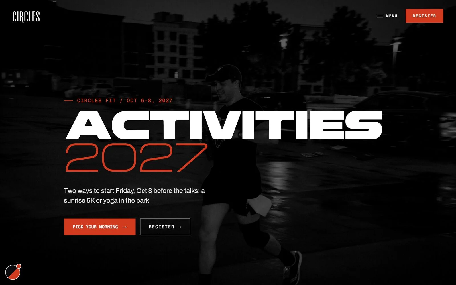
People buy a conference for the room, the classes and the walk to dinner. So the site sells the days themselves: a workshop day on Main Street, two days on the Palace stage, a sunrise 5K and a city guide measured in minutes on foot.
Eight hands-on classes in two tracks, ninety minutes each, at Hotel Vin on Main Street.
8 classes · 2 tracksTalks at the Palace Arts Center from people who make things for a living, then the conversations that keep going.
Palace Arts Center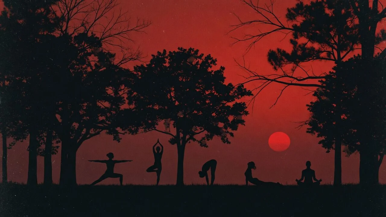
A sunrise 5K or yoga in the park before the final day on stage. The gear is included.
6:00 AM 5K · 6:30 AM yogaplaces to stay, eat and drink, numbered by how many minutes they sit on foot from the conference door.
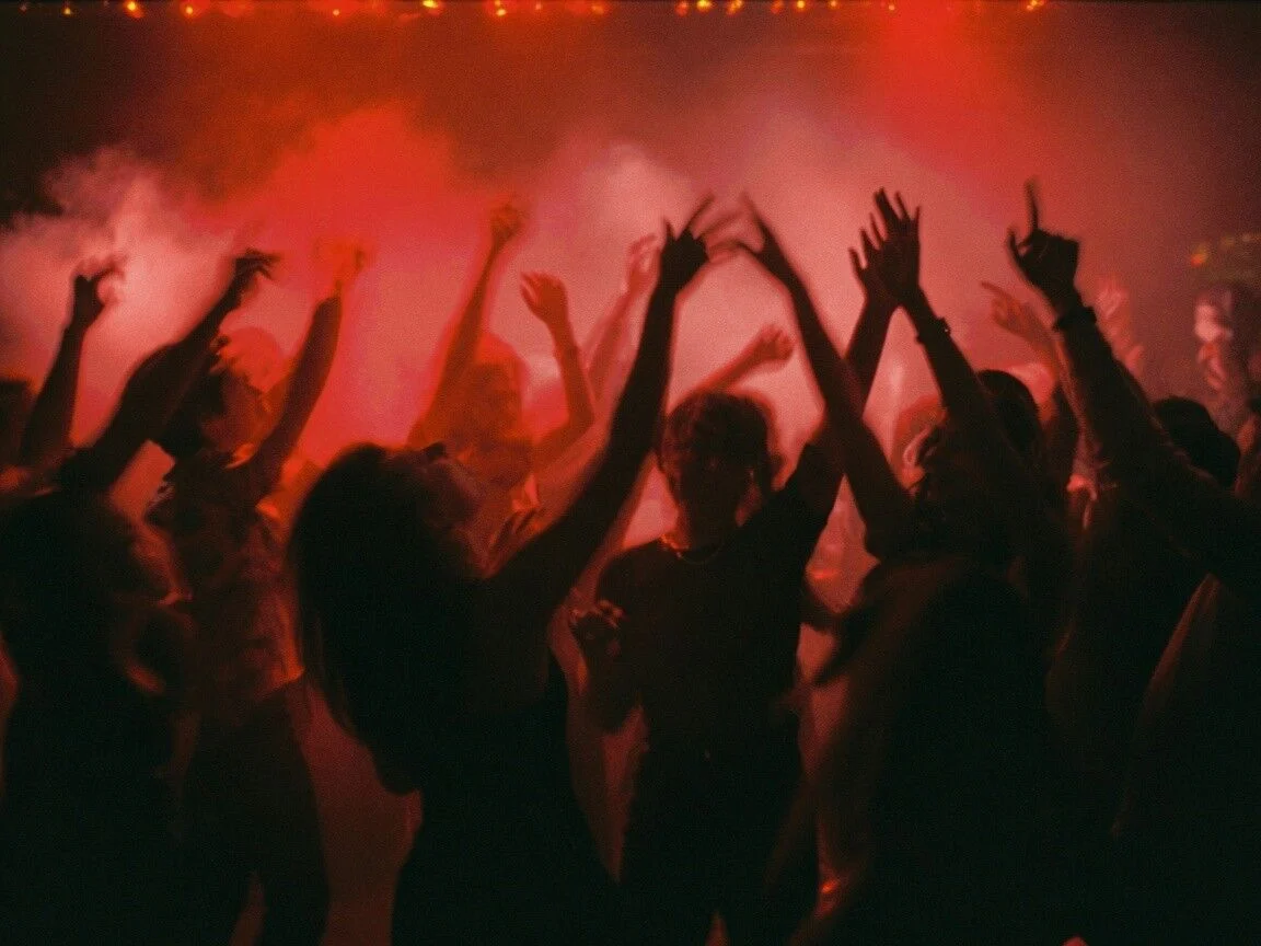
“Some of the best conversations at Circles happen away from the stage.”
Every image on the site went through the same hands. Scroll and each step takes the stage.
What it shows, how it is lit and what it must never look like.
AI makes a handful of takes on the brief in minutes.
Handshakes, empty rooms and stock poses go. People making things stay.
The pick that feels like Circles, not like a stock site.
One red, black and white grade, so AI art and real photos sit together.
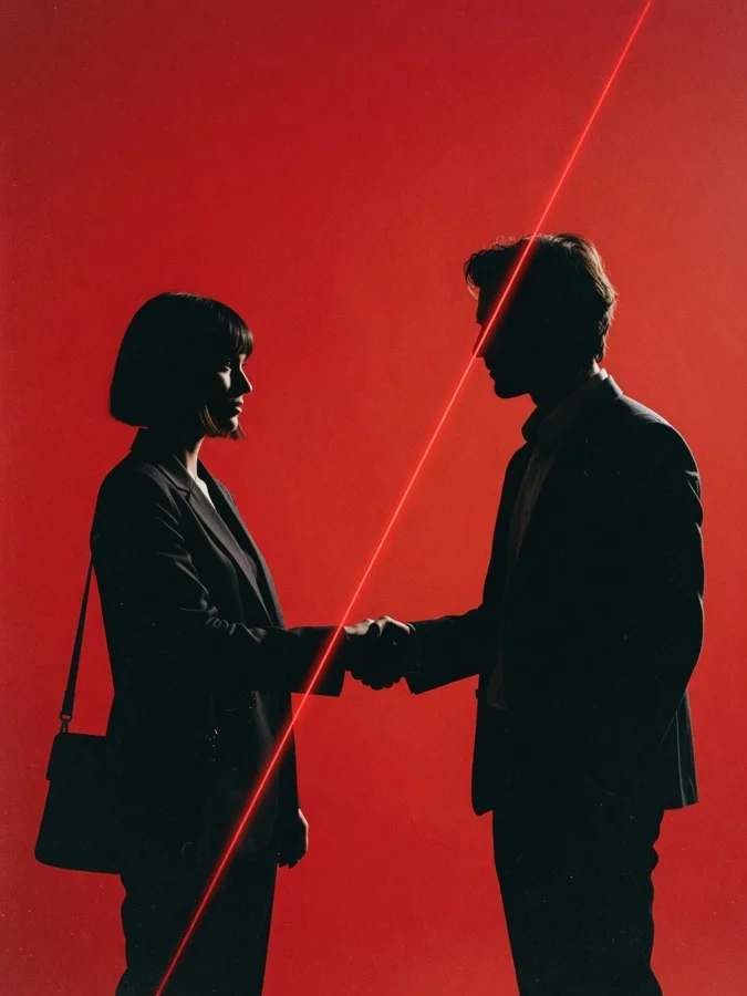 Option A
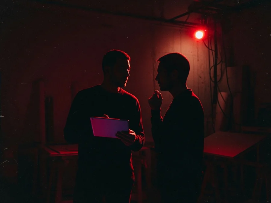 Option B
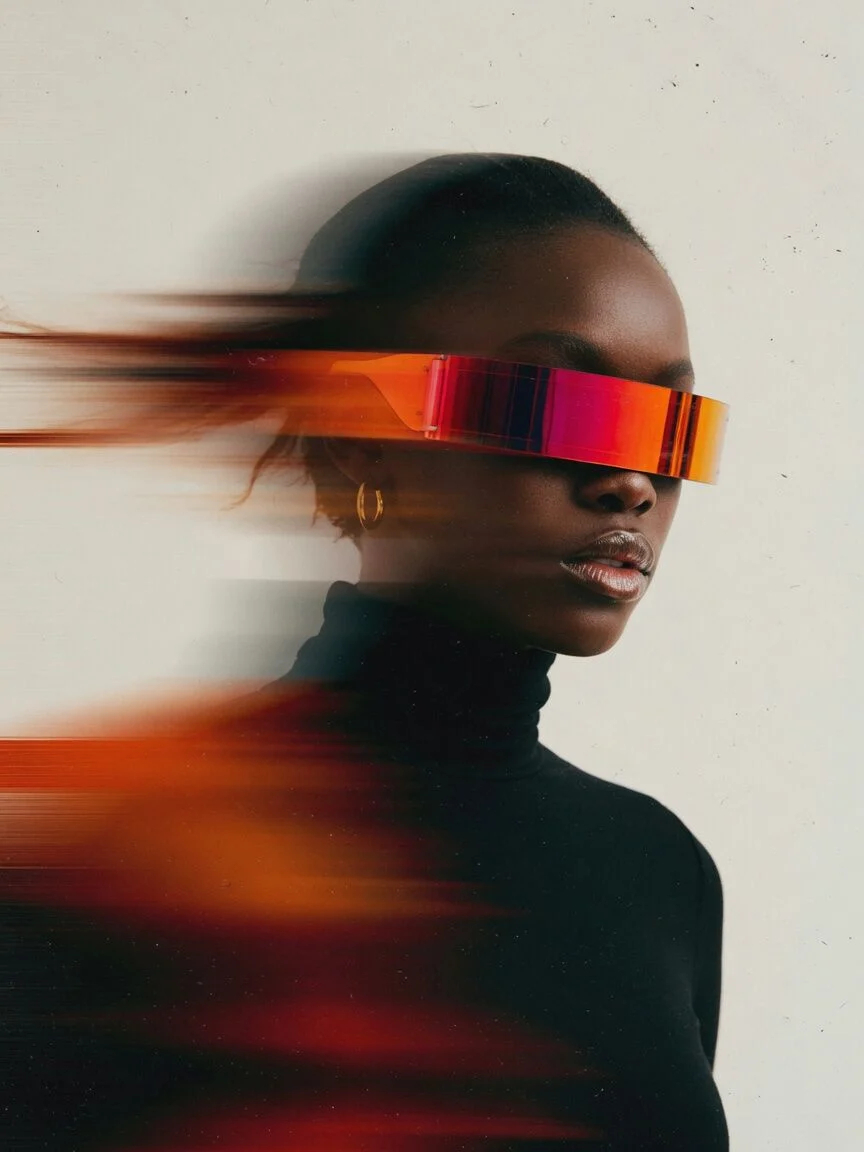 Option CCut · HandshakeCut · PosedKeepKept
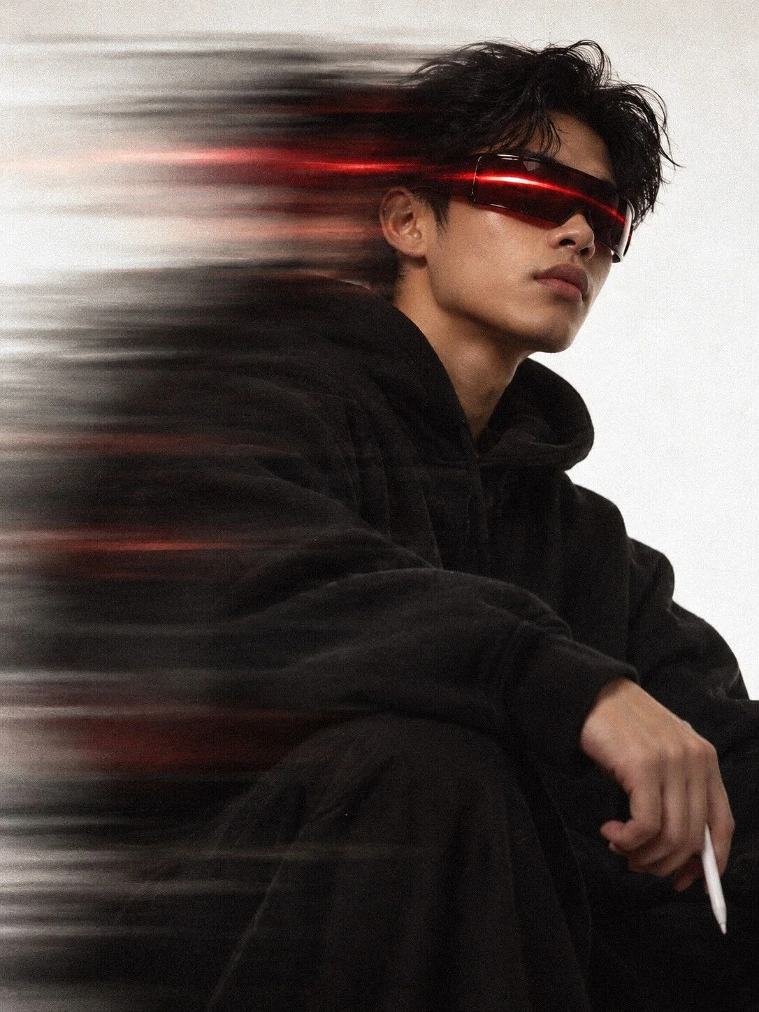
Thirteen years of real Circles photos went through the same rules and the same grade, so the archive and the new art read as one library.
Every frame, made or photographed, goes through one grade so it all looks like one brand. Drag to compare.
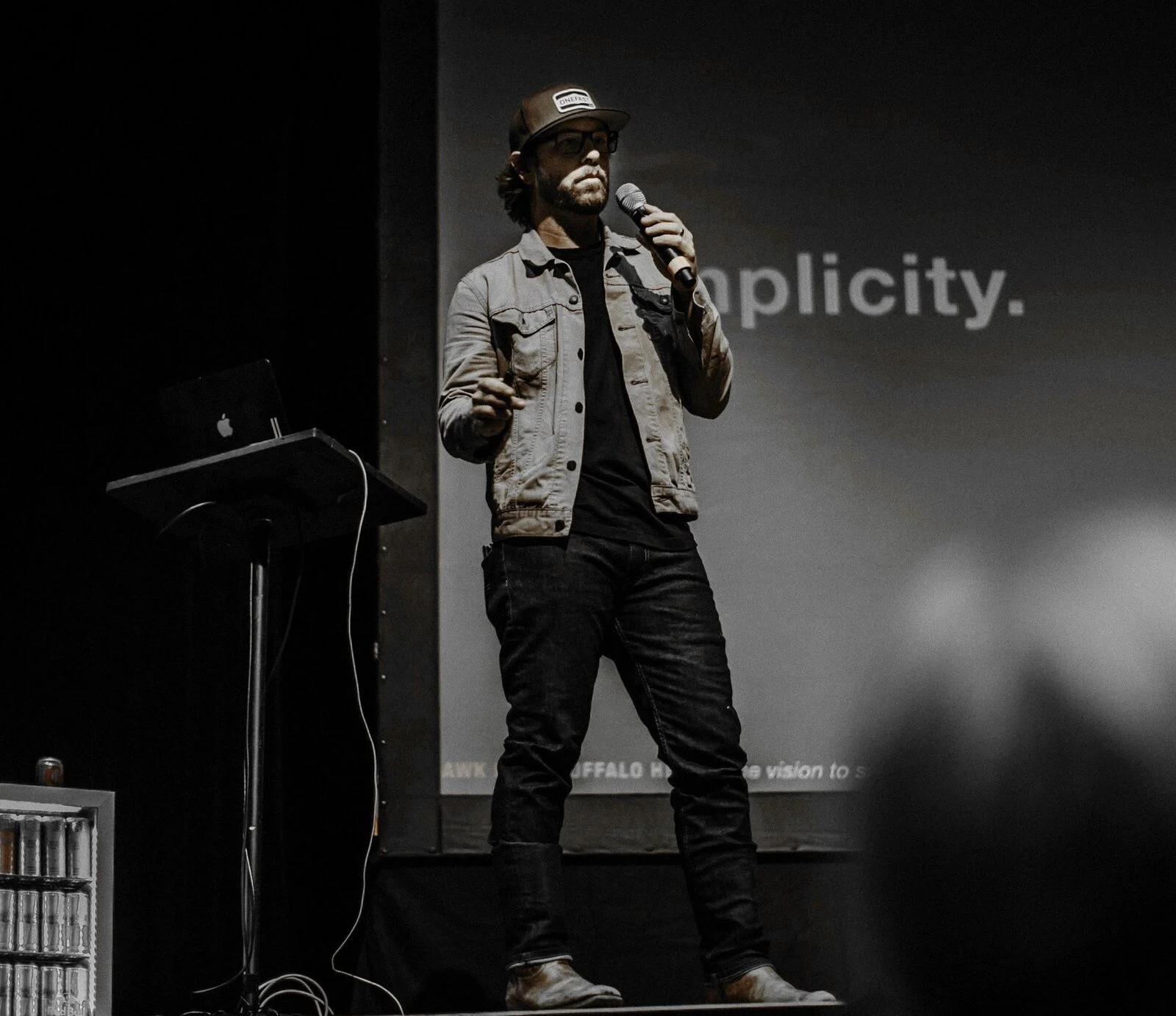
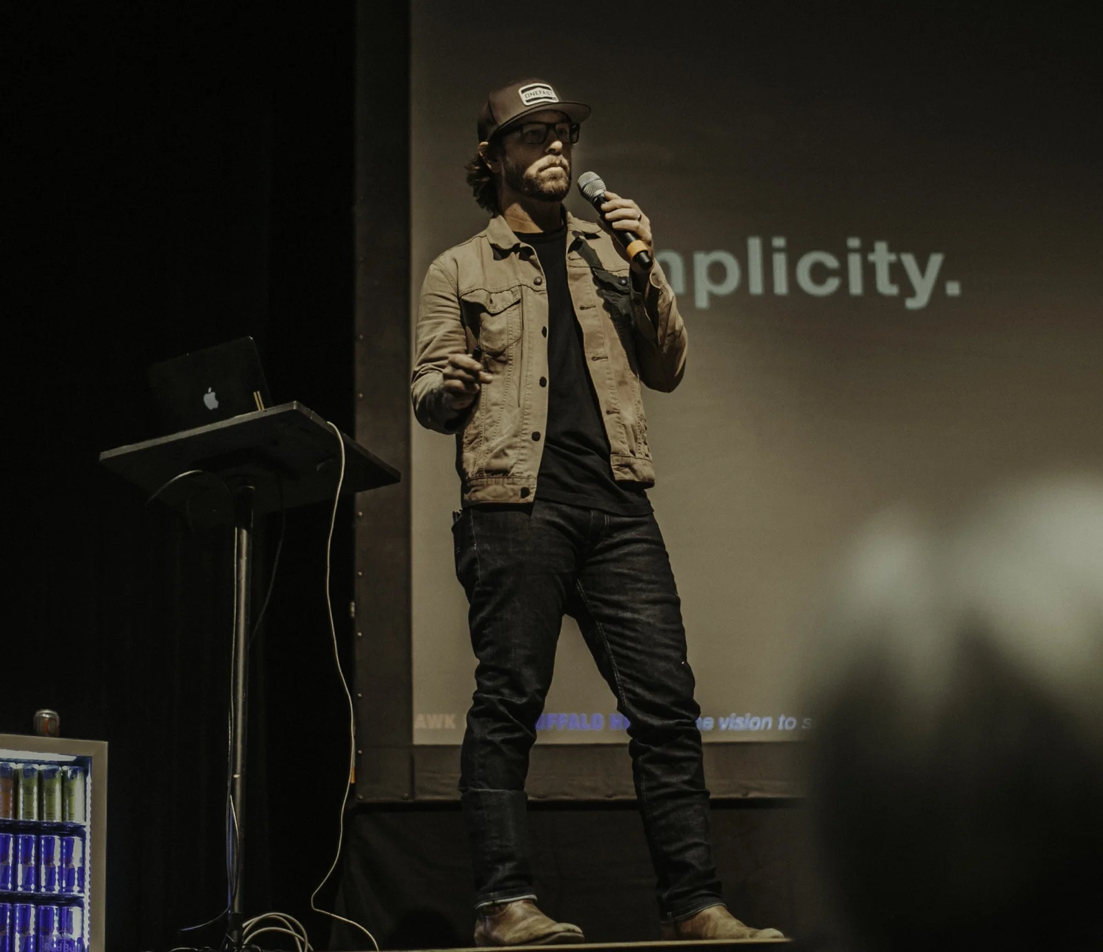
Thirteen years of Circles photos, sorted with AI against our rules: real moments, faces, no empty rooms. The team checked every pick.
Thirteen years of archive photos regraded to one red, plus a library of new creatives made from written briefs and graded by hand.
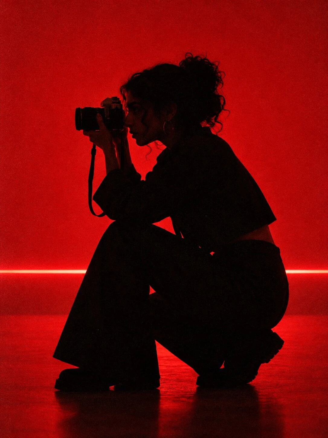

Editorial photograph of a hip, modern creative at work. Dark studio or a night shoot. Saturated red is the only accent.
NEVER: suits, handshakes, people pointing at laptops.
8 prompts on the brand page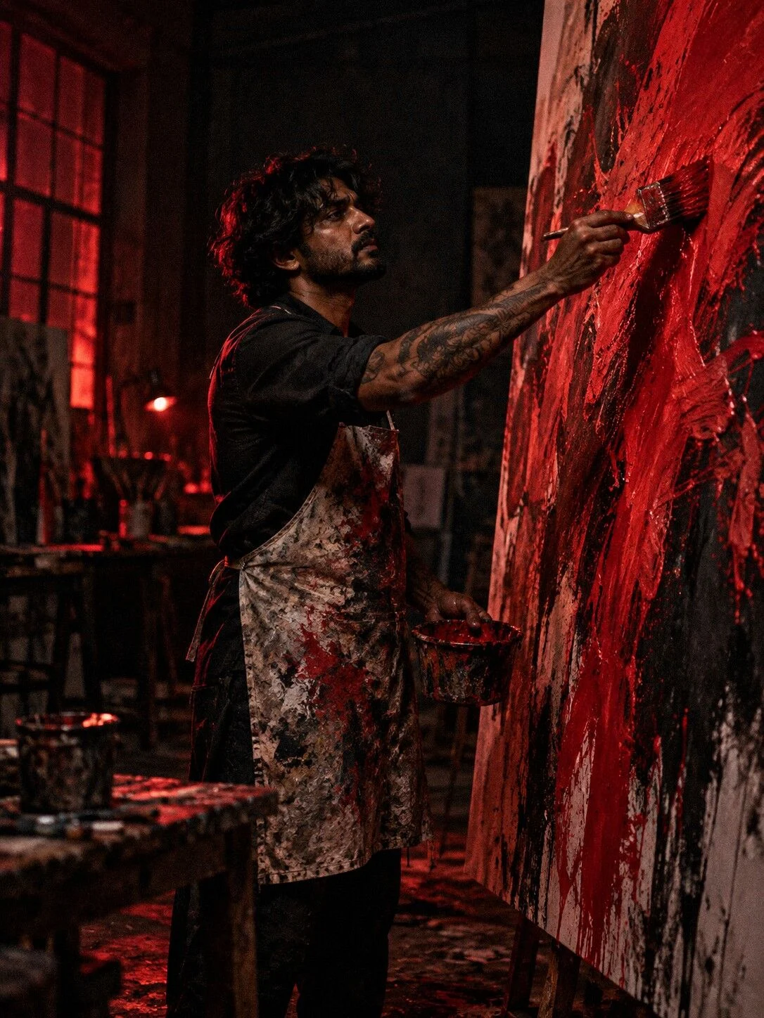
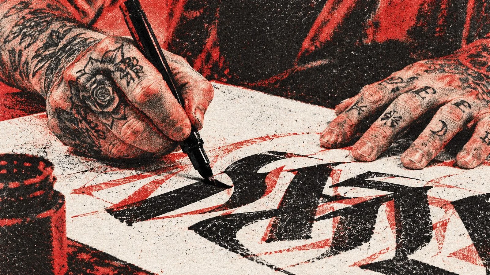
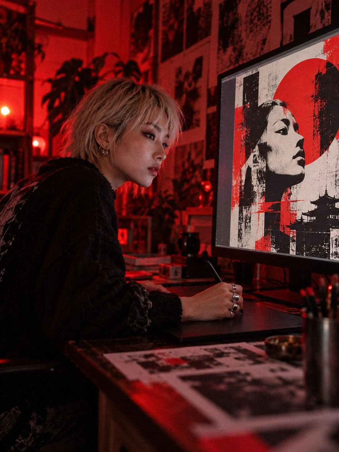
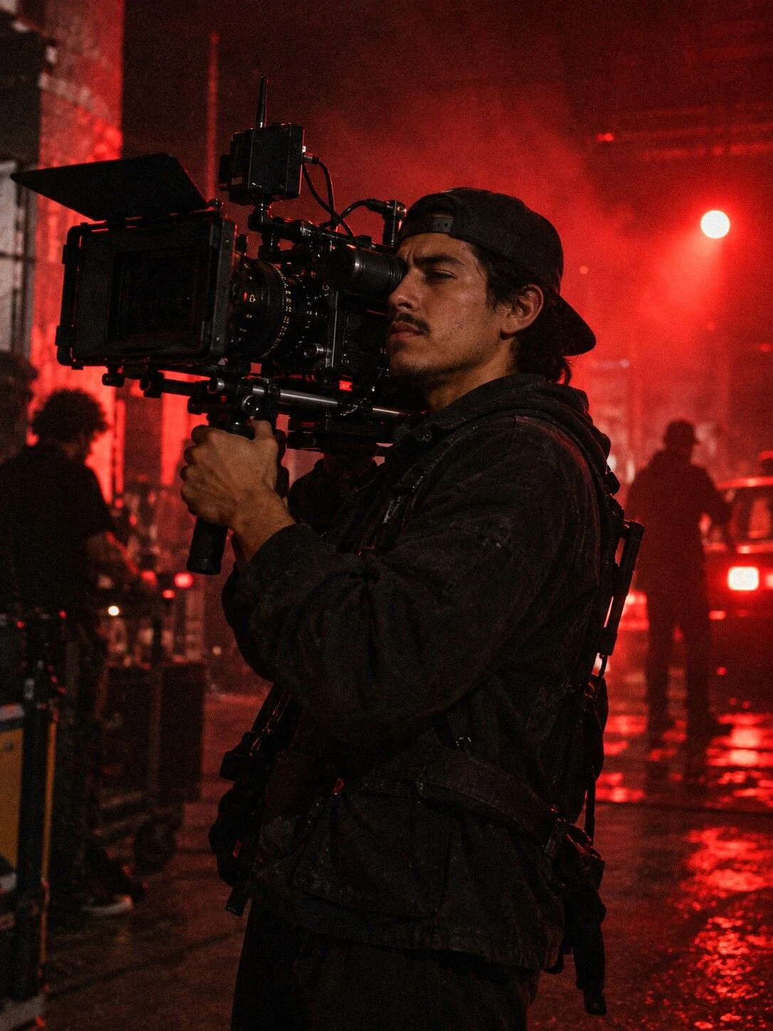
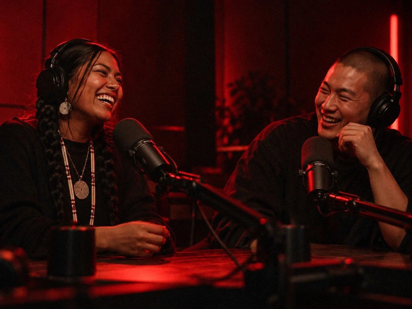
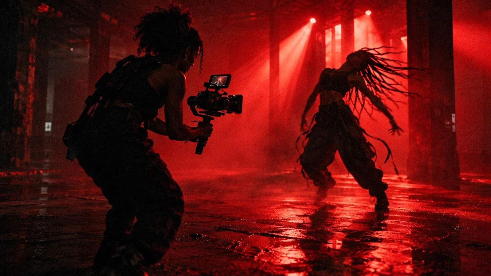
Real photos from past conferences, pulled from the archive and graded to the same palette so last year’s crowd sits right next to the new art.
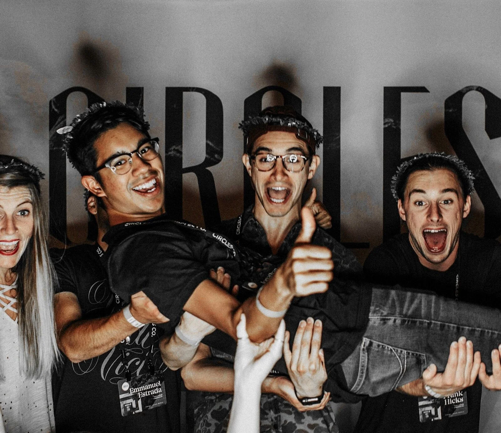
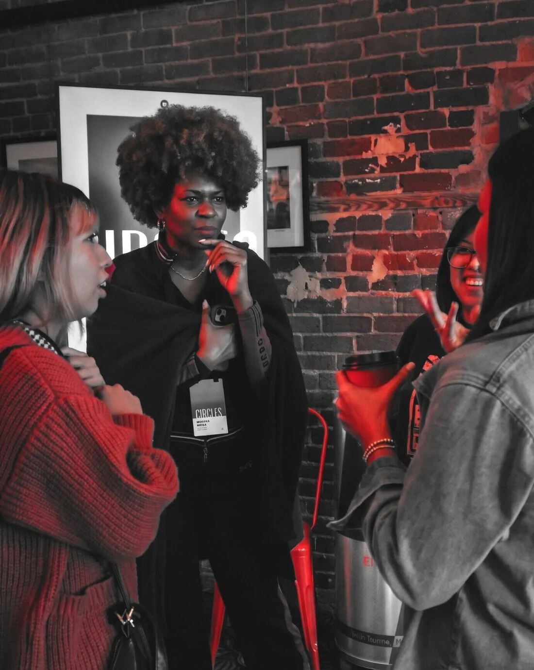
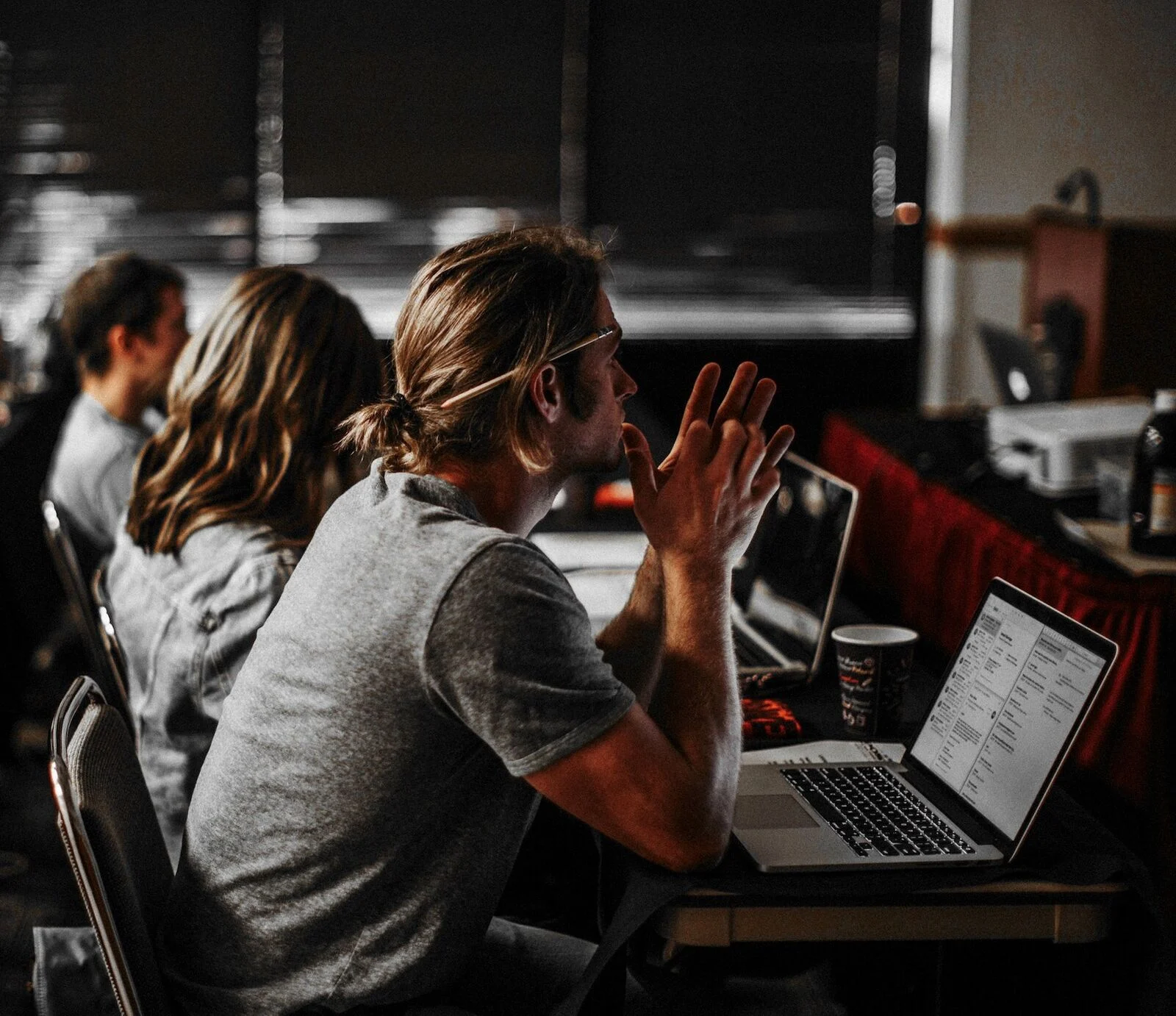

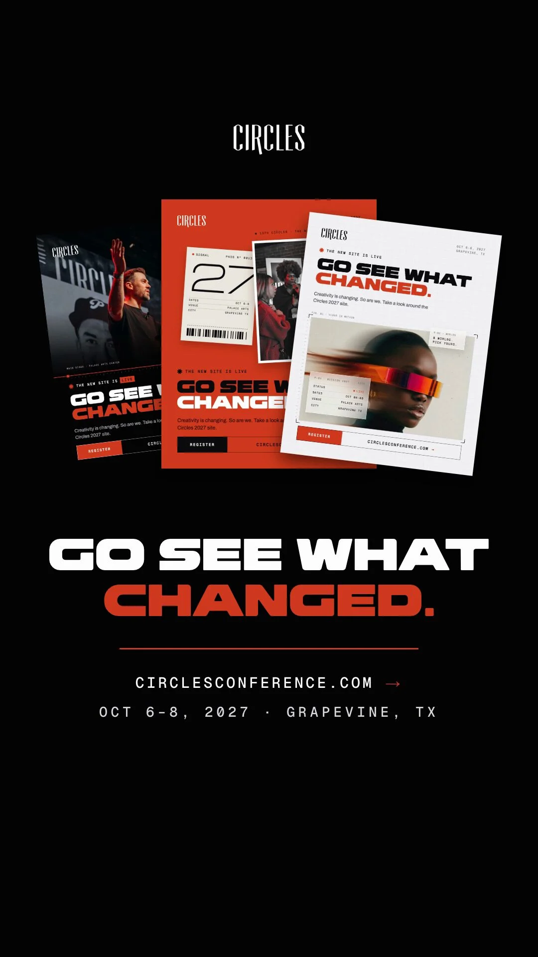
The launch went out as one system: a story, three posts and the passes that followed. Here it is pulled apart.
One line in the Bold, the red doing the work, pointing straight at the site.
Dark, red and white versions of one post, so the grid never repeats.
All three posts on one story, for the people who missed the first.
The site greets every new pass, and the same alert runs on the launch film.
Short, vertical and made for phones. They move the way the site moves: thinking, building, then welcome.
A tour through the worlds: each one types its name, builds, and hands off to the next, ending on the new dates.
The three launch posts fan out, then one line: go see what changed.
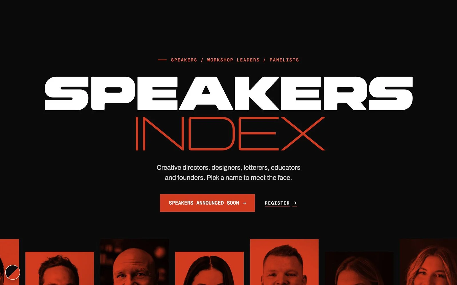
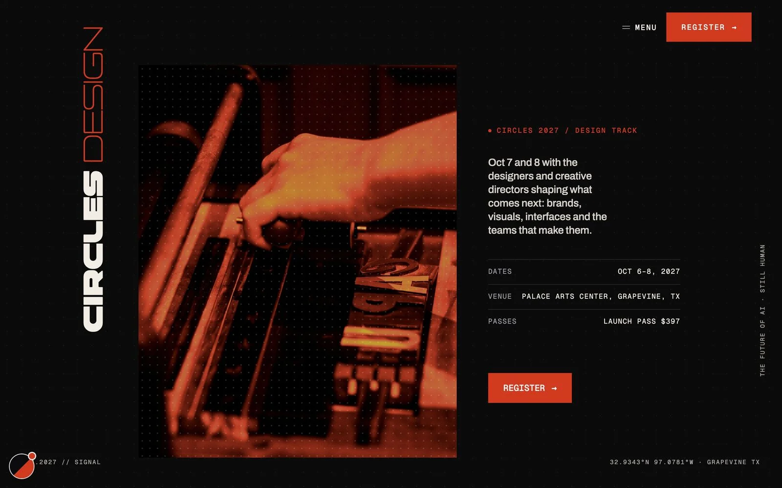
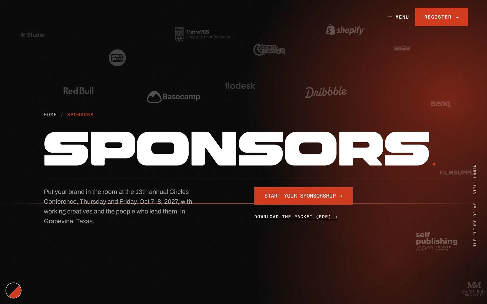
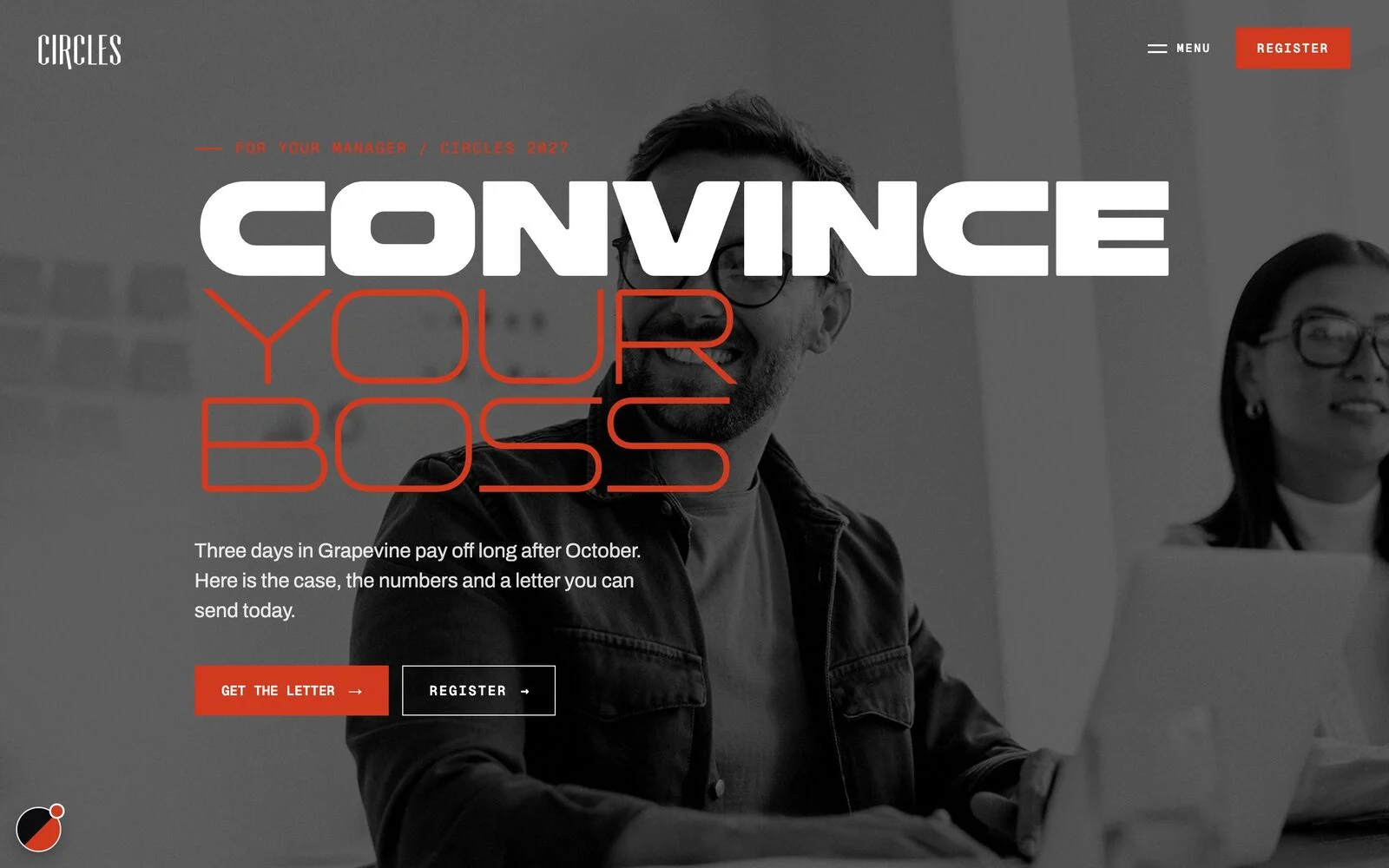
Speakers, workshops, sponsors, a city guide and a letter to convince your boss. The inner pages share one house look and follow the world you picked.
From brand identity to design direction, we partner with you to build a creative foundation that feels aligned, professional, and easy to grow with.

2026 Copyright Circles Co Studio. All rights reserved. Privacy Policy. Designed by circles+co
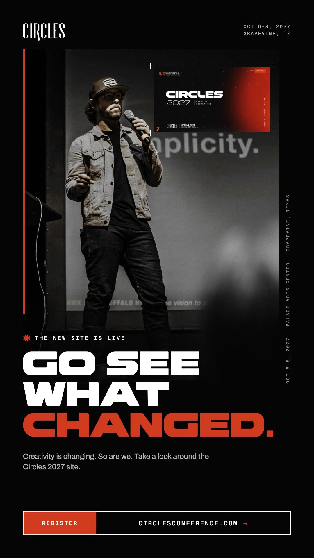
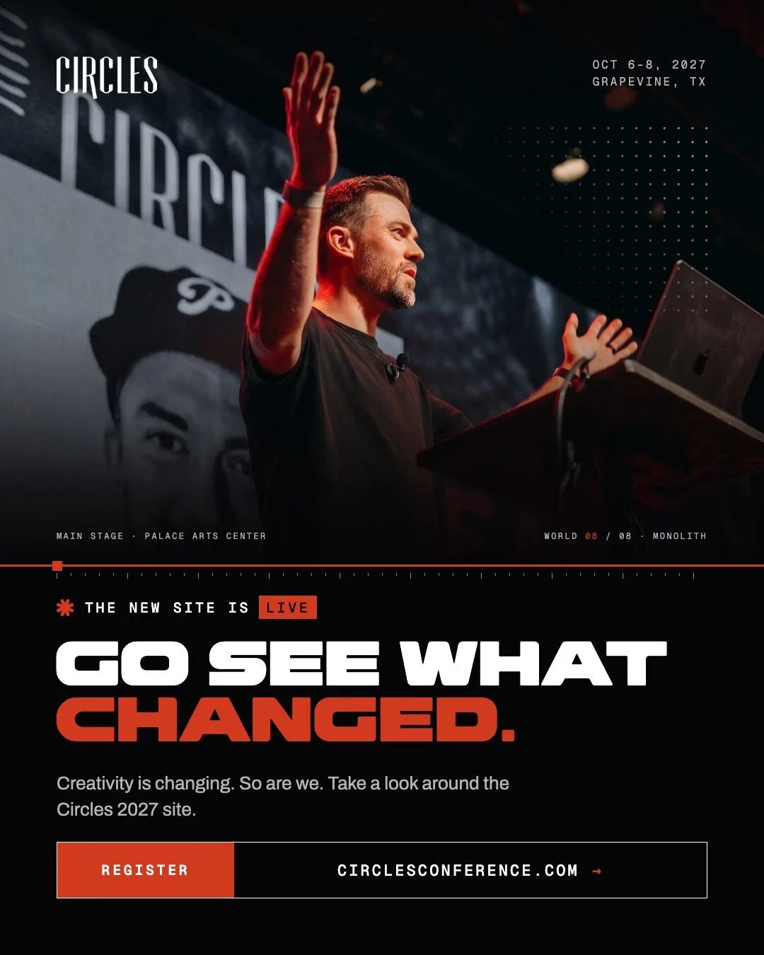
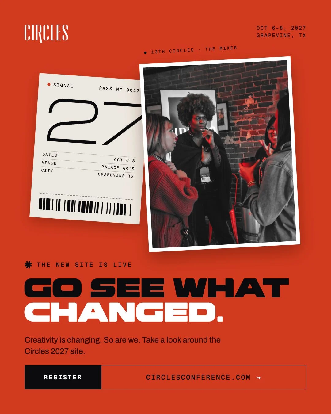
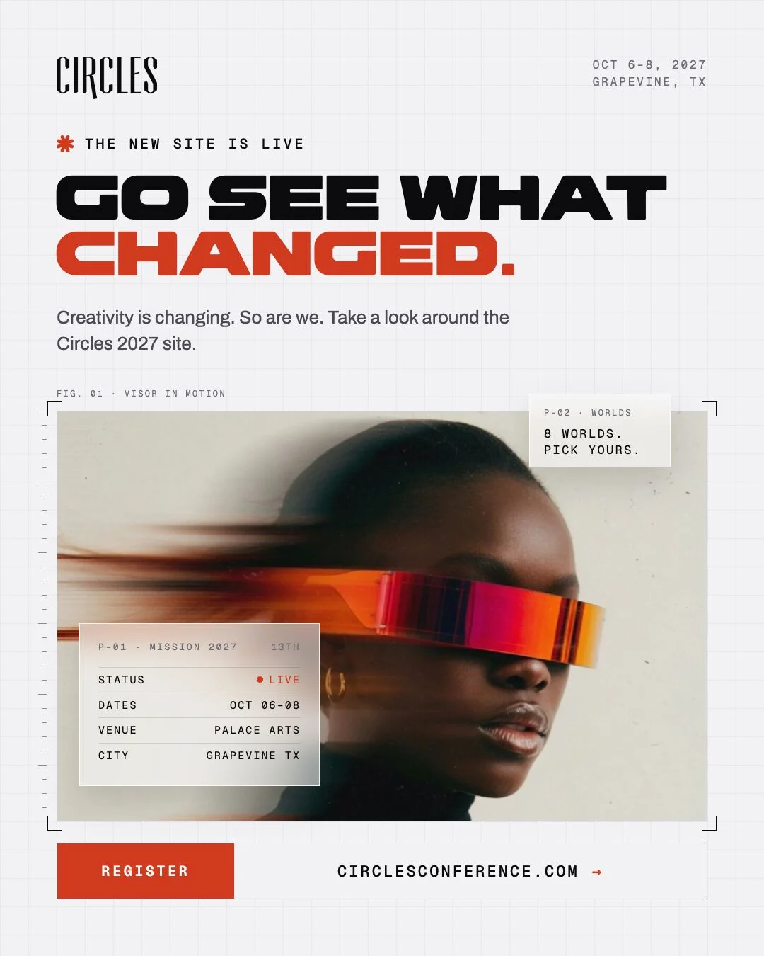


Four concepts before one.
We tried four directions for the launch kit before picking the one above: same type and layout, a different photo and crop each time.