
The
Solution
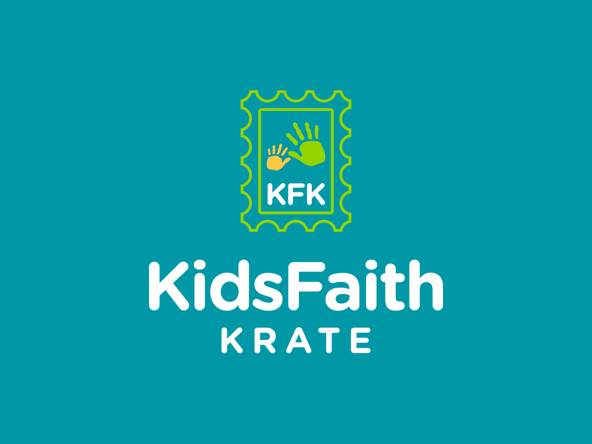
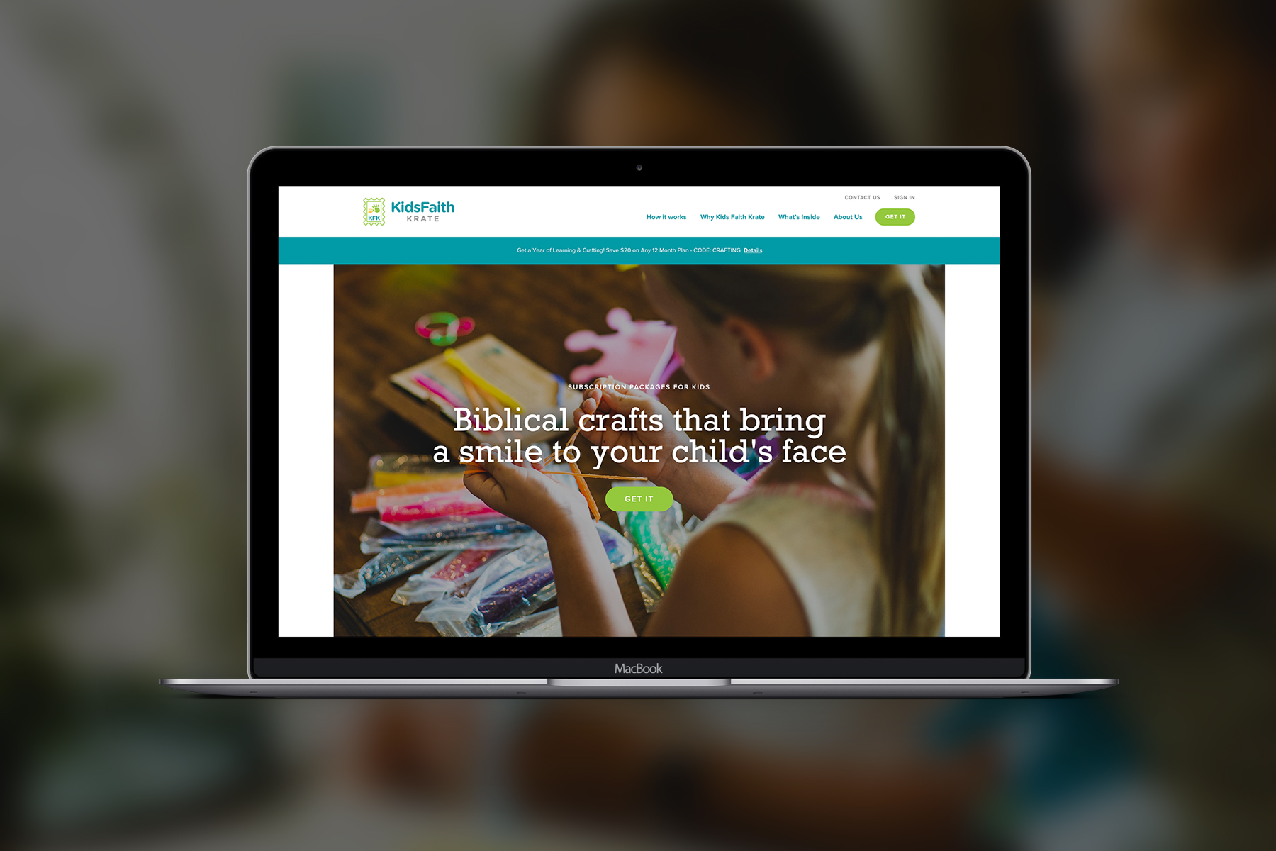
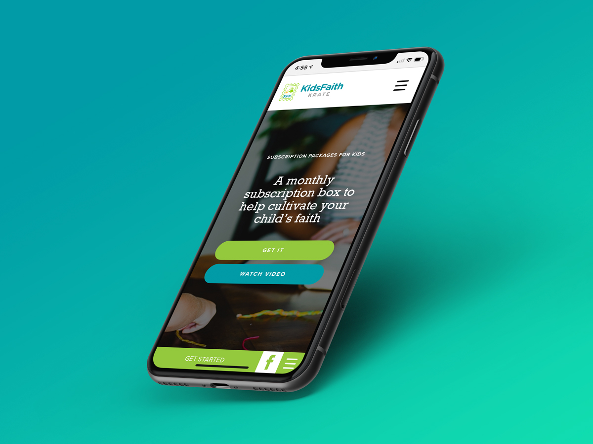
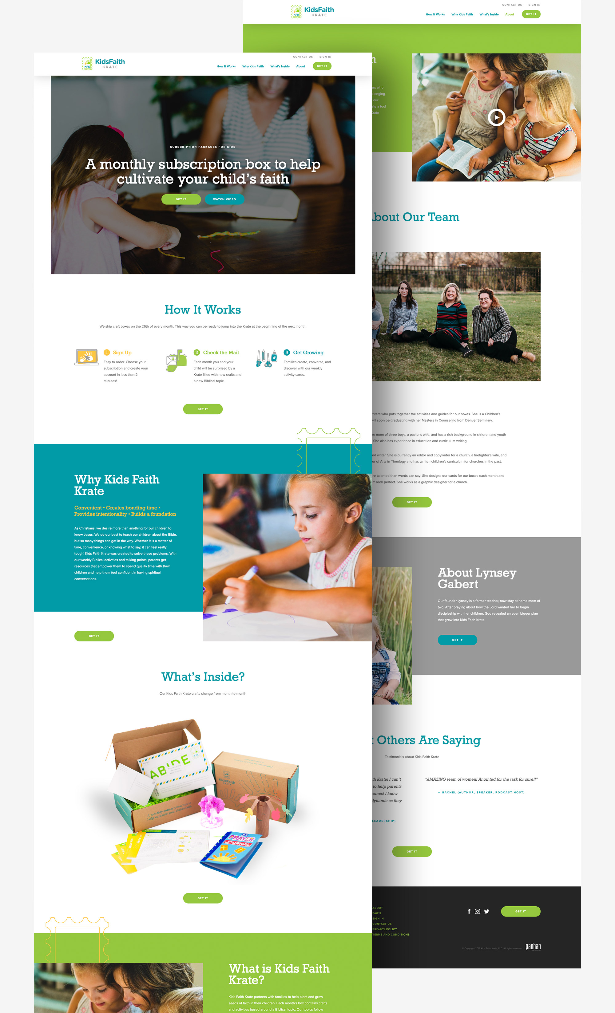
First, we cleaned up the Kids Faith Krate logo. We used the trio of kid-friendly colors from the logo to create an approachable, sleek website design. With clean copy and colorful imagery, we created a mobile-friendly website that’s easy to use. To make purchasing a box even easier, we included a simple illustration beneath the header image to take prospective customers through the steps of ordering a subscription box.

I am so glad we chose Circles Co. to do our website. The task was so daunting to me, but once they took over it was seamless and painless! The website looks so professional and is everything I envisioned for Kids Faith Krate. I will recommend Circles Co. to everyone I know!
— Lynsey Gabert, owner of Kids Faith Krate
Let's Collaborate
Want to discuss a new project? Chat about design? Get a quote? Compare favorite movies or tv shows? Drop our Circles inbox a line, and let’s get this convo rolling.
