Pink Impact 2020
Women's Ministry of Gateway Church
The Task
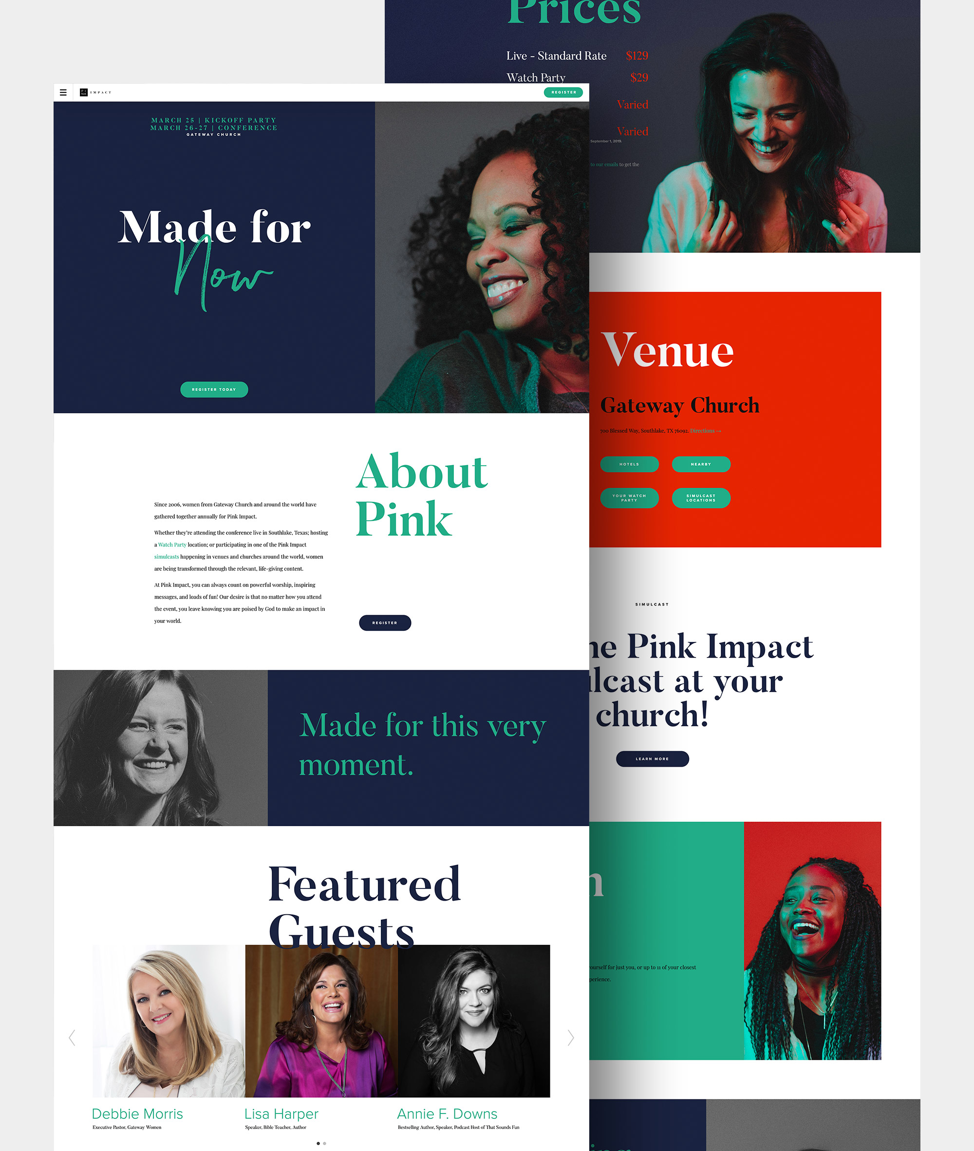
Gateway Church approached us seeking creative direction for their annual Pink Impact conference. Since 2006, women from Gateway have joined women from around the world for Pink Impact in Southlake, Texas. The conference includes simulcasts in venues and churches around the world.
A conference of this scale, and with such a digital presence, needed a brand identity and a website for attendees, Watch Party hosts and others interested in this transformative event to gather and share information. They tasked us with creative direction over photography, branding and the overall conference website.
The Solution
Laying the foundation with strong brand strategy, we started developing a sleek but colorful conference website. The mobile-friendly website featured striking photography and bold words from past attendees. We also incorporated the conference’s colorful social feed into the design for an accessible, friendly impression.
Let’s create something amazing together.
From brand identity to design direction, we partner with you to build a creative foundation that feels aligned, professional, and easy to grow with.

