Hillock Builders
A home and commercial construction company in Amarillo
The Task
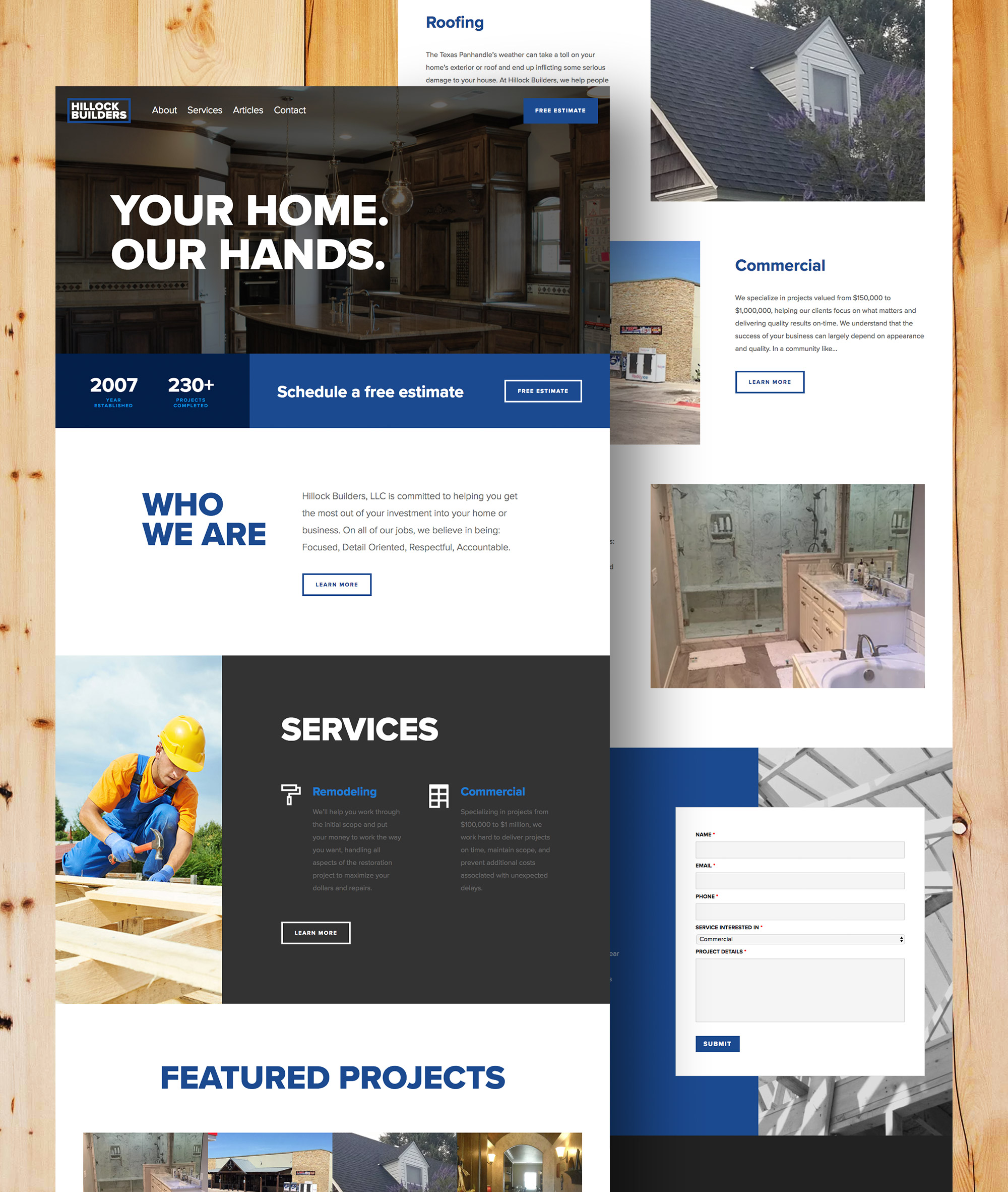
Hillock Builders is a home and commercial construction company in Amarillo. They wanted to redesign their current website so it would be mobile responsive and easy to access. We were tasked with designing a website with a clean look and straightforward information so potential customers could look over examples of Hillock Builders completed projects and schedule a free estimate.
The Solution
We created a way for visitors to easily access a tool where they can schedule a free estimate. We also utilized the brand’s blue tones to create a cool, clean look for the website. We created a better mobile experience by consolidating the menu and summarizing the experience and services provided by Hillock Builders on the home page.
Let’s create something amazing together.
From brand identity to design direction, we partner with you to build a creative foundation that feels aligned, professional, and easy to grow with.

